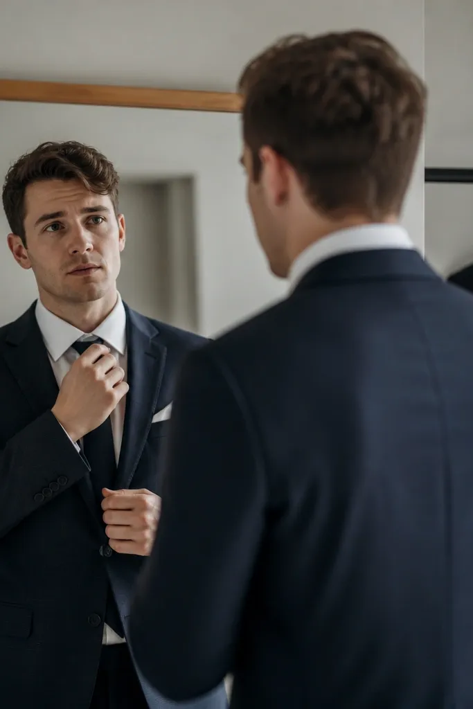
1. The Jacket That’s Too Short (But Still “Technically Fits”)
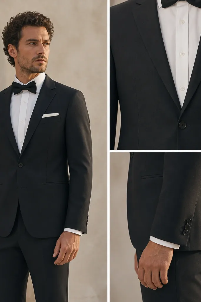
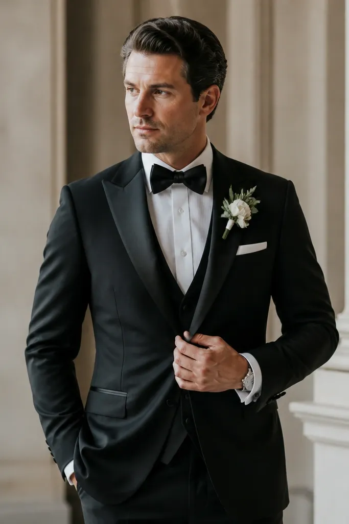
A too-short jacket makes you look top-heavy in photos and can expose your waistband when you sit. Even if the shoulders feel okay, jacket length affects how the proportions read in standing portraits. Look for a hem that covers the seat — especially when you’re seated — so your torso stays clean and intentional.
Good to knowRaise your arms like you’re adjusting a boutonniere. If your shirt or belt line peeks out, the jacket is too short — choose a longer size or ask for tailoring.
2. Sleeves With the Wrong Break (You’ll See It Every Time You Raise Your Hand)
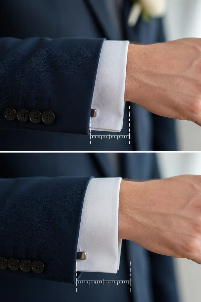
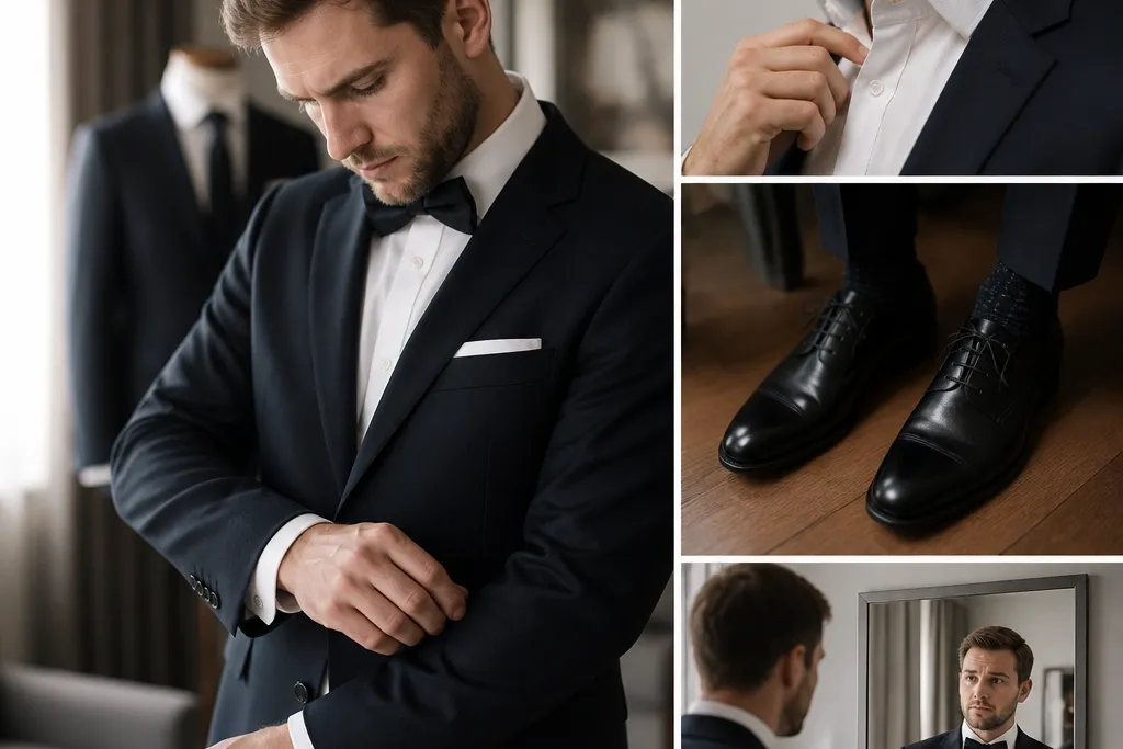
Sleeve break changes how polished you look at arm level — and it’s super noticeable in wedding photos. If the shirt cuff shows too much, it can look casual; if none shows, it can look cramped. Aim for a clean, intentional cuff reveal that stays consistent even when your arms move.
When trying on, bend your elbow. You want a small cuff reveal that doesn’t disappear completely and doesn’t overhang past the knuckle.
3. Shoulders That Pull When You Sit (The “Photo Fit” Trap)
Shoulder seams should sit right at the natural shoulder point. If the seam rides inward or the fabric pulls across the upper back, you’ll feel it during the ceremony, eating, and hugging. This mistake often happens when people size by chest only.
Good to knowSit down in the jacket for 30 seconds. If you feel tugging at the shoulder or upper back, size up and tailor the waist instead.
4. Trouser Break That Looks Off in Motion
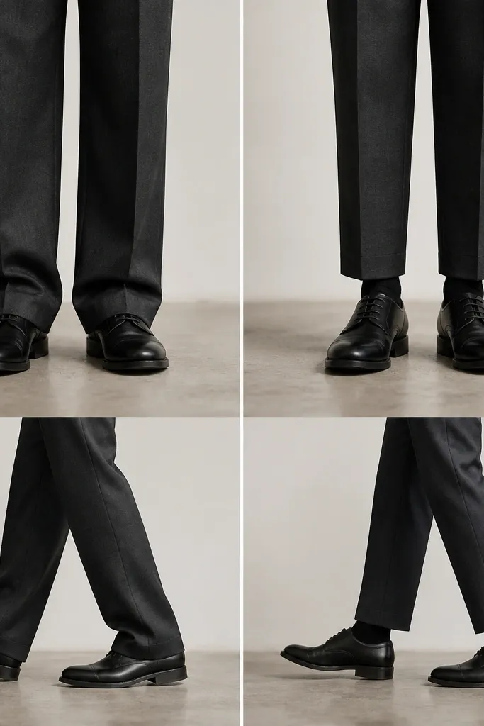
Trouser break affects how your legs read in photos and how you move through the day. Too much break can bunch at the ankle and look messy when you walk; too little can make your legs look chopped and draw attention to bare sock areas. Your height and shoe style matter, but the goal is a smooth line.
Good to knowWear the exact shoes you’ll use and take a few steps. The hem should skim the top of the shoe without stacking or floating far above it.
5. Tie Length Mistake (The “Ends Above the Belt” Problem)
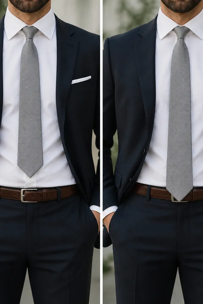
Tie tips that land too high can make you look shorter and less formal. On the flip side, a tie that’s too long can bunch and look sloppy when you sit. The correct length depends on torso height, but there’s a reliable visual target.
Good to knowTie the knot you’ll actually wear and check the tip. It should land around the belt line — not above it and not past the buckle.
6. Collar Clash: Shirt + Lapel Width That Doesn’t Match Your Face
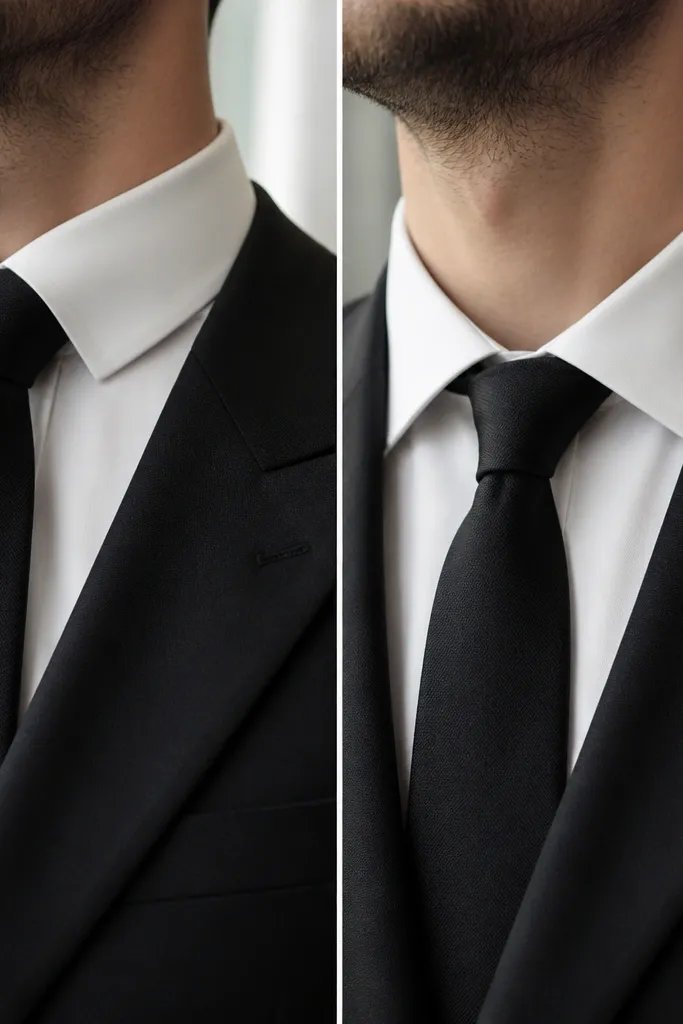
When the shirt collar is too narrow or too narrow-to-lapel ratio, the tie knot can look squeezed and the whole neckline looks “off.” It’s a common groom suit mistake because most people choose the suit first and forget the shirt collar shapes the face. A balanced collar spread creates a sharper, more expensive look.
Try the shirt with the suit lapels before buying. The collar should lie flat and frame the knot without twisting.
7. Fabric Blend That Wrinkles Overnight (Yes, Even for Wedding Days)
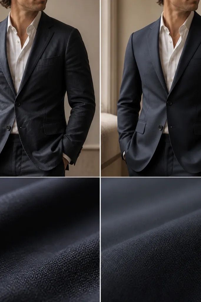
Certain polyester-heavy blends wrinkle fast and hold creases from travel or storage. You’ll notice it most on sleeves and elbows, especially in candid photos. If you want a suit that stays crisp through photos, speeches, and a long reception, fabric choice matters more than people think.
Good to knowAsk how the fabric behaves: look for blends that “bounce back” and avoid super-crease-prone lightweight knits for formal groom looks.
8. Pocket Style That Adds Bulk (Patch Pockets vs. Flap Pockets)
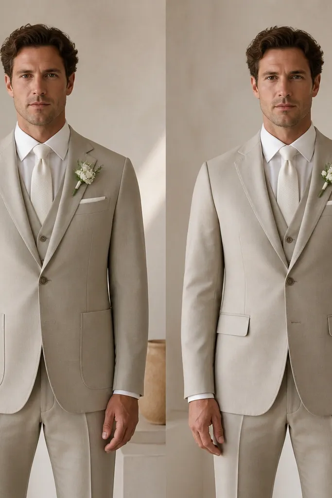
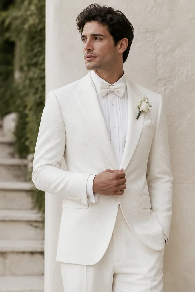
Patch pockets can add visual width because they sit more forward and outward. Flap pockets usually keep the jacket line cleaner and more tailored. This matters if you’re choosing between a slim or classic cut and want a flattering silhouette in photos.
If you’re trying to minimize bulk, prioritize flap pockets and keep the jacket waist close to your natural shape (tailoring helps a lot).
9. Color That Reads “Off” Under Ceremony Lighting
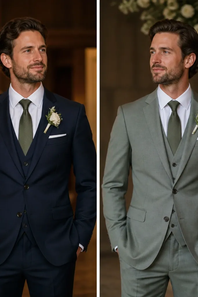
Some colors look perfect in daylight but shift under warm venue lighting, especially deep charcoals and certain navy tones. That can make your skin look washed or your tie look mismatched. The fix is choosing a shade that stays consistent in both warm and cool light.
Before buying, check the suit in similar lighting — if possible, view it near warm bulbs or in venue photos from the same time of day.
10. Shoe Color + Pant Hem: The Gap That Makes the Whole Look Feel Cheap
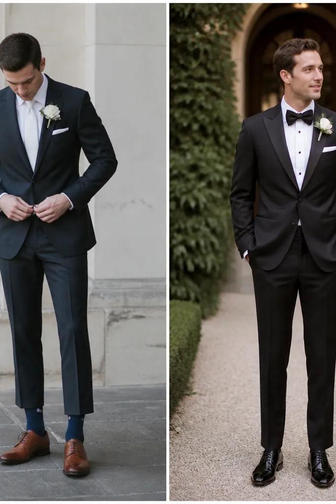
A visible sock gap or a shoe tone that clashes with your suit can pull attention away from your tailored lines. Even if everything is “right,” the bottom third is what people notice in motion. Coordinating shoe color with trouser tone keeps the outfit cohesive and refined.
Wear the exact socks and shoes. The hem should cover the top of the sock when you stand naturally.