1. Deep Navy Wool Suits with Satin Burgundy Ties
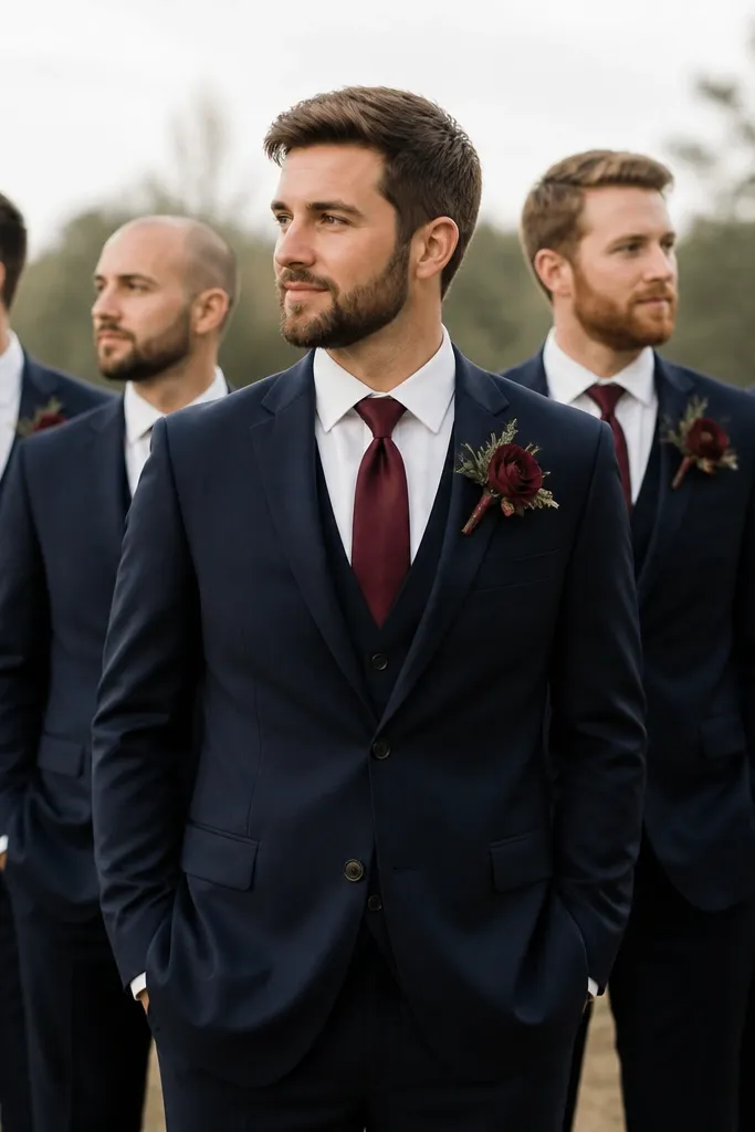
Navy wool reads classic in both indoor and outdoor venues, and wool texture adds depth so your photos don’t look flat. Burgundy satin ties bring a soft sheen that catches light without looking flashy, especially against white shirts.
Good to knowChoose ties that are the same fabric type (satin vs matte) across the group to avoid “almost matching” in photos.
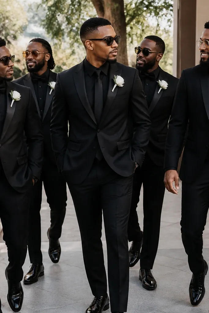
2. Black Suit, Charcoal Shirt, and Matte Black Bow Ties
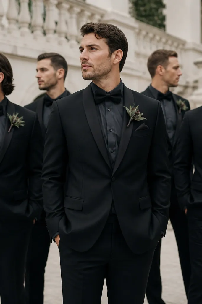
This is a sleek, modern option when you want minimal color but maximum cohesion. The charcoal shirt softens the harshness of black suits and makes the bow ties and lapels stand out.
Keep pocket squares simple — white linen or black satin — so the look stays sharp, not busy.
3. Forest Green Velvet Jackets with Cream Shirts
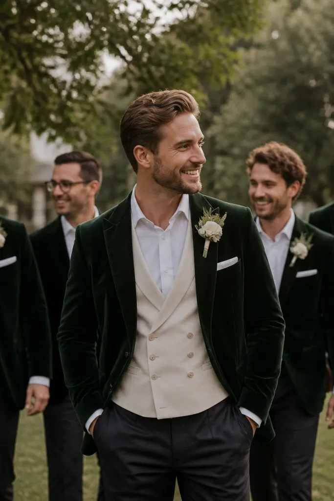
Velvet gives instant “aesthetic” energy in winter and fall photos, and cream keeps the palette warm and flattering. The waistcoat adds structure, so groomsmen look like they’re part of the same styling story.
Good to knowUse velvet only on the jackets (not every layer) to keep the group comfortable and reduce maintenance headaches.
4. Light Blue Linen Suits with Chambray Blue Boutonnieres
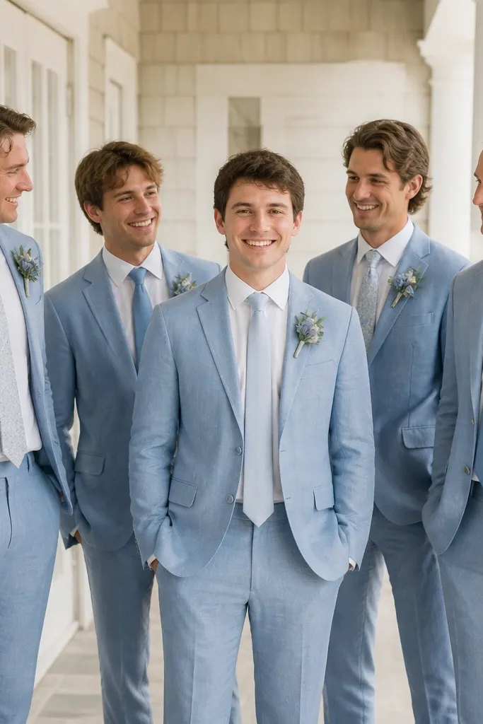
Linen suits are perfect for warm-weather weddings because they breathe and photograph beautifully with natural wrinkles that look intentional. Chambray-toned details keep everything soft and cohesive instead of high-contrast.
Good to knowHave everyone use the same shirt color (white or off-white) so tie and boutonnière colors don’t fight.
5. Slate Gray Suits with Powder Blue Knit Neckties
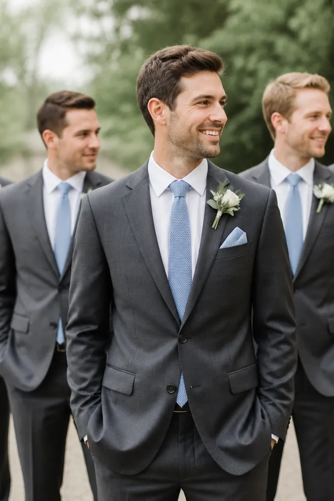
Knit ties add texture that reads “designed” in photos, especially when paired with a cool neutral suit like slate gray. Powder blue keeps it airy and friendly without turning the look overly springy.
Match the pocket square to the tie tone (powder blue) but keep the pattern minimal to avoid visual clutter.
6. Tan Suits with Rust Ties and Matching Pocket Squares
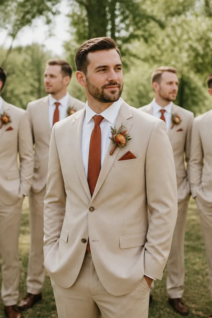
Tan suits create a warm, Mediterranean vibe, and rust ties add depth that looks amazing in golden-hour photos. Using the same rust tone in the pocket square makes the group feel coordinated even if boutonnières vary slightly.
Pick rust shades that lean brick-red rather than orange for a more flattering, less neon look.
7. Charcoal Suit with Silver Tie Clips and Cool-Tone Accents
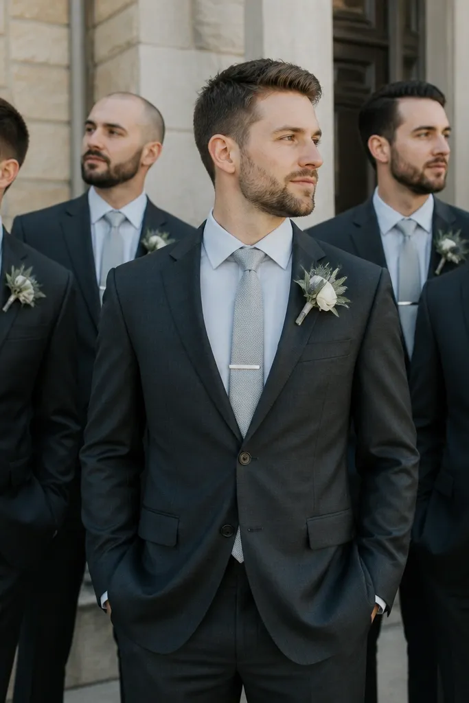
Charcoal is forgiving and looks expensive, and silver metal details create instant cohesion across different tie designs. Cool-tone accents (silver clips, light gray shirts) prevent the group from looking mismatched when ties vary in pattern.
Buy tie clips in one batch and assign a clip to each tie style so everyone gets the same metal finish.
8. Cream and Navy Seersucker for Beachy Photo Pop
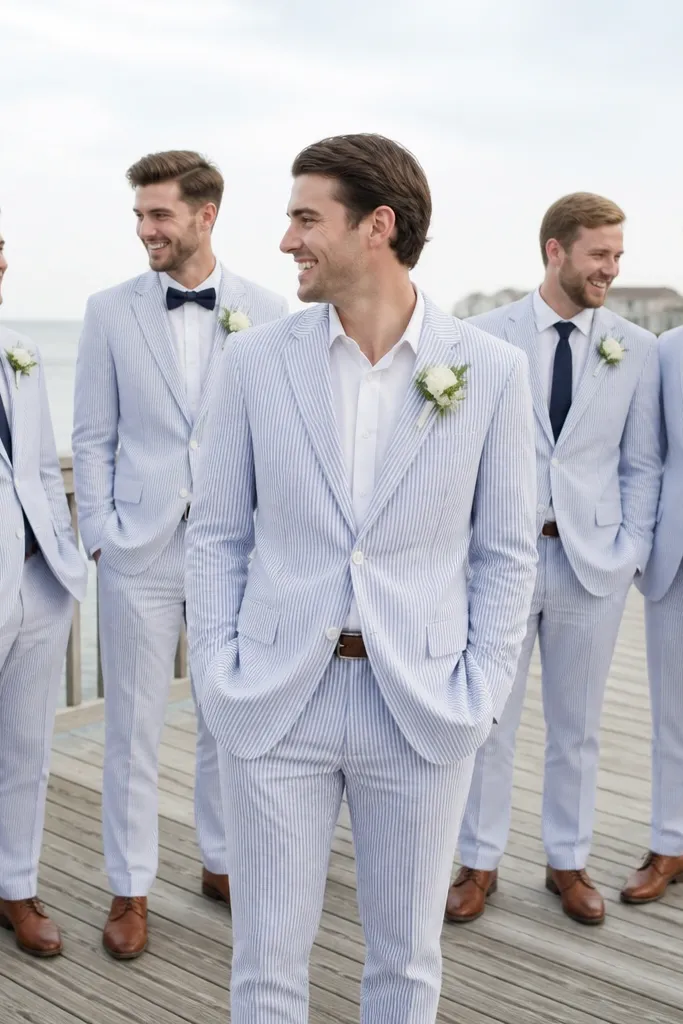
Seersucker’s stripes photograph with natural contrast that looks lively without feeling chaotic. Navy-and-cream is beach-friendly and keeps the palette consistent across different tie choices.
Good to knowKeep footwear consistent (brown leather or tan suede) so the bottoms of the photos match too.
9. Burgundy Suit Separates with Blush Pink Shirt Details
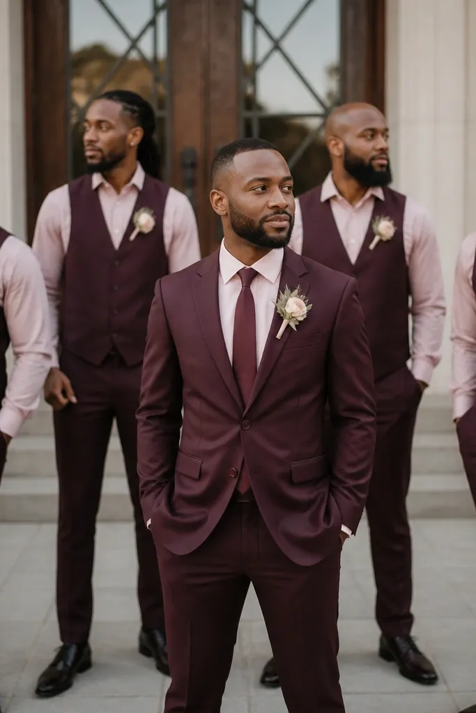
Separates let you tailor each guy’s fit while keeping the color story intact. A blush pink shirt detail adds softness and looks gorgeous in indoor lighting where burgundy can sometimes go too deep.
If you mix separates, keep the jacket color and trouser color identical — even a slight shade difference shows in group photos.
10. Olive Green Suits with Mustard Knit Bow Ties
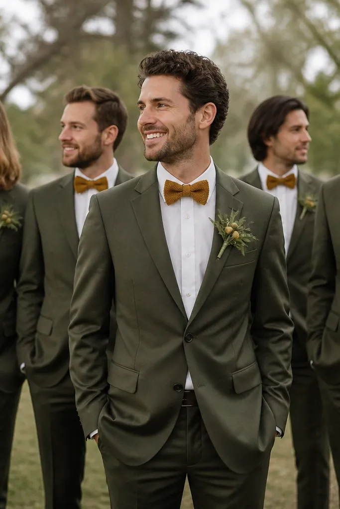
Olive + mustard is a warm, earthy combo that looks intentional and cozy for fall weddings. Knit bow ties add a handmade texture that stands out without needing loud patterns.
Stick to solid mustard (not patterned) so the group stays cohesive even with varying face shapes and collar styles.
11. Navy Tuxedo Look with White Shirt and Black Bow Tie
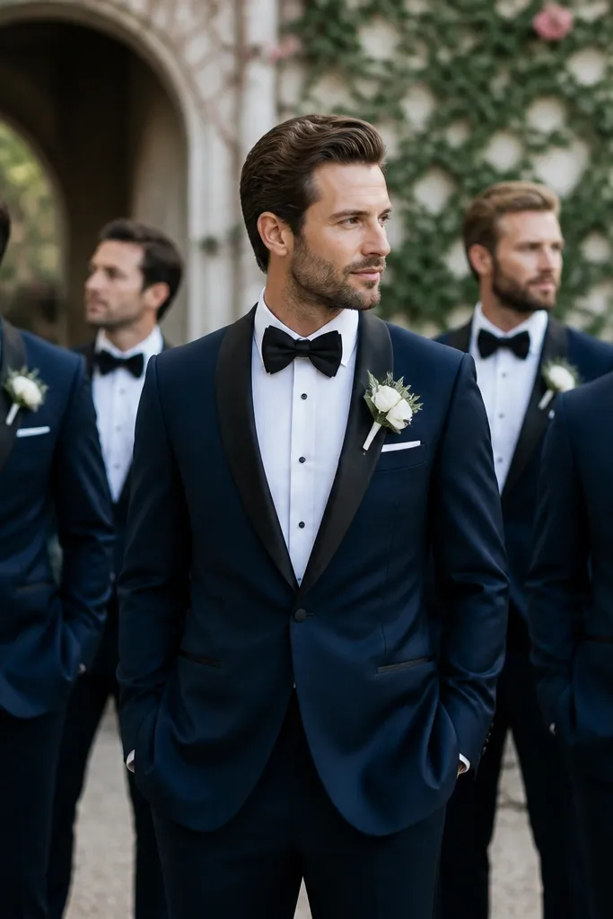
A navy tuxedo keeps you from the usual black-tux monotony while still reading formal. Satin lapels mirror the bow tie’s finish, so the whole group looks “matched” even if the suits vary slightly by brand.
Good to knowConfirm lapel satin color is consistent (black vs silver-toned) across the tuxedos for clean, photo-ready contrast.