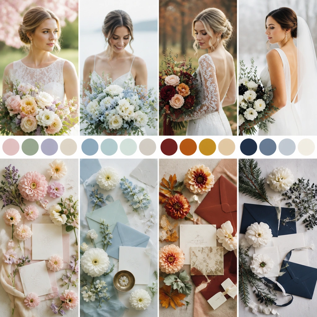
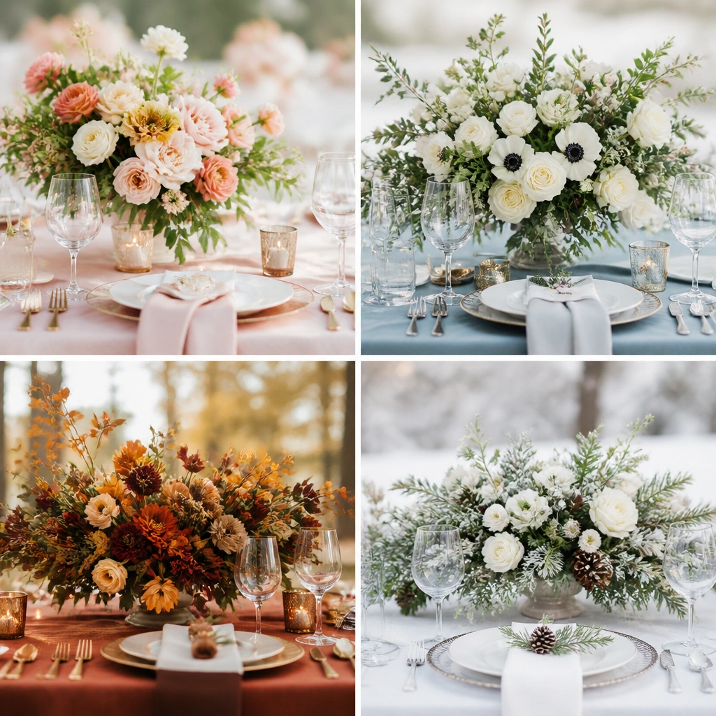
1. Spring Blush + Sage Garden (warm, airy, soft romance)
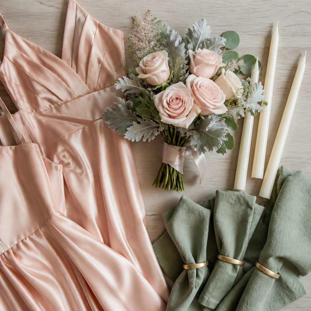
Blush and sage look fresh because they balance sweetness (blush) with a grounded herbal tone (sage). For fabric, satin or chiffon keeps the palette light, while linen napkins add texture so it doesn’t look flat. Florals like blush roses, ranunculus, and eucalyptus make the colors feel natural, not forced.
Start with sage as your “neutral” and choose blush as the pop — add cream or ivory to tie in stationery and tableware.
2. Summer Coral + Sunflower Yellow (high-energy, beach-to-garden friendly)
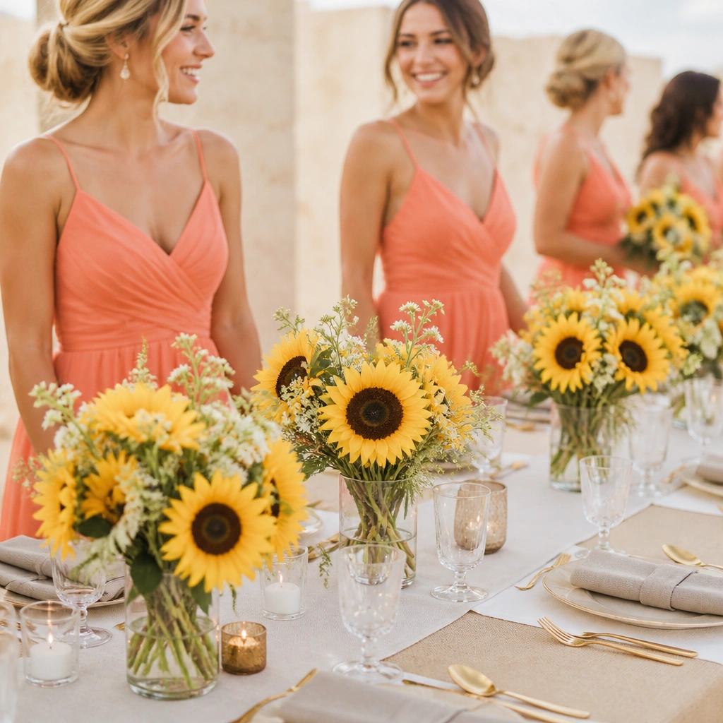
Coral reads warm and flattering in sunlight, while sunflower yellow adds a cheerful focal point. The trick is contrast: keep whites (tablecloth, candles, signage) crisp so the yellows don’t look muddy. Use clear vases or textured ceramics to keep the palette vibrant without feeling too themed.
Limit sunflower to flowers or accents — paint, linens, or large areas in yellow can overpower photos.
3. Autumn Terracotta + Burnt Orange + Cream (cozy, rich, earthy)
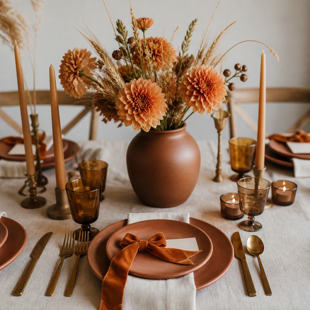
Terracotta and burnt orange feel intimate because they mimic natural clay, leaves, and harvest tones. Pairing with cream keeps everything breathable and stops the palette from turning too dark. Materials matter here: velvet ribbon, matte ceramics, and dried grasses make the scheme look curated instead of “orange season.”
Good to knowAdd one deep anchor color — like chocolate brown or espresso — only in small details (candles, menu text) for depth.
4. Fall Plum + Burgundy + Champagne (luxury, candlelit vibes)
Plum and burgundy create a jewel-toned palette that looks stunning indoors, especially under warm lighting. Champagne-gold keeps the scheme elegant and helps reflective details show up beautifully in photos. Choose florals with varied texture — orchids, berries, and dark greenery — so the palette looks layered, not flat.
Good to knowUse champagne for metallics and signage only — avoid adding silver, which can clash with the warm undertones.
5. Winter Icy Blue + Silver + White (clean, crisp, modern)
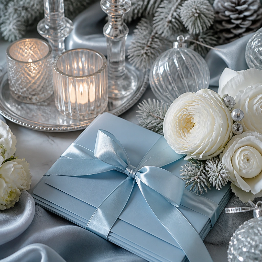
Icy blue feels fresh in winter because it’s cool and light, while silver and white add a crisp, snow-gloss effect. Keep everything bright: white linens, clear glass, and reflective accents make the palette look intentional. For flowers, choose white blooms with cool greens (eucalyptus) to maintain that “winter morning” look.
Good to knowChoose one sparkle surface (silver trays or glass ornaments) and keep the rest matte to prevent over-glittering.
6. Winter Emerald + Black Tie Gold (dramatic, bold, glam)
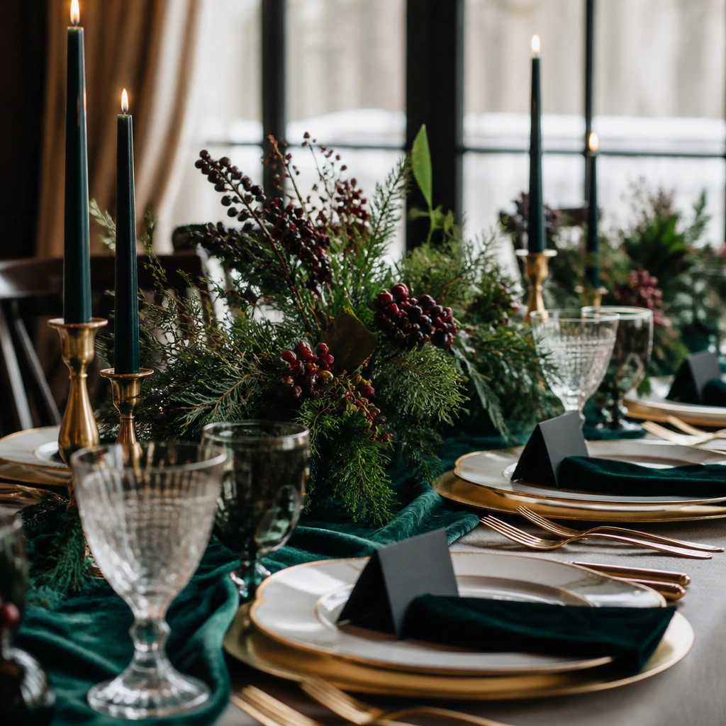
Emerald and black create high contrast that photographs like classic editorial style. Gold details bring warmth so the palette doesn’t feel harsh. This scheme shines with velvet, satin, and heavy paper textures — they catch light and look luxurious without needing lots of decor.
Use black only in stationery or small decor elements — keep linens mostly deep green or dark charcoal for a softer look.
7. Year-Round Neutral: Ivory + Taupe + Soft Green (beginner-proof, timeless)
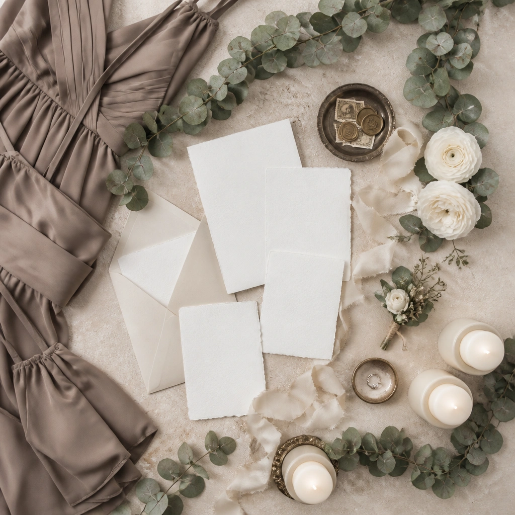
If you’re a beginner and want near-zero mismatch, neutrals are your best friend. Ivory and taupe work across every season because they don’t fight the lighting; soft green adds life without turning into a color theme. This palette looks especially clean with minimal florals and textured stationery.
Good to knowPick your green first (eucalyptus, sage, or olive) then match all other elements to ivory/taupe — don’t add extra colors until you’ve seen the photos.
8. Spring/Autumn Reversible: Dusty Rose + Olive + Warm Gold (transitional magic)
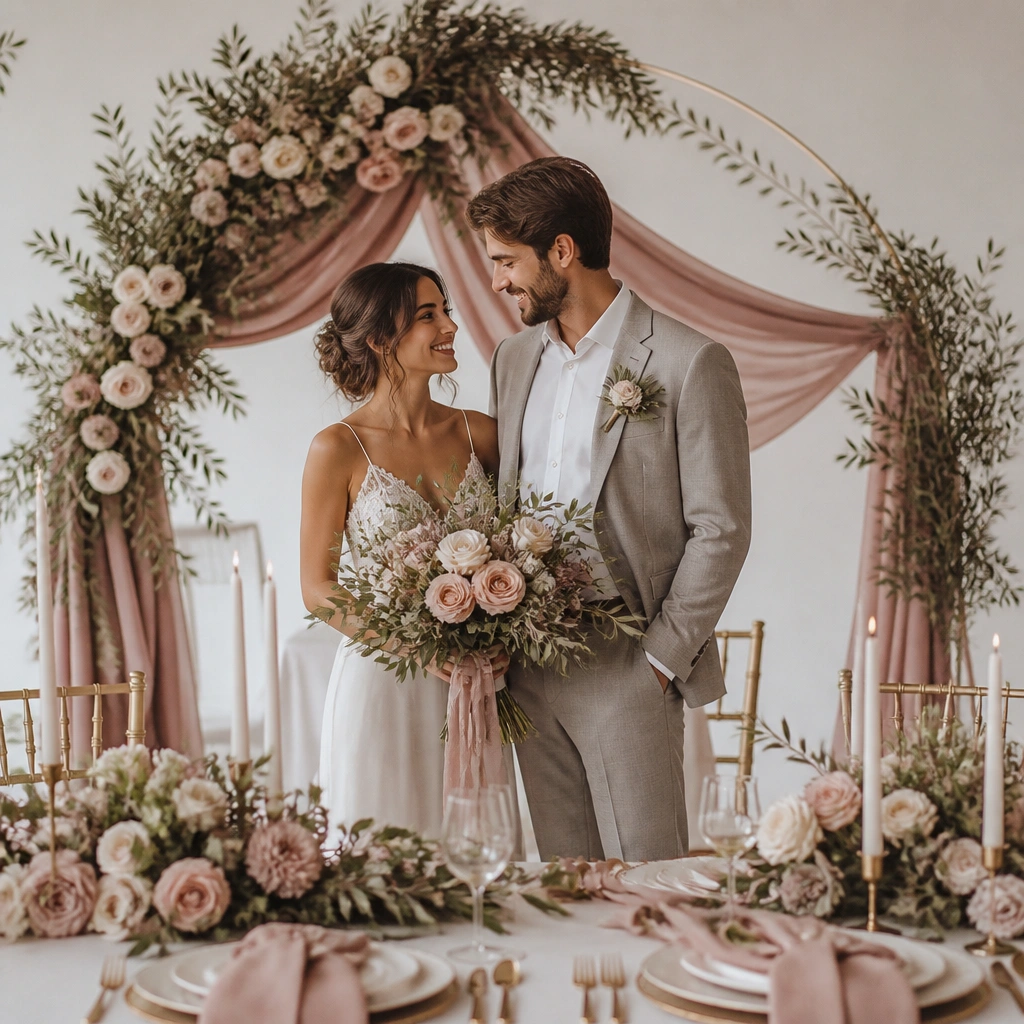
Dusty rose is flattering and romantic, while olive gives it a grounded, natural feel that works in both mild spring and crisp autumn. Warm gold ties the palette together and makes skin tones look warmer in photos. This is a great “one palette for two seasons” option if your wedding date is borderline or weather changes.
Good to knowKeep dusty rose consistent across bridesmaids by choosing one fabric type (chiffon or crepe) so the undertone stays uniform.
9. Summer Night: Navy + Coral + White (modern coastal meets nightlife)
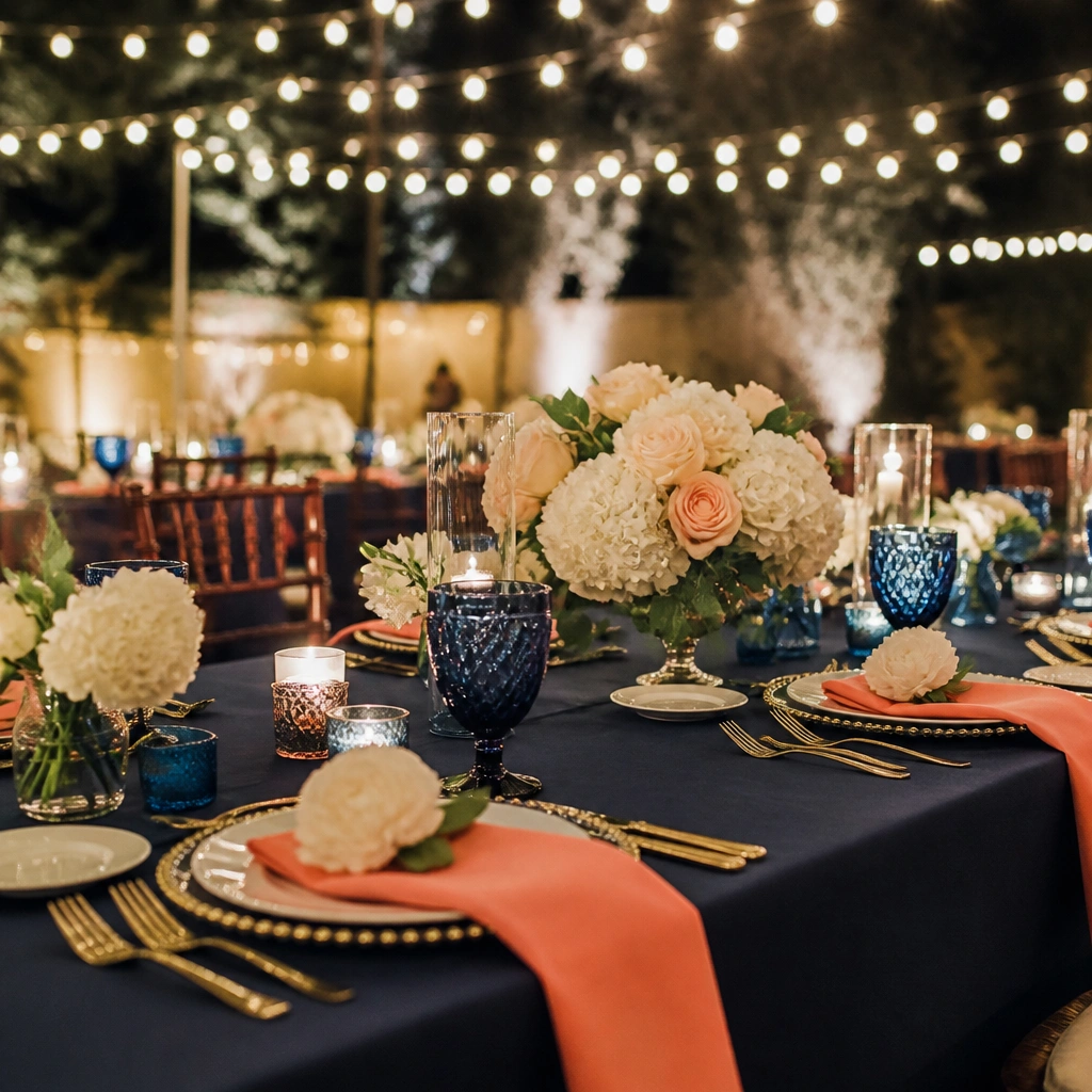
Navy is a strong summer base because it stabilizes bright coral and still looks elegant at night. White florals and accents keep the palette clean, so it doesn’t feel heavy. Use glassware or acrylic chargers in navy-tinted tones for a modern look that reads “intentional” in low light.
Good to knowTest your coral under warm bulbs — if it turns too orange, switch to a softer coral-rose shade for consistency.
10. Garden Romance: Lavender + Butter Cream + Soft Pewter (dreamy, not purple overload)
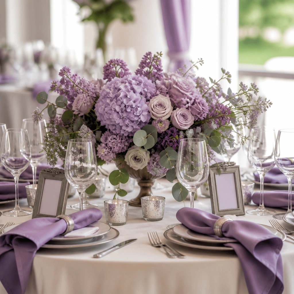
Lavender can look magical, but it’s easy to go overboard — the creamy neutral fixes that. Soft pewter adds a subtle metallic that won’t overpower the florals. Choose lilac-toned blooms plus pale greenery to keep the whole palette gentle and cohesive rather than dramatic.
Good to knowIf you’re unsure about lavender, start with it in napkins and signage first, then move it into florals once you see how it photographs.