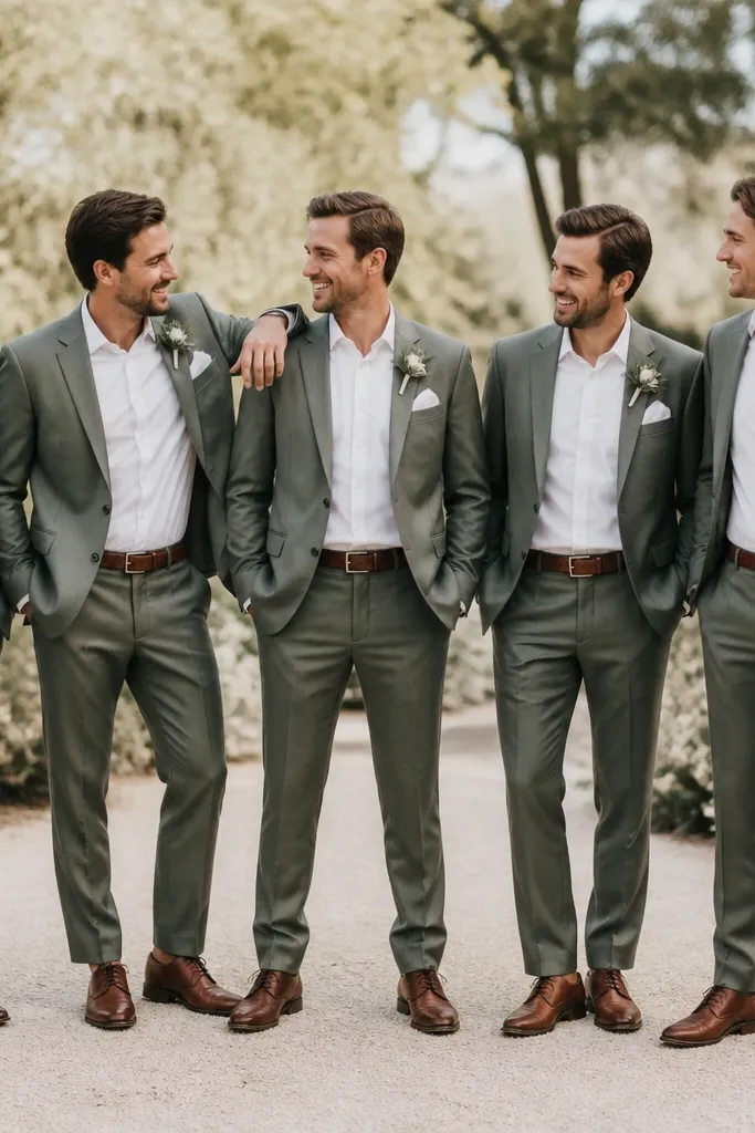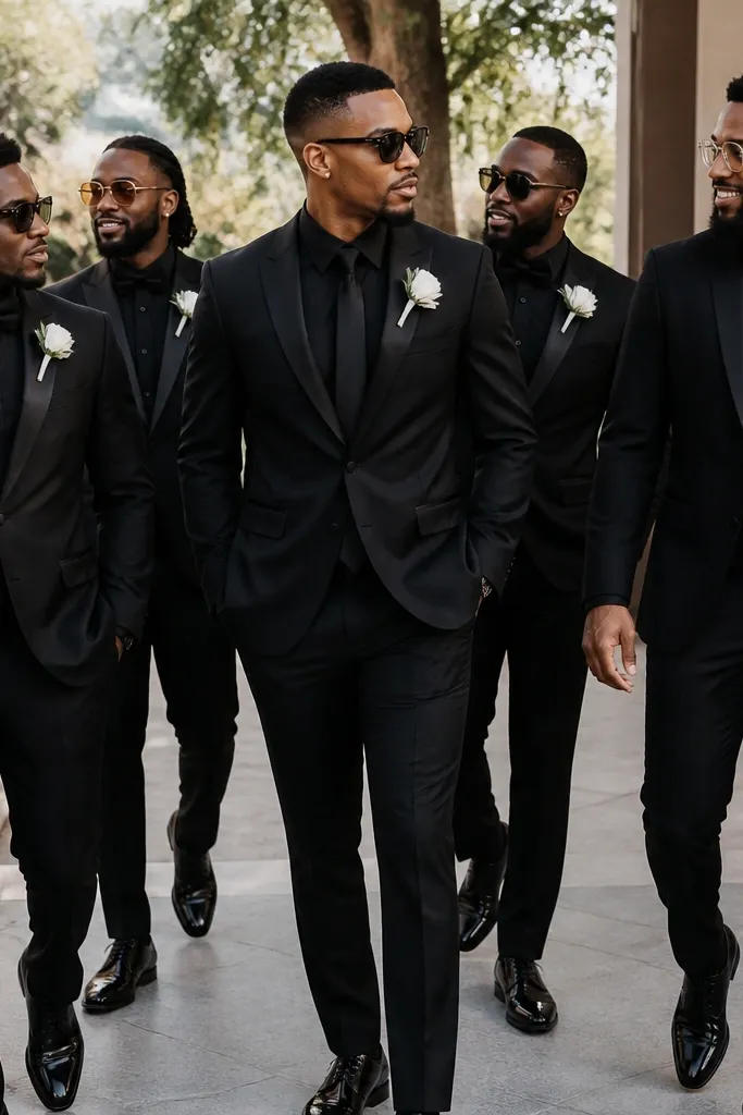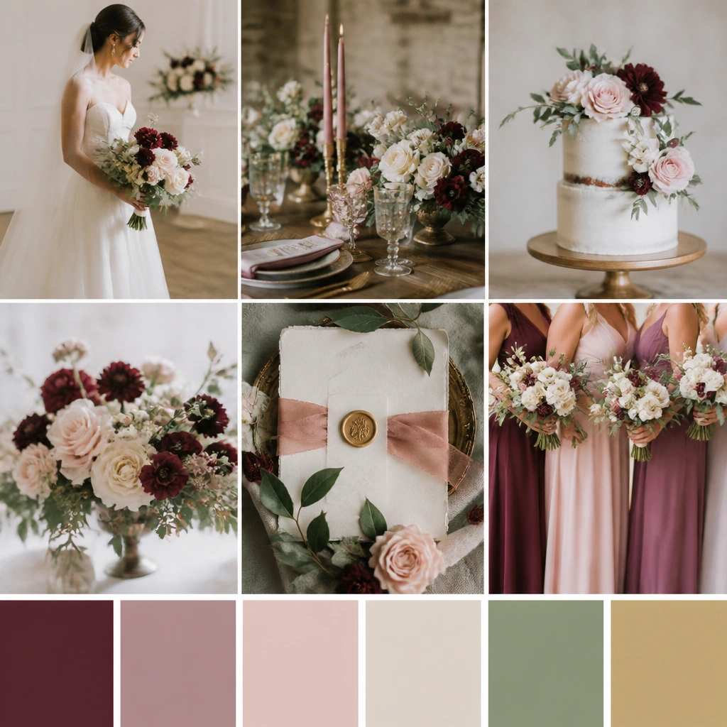

1. Cream + Champagne + Burnt Orange (Autumn Glow)
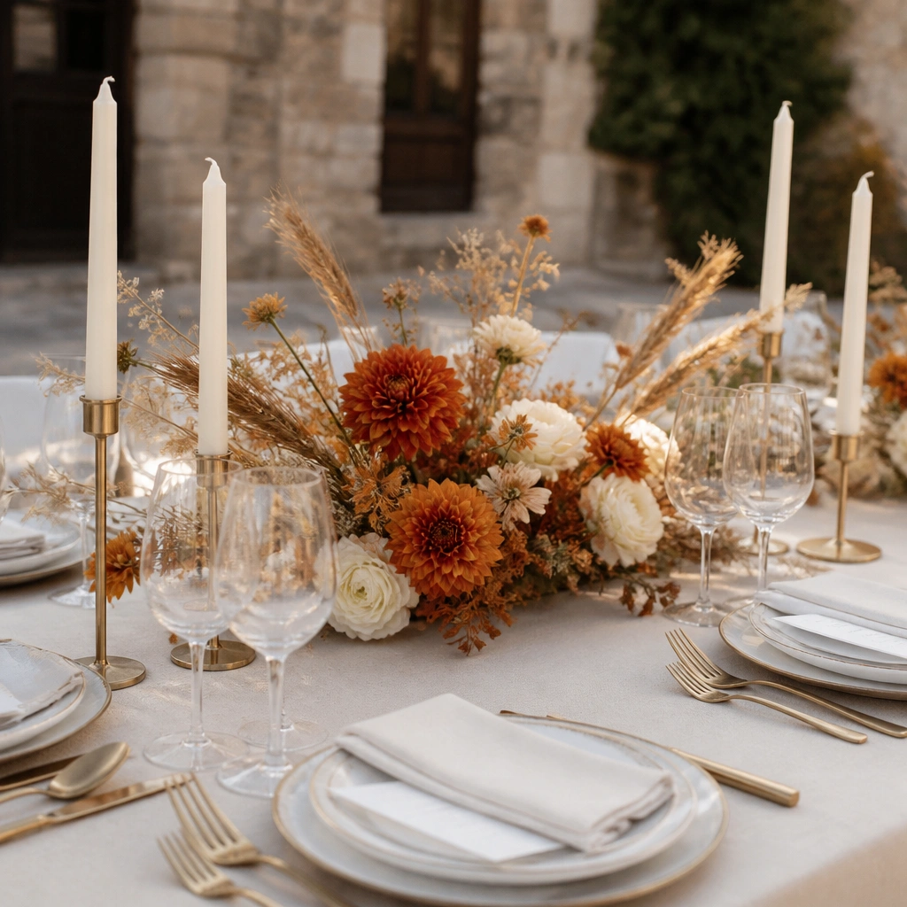
This palette is built for warm lighting: cream and champagne act like a soft filter, while burnt orange brings a “photo pop” that doesn’t overpower skin tones. Choose blooms with natural texture (dahlias, marigold-like oranges, dried wheat) so your centerpieces look full even with fewer stems. Gold accents keep everything from feeling rusty or too casual.
Good to knowStart with 1 main floral color (burnt orange) and repeat it 2 more times — napkin rings or signage ink, plus a small candle or favor detail.
2. Blush Rose + Dusty Mauve + Antique Gold (Romantic Luxe)
Blush and dusty mauve create depth without needing bright colors. Antique gold makes the palette feel more formal than plain yellow-gold, especially against creamy whites and textured papers. This scheme is forgiving for budget florals — you can mix fresh blooms with dried mauve sprays to stretch volume.
Use mauve as the “shadow” color: add it in napkins, chair sashes, or a second ribbon shade, not just in the bouquet.
3. Sage Green + Ivory + Soft Terracotta (Garden Minimal)
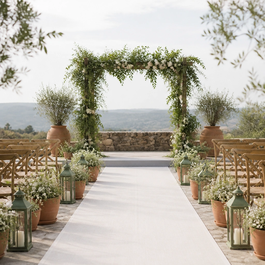
Sage green looks fresh in both daylight and indoor lighting, while ivory keeps the whole palette clean and modern. Terracotta adds warmth and a handmade vibe — think clay votives, terracotta-toned ceramics, and dried seed pods. This is a great choice if you want “garden” energy without a full-on woodland theme.
Good to knowPick greenery first: use sage-toned foliage (olive, eucalyptus varieties) and keep flowers mostly white for a budget-friendly, cohesive look.
4. Navy + Periwinkle + White (Coastal Night Sky)
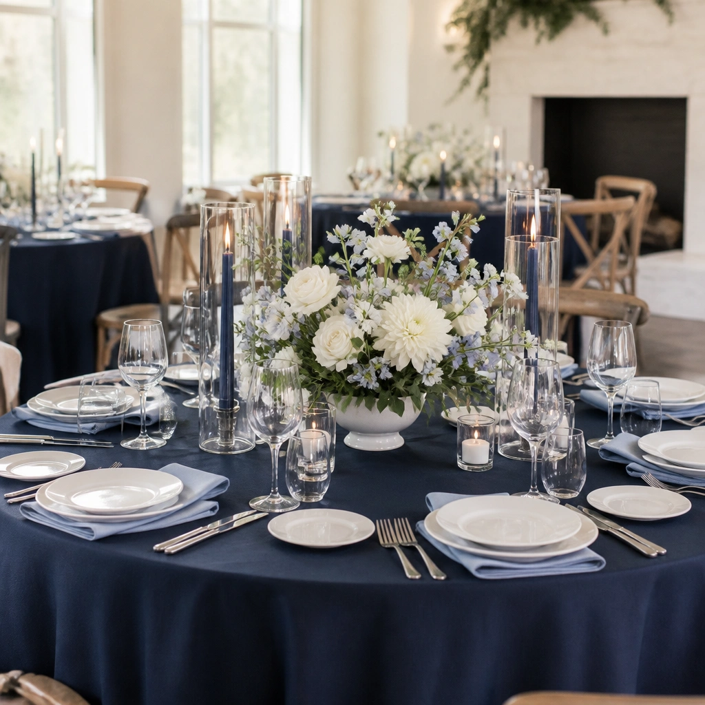
Navy is the anchor that makes accents look intentional, and periwinkle gives a softer, romantic twist compared to bright blue. White keeps it crisp so it doesn’t feel heavy. This palette photographs beautifully at dusk because the darker base increases contrast around centerpieces and signage.
If you’re renting linens, choose navy as the base and keep your flowers mostly white — add periwinkle only through napkins, ribbon, or a few standout blooms.
5. Dusty Teal + Cocoa Brown + Cream (Modern Earthy)
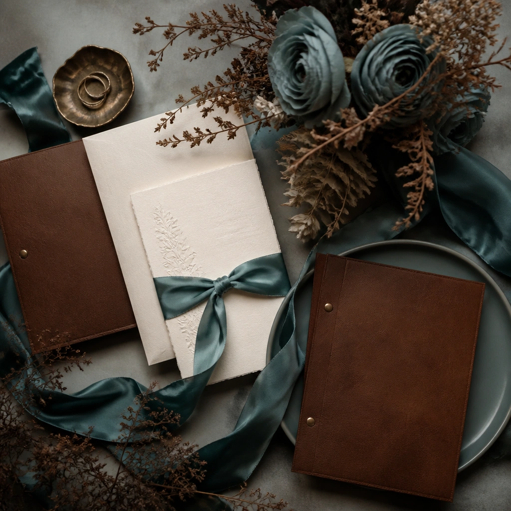
Dusty teal feels elevated and unusual, while cocoa brown adds a grounded, modern element. Cream keeps the palette from turning too dark, especially for daytime ceremonies. Use materials like satin ribbon, textured paper, and dried elements to make the scheme look expensive without needing large floral budgets.
Choose one “texture hero” — either satin (teal) or kraft/cocoa paper (brown) — and repeat it across stationery and table styling.
6. Black + Ivory + Rose Quartz (Editorial Chic)
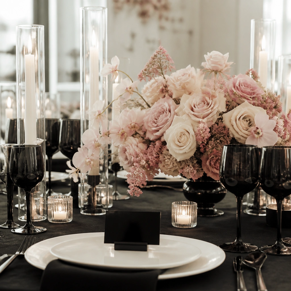
Black instantly sharpens the look and makes even simple arrangements look styled. Ivory prevents the palette from feeling goth, and rose quartz adds a soft romantic contrast to the dark base. This scheme works especially well for modern venues and couples who want clean lines over lots of florals.
Good to knowUse matte black for signage and glossy black only in small details (menus or candle holders) to avoid everything looking flat on camera.
7. Red Wine + Blush + Gold (Romantic Holiday-Even-Anytime)
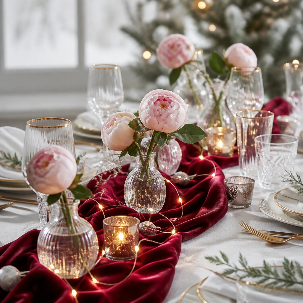
Red wine brings dramatic color that reads “luxury” in photos, while blush softens it so the overall vibe stays romantic. Gold ties it together and warms skin tones, which is a big deal for wedding portraits. For a budget version, use blush filler flowers (roses or carnations) and let the wine color come from ribbons, berries, or a few statement blooms.
Add warm light: place battery candles or string lights behind centerpieces so the wine color glows instead of looking muddy.
8. Lilac + Soft White + Silver (Spring Airy Dream)
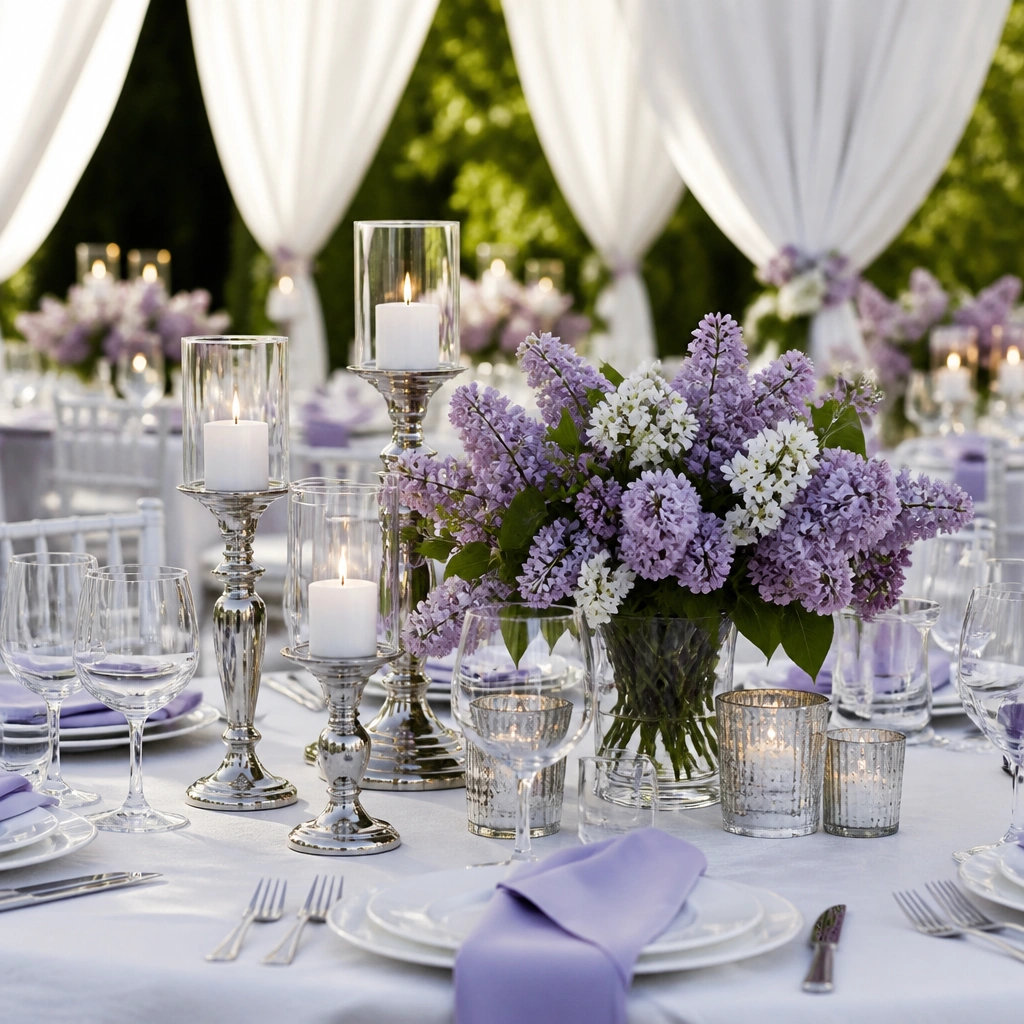
Lilac is delicate and romantic but still distinct, and it looks especially pretty in spring and early summer. Soft white keeps the palette airy, while silver adds a cool, clean sparkle that feels modern (not yellow). This is a great budget scheme because you can use lilac as an accent through paper goods and napkins while keeping flowers mostly white.
Use lilac in three places max: napkins, signage ink, and a small ribbon detail. Too many lilac-heavy elements can look flat.
9. Emerald + Ivory + Black Accents (Statement Jewel)
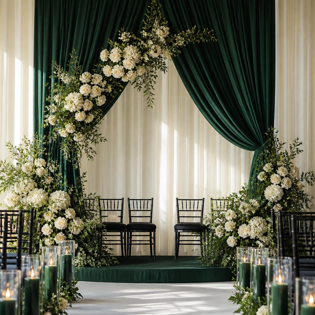
Emerald is a bold jewel tone that makes your photos pop, and ivory prevents it from feeling heavy. Black accents act like the “outline” color — they sharpen edges and help signage and place cards stand out. This palette pairs well with formal venues, ballroom lighting, and couples who want a high-impact look without neon colors.
Let emerald be the cloth and accent, not the entire floral plan. Use ivory blooms as the base so the jewel tone stays intentional.
10. Yellow + White + Light Blue (Citrus Picnic Bright)
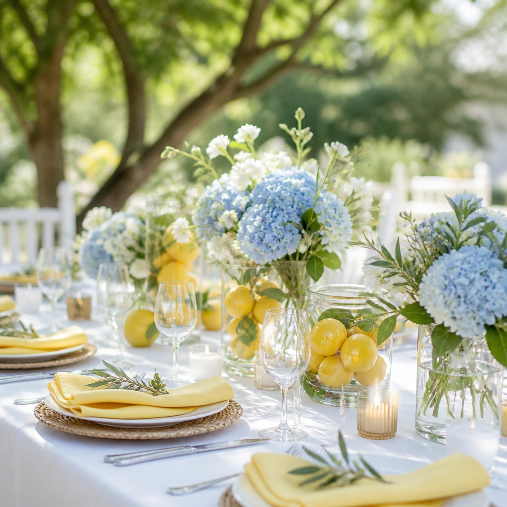
Yellow and light blue create a cheerful, summery contrast that feels fresh rather than childish when balanced with lots of white. This palette is budget-friendly because you can get a similar look with mixed white blooms and inexpensive greenery, then add pops of yellow through napkins, signage, and fruit decor. Citrus details (lemons, oranges) make the theme feel cohesive instantly.
If yellow makes you nervous, choose butter yellow instead of neon. Keep yellow at about 20-30% of the styling for a classy, “wow” effect.