1. Navy + Ivory “Crisp Contrast” Wedding
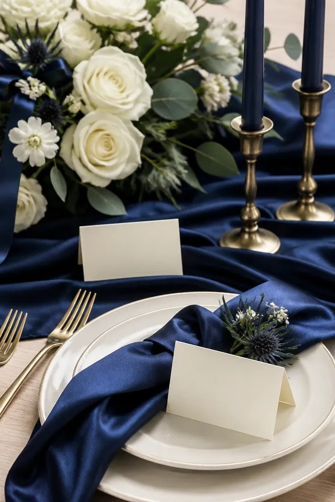
Navy + ivory reads high-end because the contrast stays strong in both daylight and indoor lighting. Use ivory florals (garden roses, ranunculus, or baby’s breath) and keep navy mostly in accents like ribbons, napkins, and signage so it doesn’t overpower the whites.
Good to knowBuy one navy fabric swatch (napkin or ribbon) and place it next to your ivory sample in the venue’s lighting before you lock in florals.
2. Blush + Champagne Gold “Soft Glow” Palette
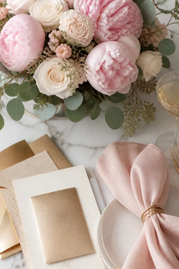
This palette is flattering because blush warms skin tones while champagne gold adds reflective highlights in photos. The key is choosing gold that looks champagne (slightly warm) instead of bright yellow-gold, which can clash with blush.
Good to knowWhen ordering metallics, request a “champagne vs bright gold” swatch and compare it under warm indoor bulbs.
3. Sage + Dusty Rose “Garden Romance” Scheme
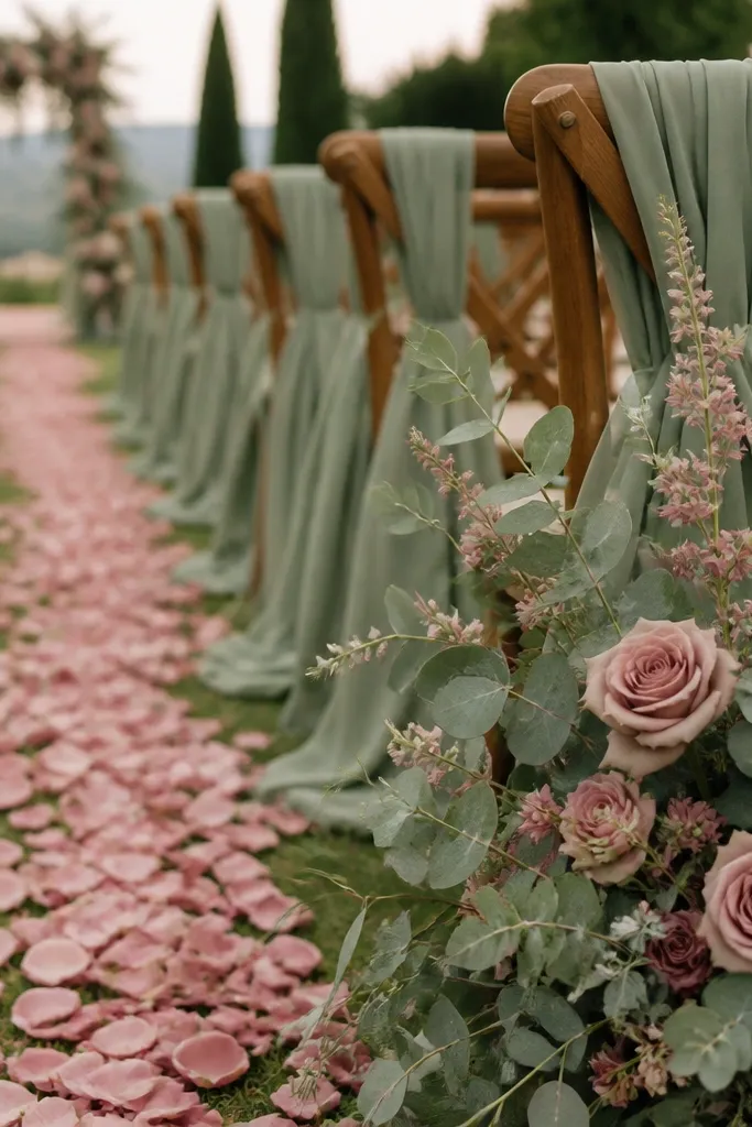
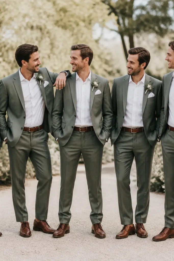
Sage green looks natural and expensive when paired with dusty rose because both tones have muted, wearable undertones. Keep florals balanced: sage-forward greenery (eucalyptus, olive leaves) plus rose blooms that are not too bright.
Use sage in the greenery and linens, then limit dusty rose to flowers and small signage so the colors don’t compete.
4. Terracotta + Cream “Desert Boho” Look
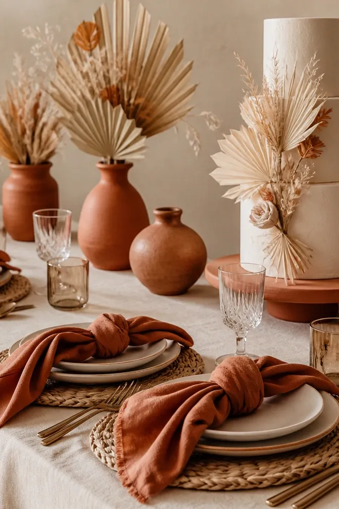
Terracotta + cream is forgiving because it blends with warm venues and natural textures like wood, rattan, and linen. Choose terracotta that leans rust-orange rather than bright orange so it stays elegant and not costume-like.
Good to knowAdd a neutral anchor (oat, cream, or warm white) in at least 50% of the styling so terracotta doesn’t dominate every photo.
5. Emerald + Black “Modern Luxe” Contrast
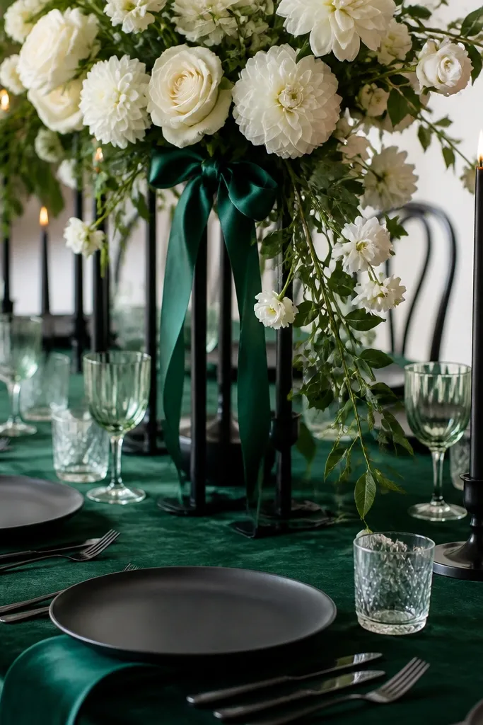
Emerald creates bold color depth, while black adds structure and sharpness. For this palette to look luxe (not heavy), keep white florals or metallic accents to lighten the composition and prevent the greens from going muddy in shadows.
Good to knowIf your venue is dim, include reflective elements (champagne glass, satin ribbon, or pearl accents) to bring highlights back.
6. Dusty Blue + Silver Grey “Cool Minimal” Style
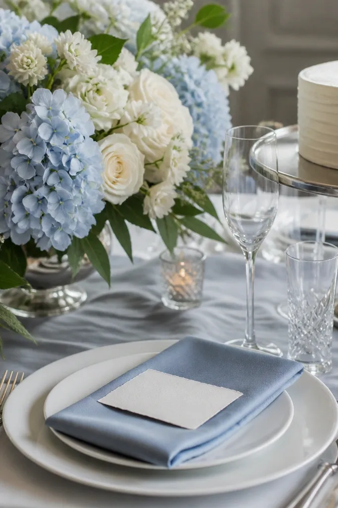
Dusty blue + silver grey is clean and modern, especially for winter weddings or venues with cool-toned architecture. The trick is keeping blue slightly muted and pairing it with soft greys (not neon blues or stark white) so the palette feels cohesive.
Choose one hero fabric (napkins or runner) in dusty blue, then keep everything else in greys and whites to avoid color clutter.
7. Olive Green + Warm White “Earthy Elegant”
Olive + warm white gives an editorial look without needing bold jewel tones. Olive can read too green if it’s overly neon, so go for muted olive leaves and pair with warm whites (cream, ivory, or oatmeal) rather than bright cold white.
Add texture: mix olive with dried wheat, olive twigs, or linen overlays so the palette looks intentional in close-up photos.
8. Coral + Blush “Sunset-Friendly” Color Pair
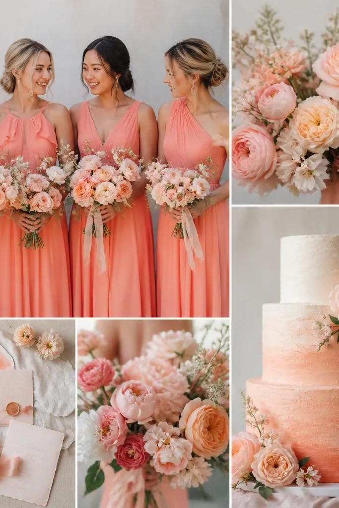
Coral + blush is perfect for golden-hour photos because coral warms the scene while blush keeps it romantic. Use coral as the statement and blush as the soft counterbalance in florals and paper goods.
Good to knowPrint a mini color strip (paper samples) and hold it next to skin tones in late afternoon sunlight to confirm it flatters everyone.
9. Monochrome Burgundy + Blush “Romantic Depth”
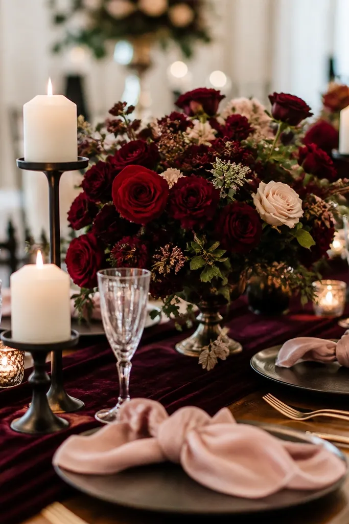
Burgundy + blush feels rich and cohesive, especially for fall and indoor receptions. The palette works because burgundy provides depth while blush prevents the look from feeling overly dark.
Good to knowIf your burgundy is very dark (almost wine), increase blush and ivory by 20-30% so the photos don’t look flat.