1. Midnight Plum + Champagne Glow
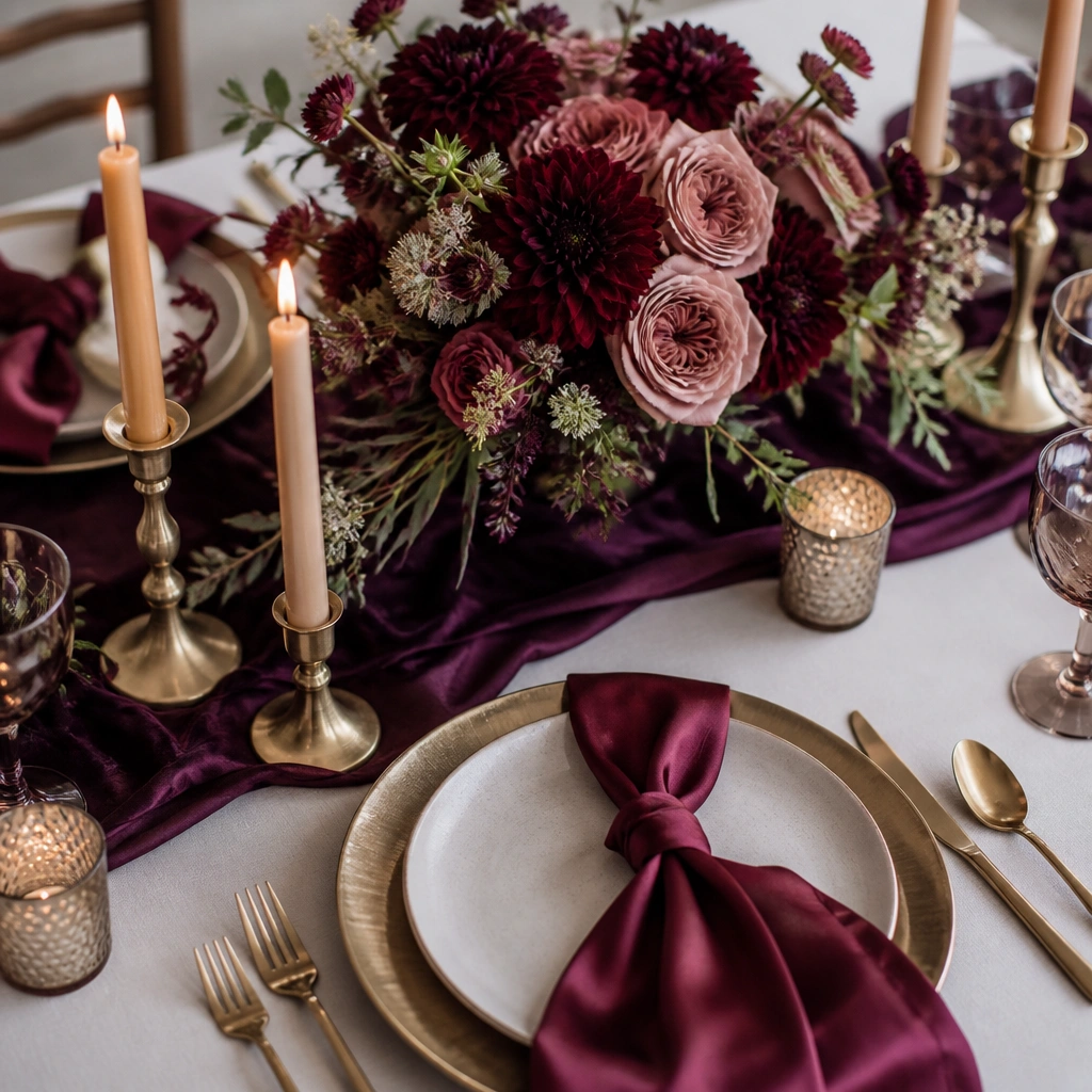
This palette looks expensive because the plum reads rich and velvety while champagne adds a soft, warm highlight. It works especially well for moody venues with low lighting — the gold catches candle flicker and keeps photos from going too dark. For attire, think plum bridesmaid dresses or a charcoal suit paired with champagne accessories.
Good to knowAdd champagne details in small areas first — earrings, menu cards, or candle holders — so the glow feels intentional, not overpowering.
2. Black Cherry + Copper Candlelight
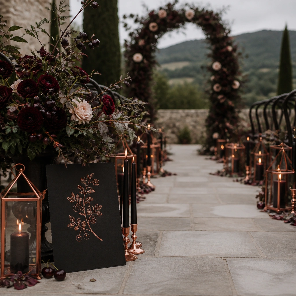
Black cherry gives you that romantic “almost black” drama without turning everything grayscale. Copper lanterns and warm copper typography echo the red tones and make the whole scene feel lit-from-within. Use black cherry for florals and copper for metals — frames, cutlery accents, or signage — to keep the scheme tight.
Good to knowIf you’re using dark cardstock, pair it with a lighter envelope liner (ivory or blush) for contrast in photos.
3. Espresso Brown + Antique Gold
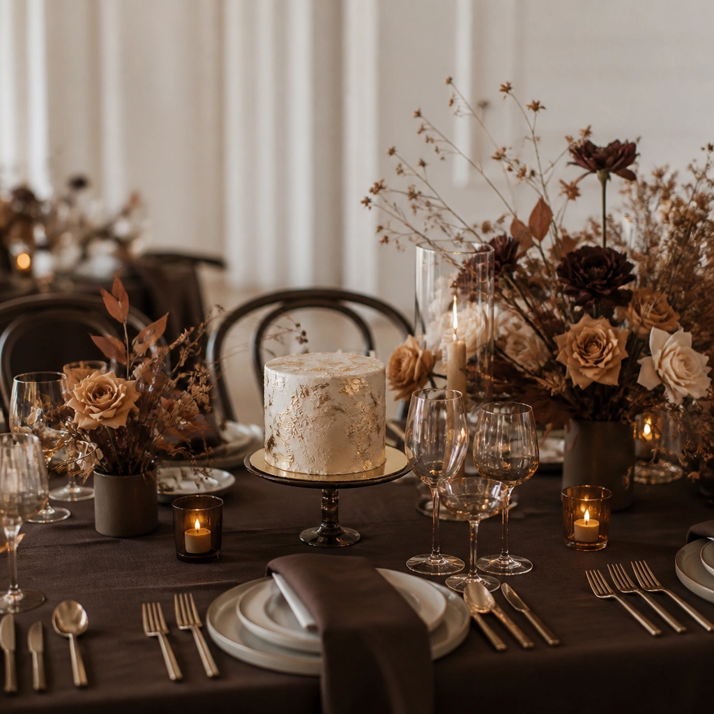
Espresso-brown can look surprisingly elegant because it’s darker than tan but softer than charcoal. Antique gold keeps it vintage-romantic and prevents the palette from feeling too modern or severe. This works beautifully with Wedloria styling: chocolate-brown suit separates or warm-toned dresses paired with gold jewelry.
Choose one “highlight texture” like gold leaf, metallic napkin rings, or glossy satin to make the brown tones look dimensional.
4. Charcoal + Dusty Rose Velvet
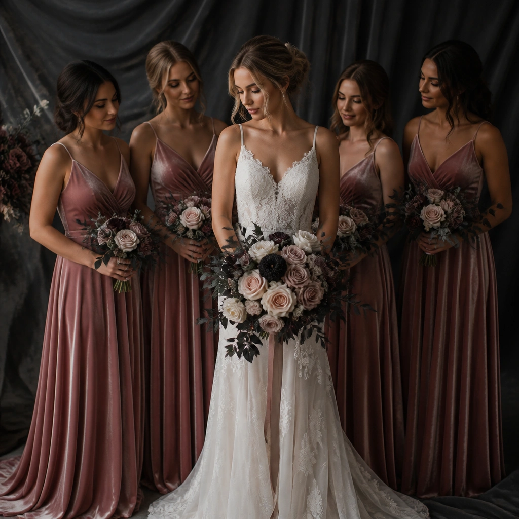
Charcoal anchors the color story, while dusty rose adds romance without going bright. Velvet (or velvet-like fabric) is the secret here — it absorbs light so the rose looks plush and cinematic. For flowers, keep blush roses and peonies dominant, then add minimal charcoal elements like dark foliage or deep berry berries.
Good to knowIn stationery, use charcoal ink on off-white paper instead of pure black — it feels softer and reads better in close-ups.
5. Teal Noir + Soft Silver
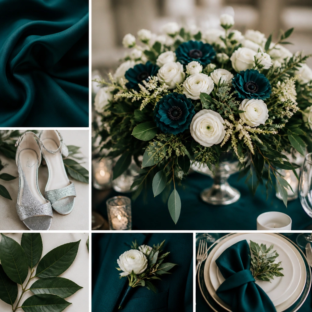
Teal noir is a moody alternative to navy — it shifts with light and gives photos a cool, dramatic mood. Soft silver (not icy chrome) keeps it romantic and balances the teal’s richness. This scheme is gorgeous for waterfront or garden venues because it harmonizes with greenery without blending in.
Use white blooms sparingly as “breathing room” — a few white accents will make teal look brighter and cleaner.
6. Inky Navy + Burnt Sienna Romance
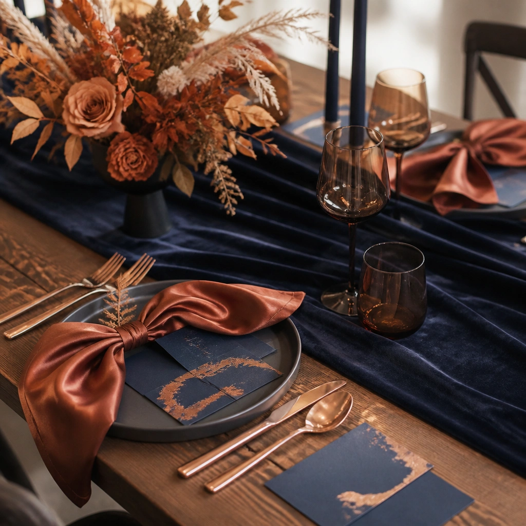
Inky navy is the ultimate moody base, and burnt sienna adds that autumn-romantic warmth. The contrast feels bold but still cohesive because both colors live in the deeper end of the spectrum. For attire, navy suits or deep navy dresses pair beautifully with copper-toned accessories and warm-toned makeup.
Good to knowLet burnt sienna show up in texture — satin napkins, dried florals, or a subtle ombré ribbon on bouquets.
7. Plum Wine + Fig and Cream
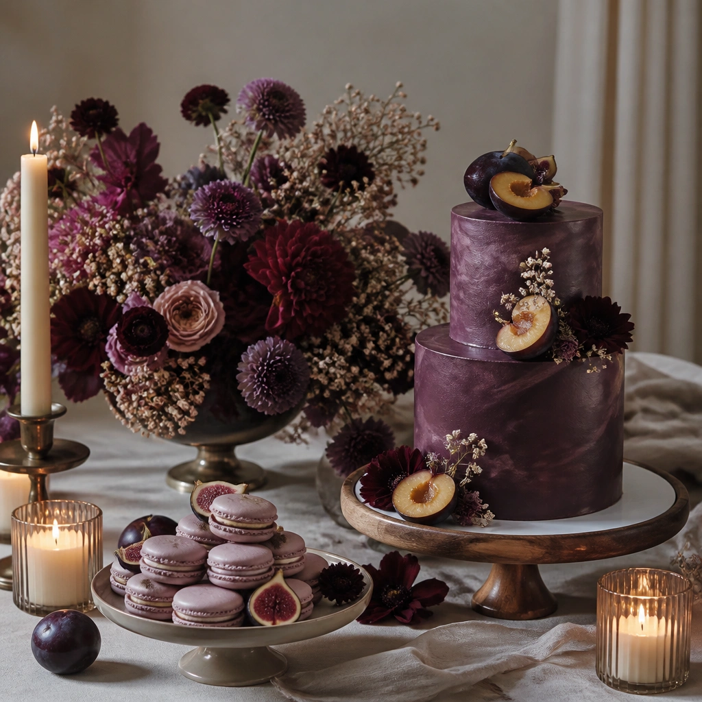
Plum wine sets the drama, while fig and cream keep it balanced so the look feels romantic, not heavy. Cream is your “photo saver” — it brightens skin tones and makes the dark colors look richer. This is perfect if you want a moody wedding but still want airy-looking details like signage and dessert plating.
Use cream in at least one large element — tablecloth, runner, or a wide bouquet wrap — so the palette breathes.
8. Forest Green + Champagne Gold Leaf
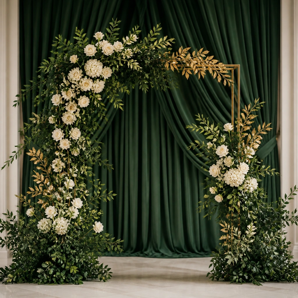
Forest green reads lush and moody, especially with gold leaf or champagne metallics. The gold leaf adds a subtle sparkle that looks stunning in candlelight and evening portraits. For florals, use dark foliage (olive, eucalyptus, or deep greens) plus ivory blooms for contrast that still feels moody.
Good to knowAsk your florist for a “green-forward” build: more foliage than flowers so the palette stays cohesive and not too pastel.
9. Burgundy + Black Lace + Warm Ivory
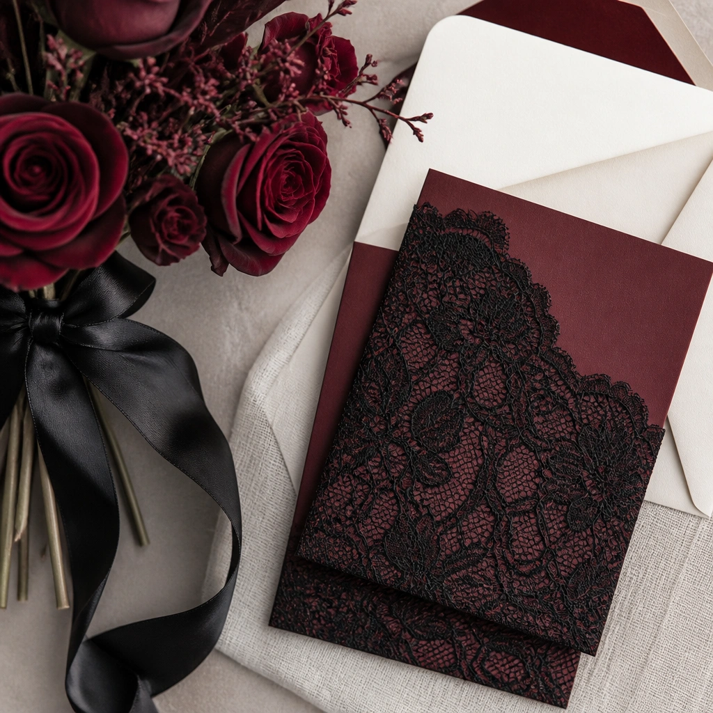
This scheme is romantic because it uses lace and ribbon as color carriers — burgundy becomes deeper and more textured. Warm ivory keeps it elegant and prevents the black lace from feeling goth-heavy. It’s especially stunning for intimate weddings where you’ll see details up close in photos.
Choose one lace element to repeat — invitations, chair sashes, or a veil-inspired ribbon — for a “matched set” effect.
10. Smoked Pink + Espresso + Gold Buttons
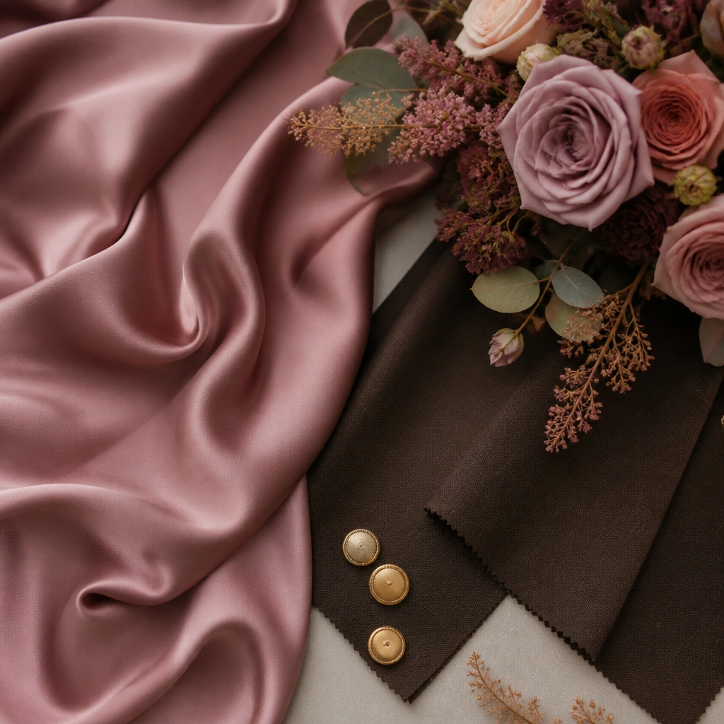
Smoked pink is the secret weapon for a dark romantic palette because it’s toned down but still clearly pink. Espresso adds depth, and gold buttons/accessories bring a tailored, luxe finish. This works for both men and women styling: espresso suits with rose accents, or smoked pink dresses with gold jewelry.
Good to knowKeep the pink desaturated: look for mauve, smoked rose, or dusty rose shades rather than bright rose.