
1. Champagne + Antique Gold + Ivory Veil
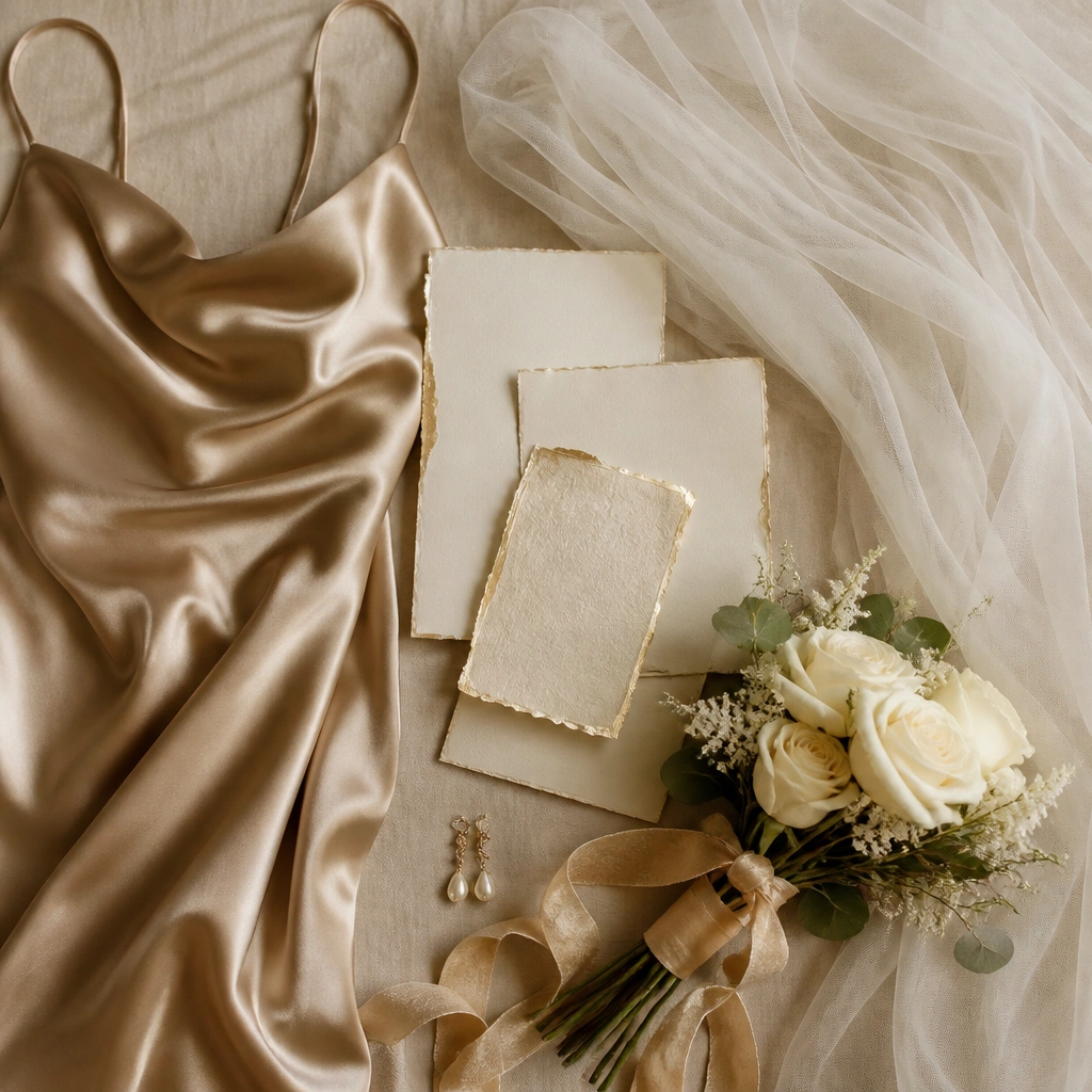
This palette feels luxe because champagne reads warmer than standard “beige,” and antique gold is softer than bright metallic. Pair ivory florals (cream garden roses, ranunculus) with champagne satin to keep skin tones glowing in daylight and candlelight. For men, use ivory or warm-cream shirts with a champagne tie and a subtle gold patterned pocket square.
Good to knowWhen choosing champagne, bring a white swatch to the store — if it looks gray next to white, it’s the wrong undertone for this scheme.
2. Blush Rose + Rosewood + Soft Pearl
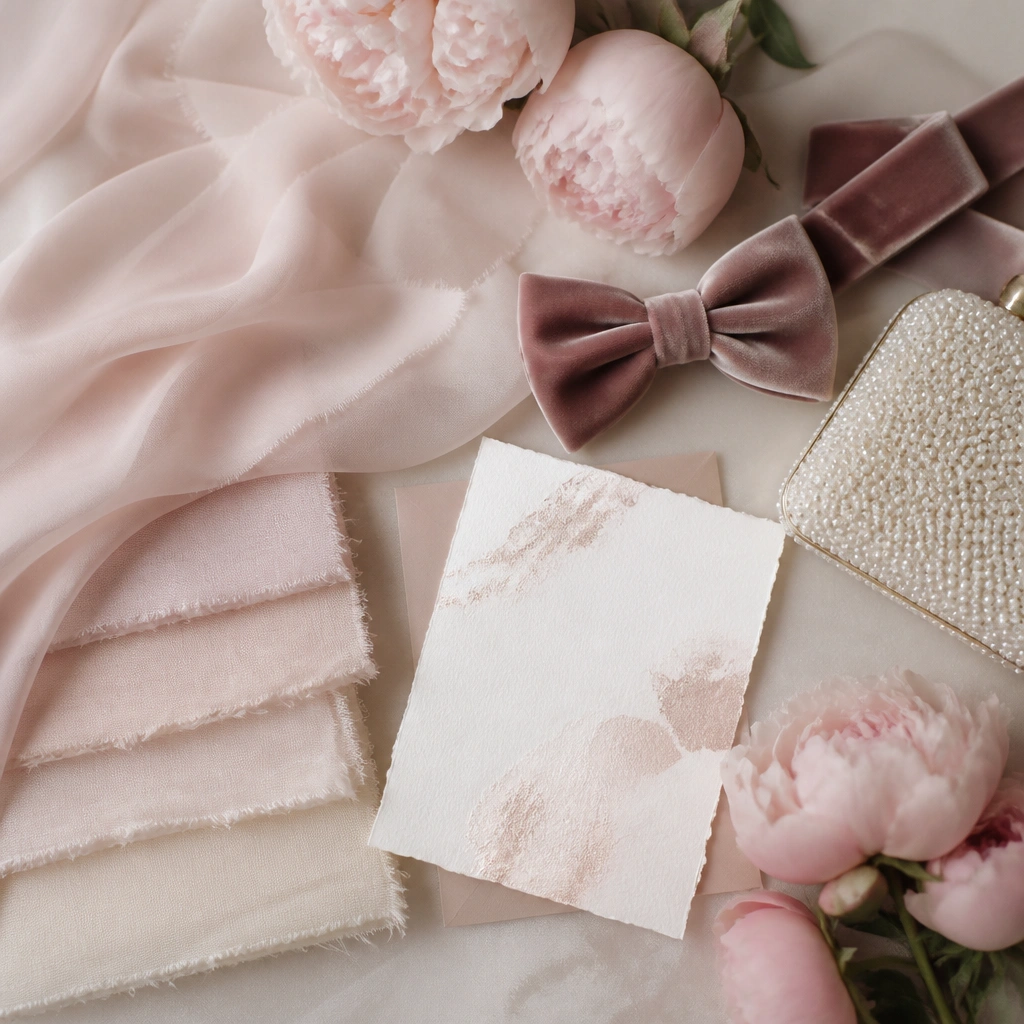
Blush rose plus rosewood velvet creates depth without going dark. The secret is “soft pearl” — use pearl-white linens and pearl accents so the look stays airy, not dusty. This scheme photographs beautifully because the contrast is tonal, not high-contrast, which flatters most complexions.
Use rosewood for accessories (ties, belts, clutch details) rather than painting the entire palette — it keeps the look elegant and balanced.
3. Sage Green + Oat Milk + Smoke Gray
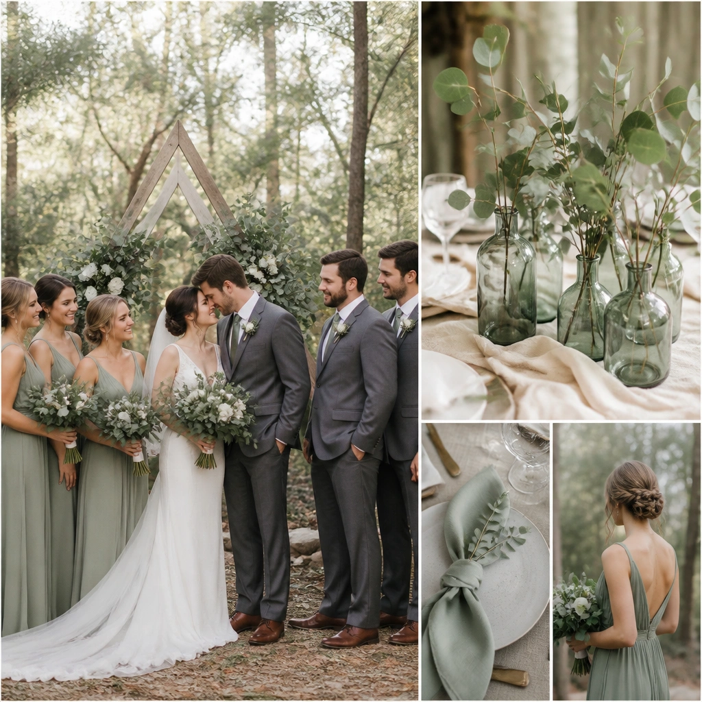
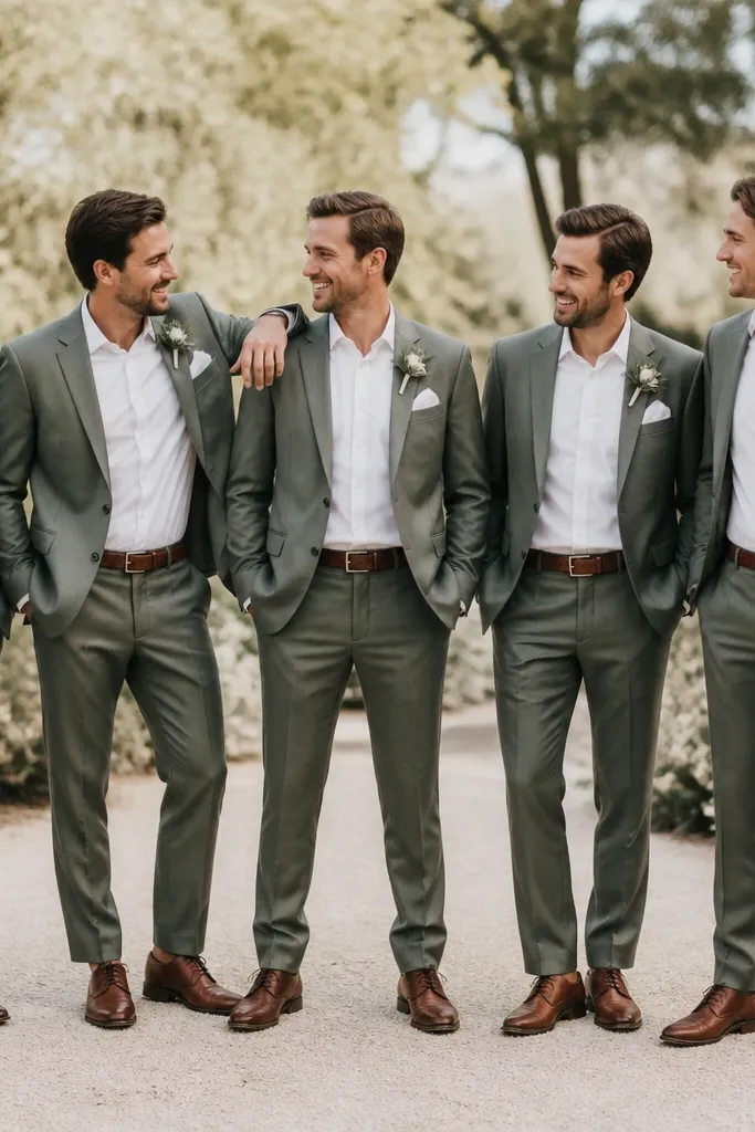
Sage is calming, but it can look flat if it’s too muted. Oat milk adds warmth, while smoke gray brings structure like a tailored suit. Together, they create a modern heirloom vibe, especially for outdoor ceremonies where greenery can otherwise overpower your palette.
Pick sage with a hint of yellow (not blue) so it matches oat tones and doesn’t look icy in shade.
4. Dusty Mauve + Espresso Brown + Champagne Rose Foil
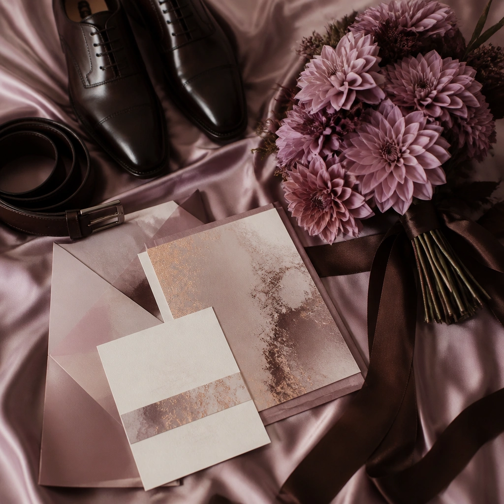
Dusty mauve is romantic, and espresso brown makes it feel grounded and high-end. Add champagne-rose foil to invitations or menus for a luxe sparkle that doesn’t scream. For men, espresso trousers with a mauve tie (or mauve pocket square) looks intentional and photo-ready.
Good to knowIf mauve looks too purple, shift toward a more neutral mauve (less violet) and pair with espresso, not black.
5. Navy Ink + White + Iced Silver
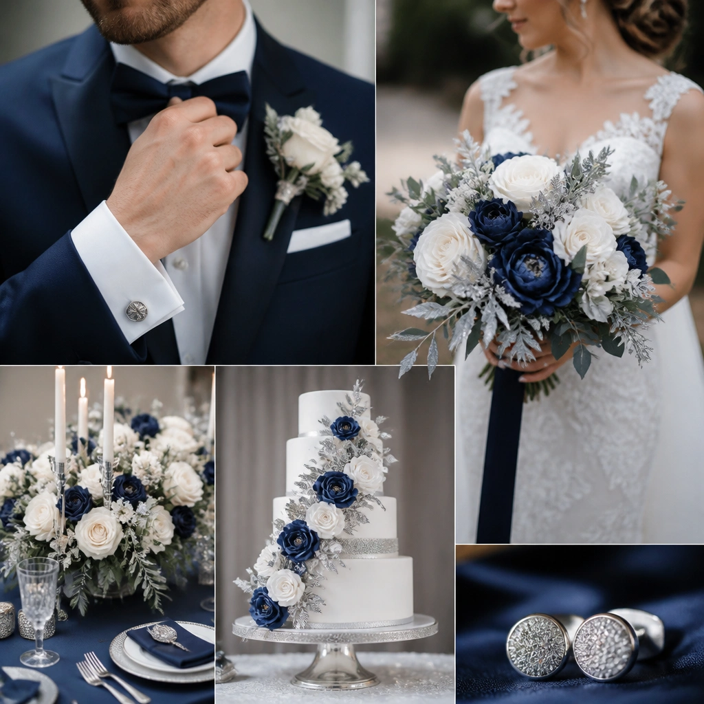
Navy ink feels formal and luxe because it’s deep without being black. White keeps the palette crisp, and iced silver adds a cool metallic that stands out in evening photos. This is a strong choice for black-tie vibes, especially with satin textures and clean typography.
Good to knowChoose silver that looks “icy” (blue-tinged) instead of yellow-toned gold to keep the navy-white contrast refined.
6. Emerald Jewel + Gold Leaf + Cream
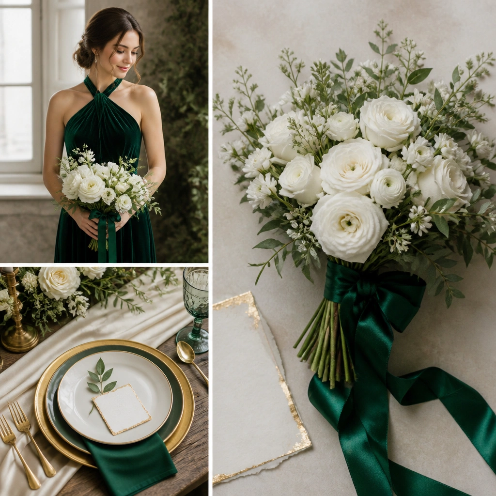
Emerald reads instantly luxe when you anchor it with cream. Gold leaf accents (foiling, candle holders, charger plates) make the green look richer instead of neon. For men, an emerald tie plus cream shirt and gold-toned watch details gives a cohesive “styled” finish.
Good to knowUse emerald in the largest garment area (dress or suit accent) and keep florals mostly cream/white so the green stays elegant.
7. Terracotta + Cinnamon + Warm Ivory
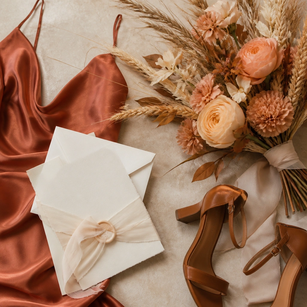
Terracotta and cinnamon create a sunlit, fashion-forward look that’s perfect for late-summer weddings. Warm ivory prevents the palette from looking too orange. Add texture like linen napkins or suede accessories for a high-end, tactile vibe.
Good to knowAsk your florist for “peach + cream” blooms rather than bright orange — it keeps terracotta sophisticated.
8. Black Tea Rose + Soft Gold + Ivory Lace
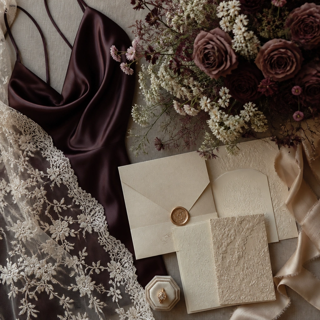
Black tea rose is a dark, romantic neutral — it looks expensive because it’s not as harsh as burgundy. Soft gold (not bright yellow) keeps it warm, while ivory lace adds femininity and lightness. This scheme is stunning for evening ceremonies because the dark rose deepens under warm lighting.
Good to knowBalance dark florals with ivory filler (baby’s breath substitute, small cream blooms) so photos don’t look heavy.
9. Powder Blue + Dusty Silver + White
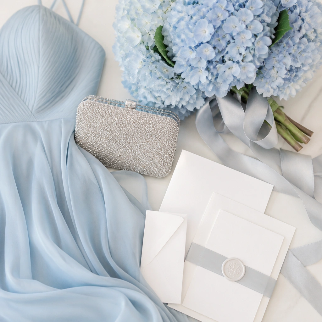
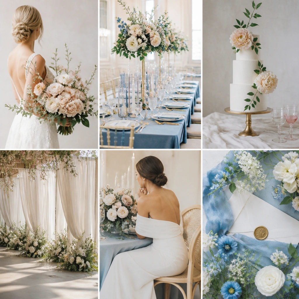
Powder blue feels fresh and couture when paired with dusty silver instead of shiny chrome. White keeps the palette bright, and the frosted metallic adds “winter luxury” without looking icy. For men, a powder-blue tie with a white shirt and a silver watch gives the same refined temperature.
Avoid super-saturated blue — powder blue should look delicate, like tinted glass, not like a primary color.
10. Plum Wine + Pewter + Ivory Champagne
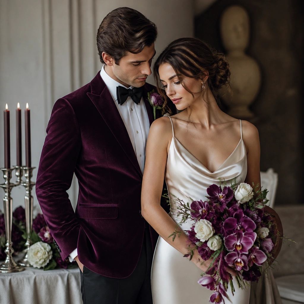
Plum wine plus pewter creates a modern, high-end contrast that looks great in both indoor venues and nighttime receptions. Ivory champagne ties the palette together so it doesn’t feel too dark. Textures matter here — velvet and satin catch light and make the colors look richer in photos.
Good to knowKeep pewter accents small but intentional (jewelry, candle holders, frame details) for a luxe look instead of a gray overload.
11. Cream + Black Ink + Clear Crystal
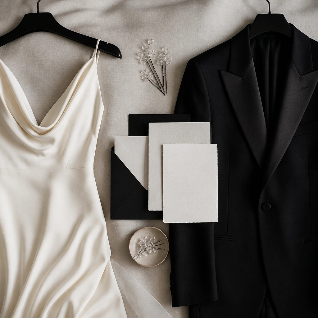
This is the “quiet luxury” palette: cream and black ink create sharp, editorial contrast, while clear crystal adds sparkle without color clutter. It works for both men and women because it’s easy to style across garments and accessories. In photos, the clarity of black-and-cream edges makes the entire wedding feel designed.
Good to knowUse crystal in hair, earrings, or signage accents — if you add too many colored elements, the palette stops reading as luxe.