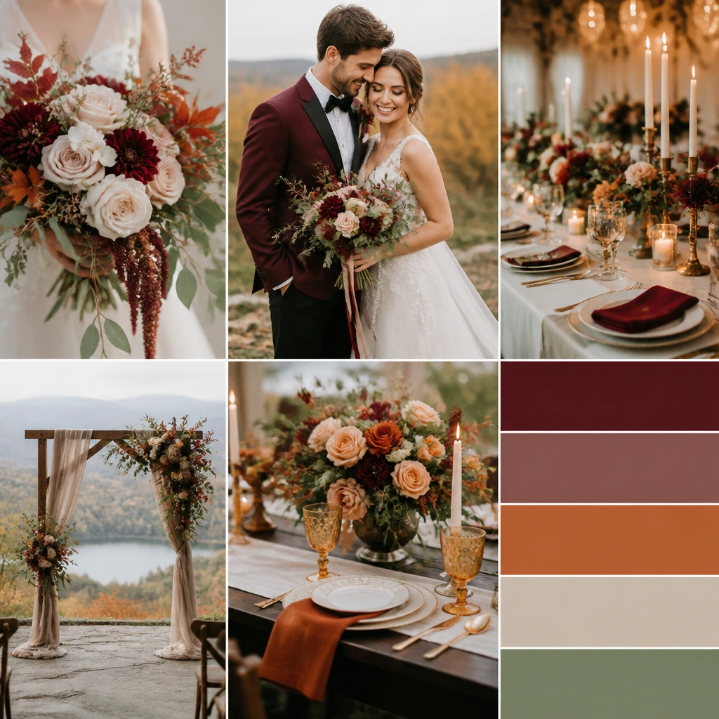
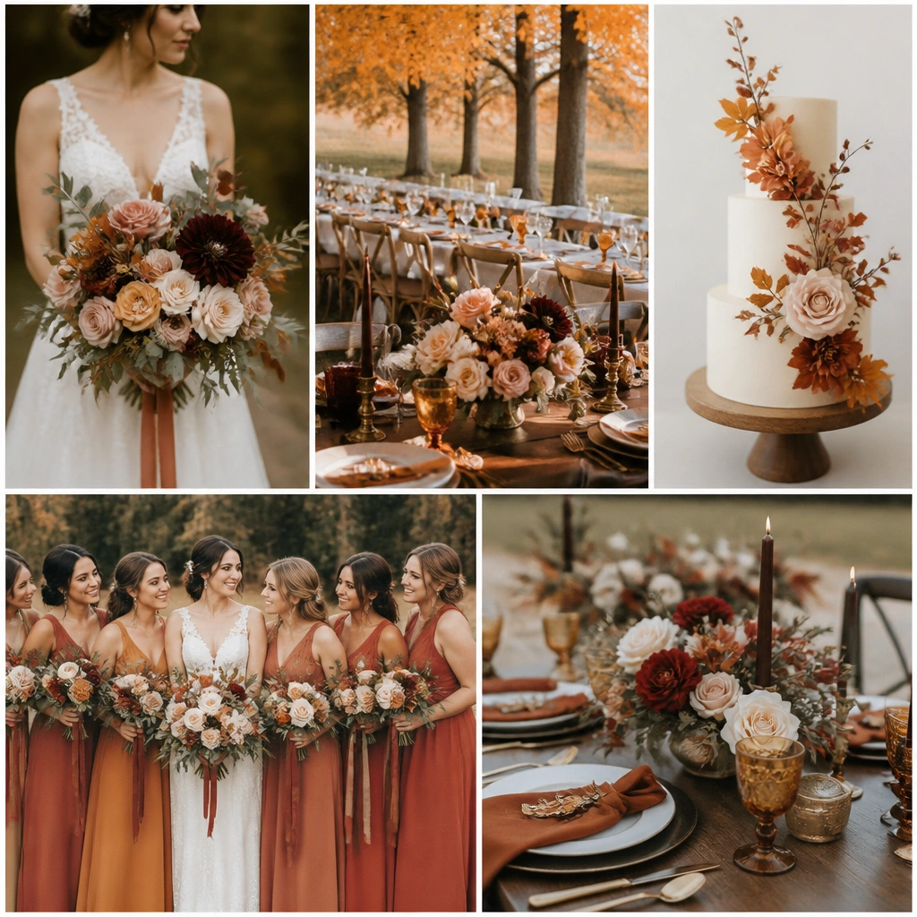
1. Clay + Burgundy + Antique Gold (Cozy Romance)
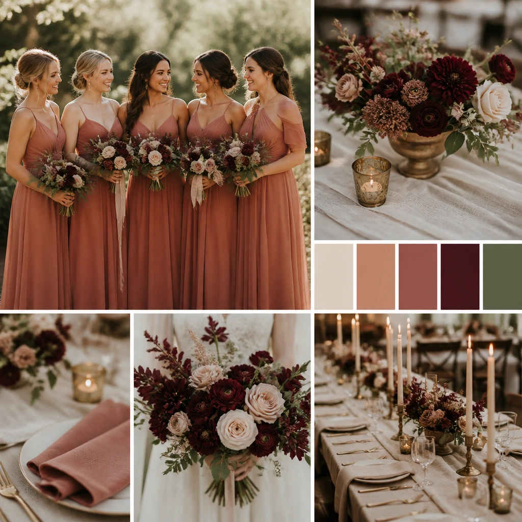
This scheme feels like warm candlelight. Dusty clay (for dresses and stationery) softens the look, while burgundy brings the autumn drama. Antique gold details — pens, frames, candle trays — tie it together and prevent the palette from looking flat.
Good to knowChoose 2-3 flowers in burgundy (like dahlias or roses) and repeat clay in ribbon, napkins, or bridesmaid dress swatches so the colors echo throughout the day.
2. Olive Green + Cream + Espresso (Garden Harvest)
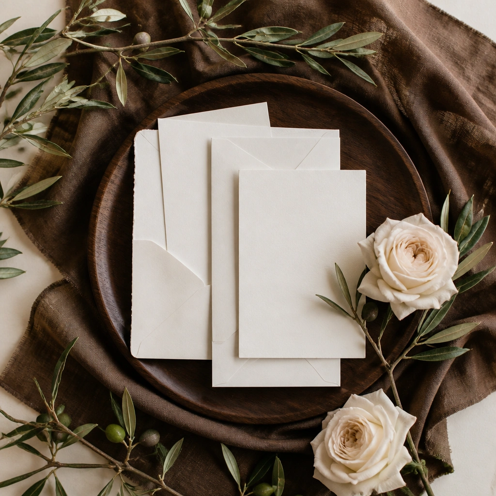
Olive and cream create that “fresh-from-the-garden” fall vibe without going too dark. Espresso (almost-black-brown) adds structure for menus, groomsmen suits, and signage. It’s especially stunning in rustic barns because the greens look natural against wood tones.
Good to knowIf your venue has warm wood beams, keep your cream paper matte (not glossy) to avoid glare in photos.
3. Burnt Sienna + Camel + Chocolate (Autumn Fireplace)
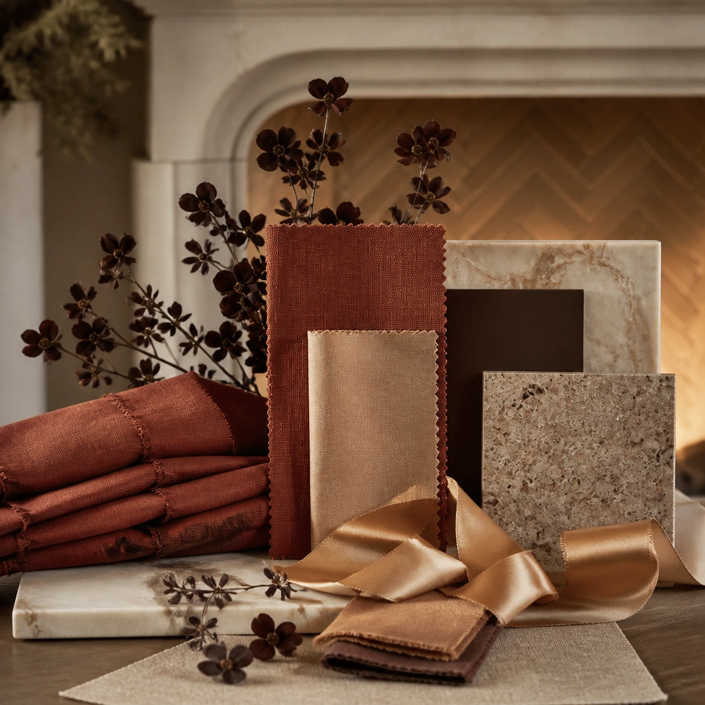
Burnt sienna is the “cozy” hero color — it reads like autumn leaves and spices. Camel keeps it elegant, and chocolate adds depth so the palette doesn’t look orange-heavy. This combo works beautifully with warm lighting and textured fabrics like satin, suede, or velvet.
Good to knowLimit burnt sienna to statement pieces (bouquets, napkins, signage) and use camel across the rest for a balanced, luxe look.
4. Dusty Rose + Fig + Soft Gold (Romantic Twilight)
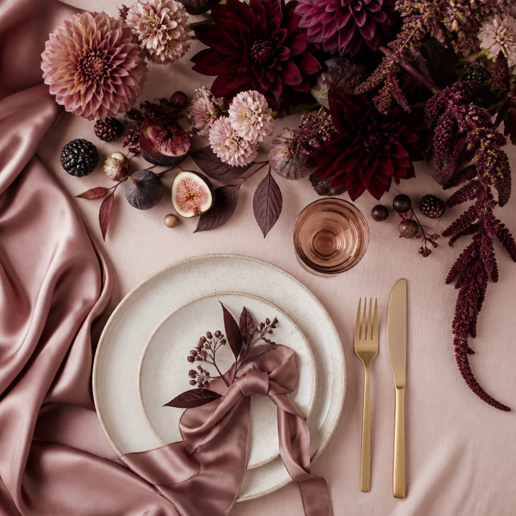
Dusty rose keeps the mood sweet and bridal, while fig adds that autumn richness without turning the palette into deep winter tones. Soft gold — think brushed or champagne gold — makes everything glow. It’s perfect if you want fall vibes but still want a classic, romantic feel.
Good to knowPair fig accents with berries or plum-toned foliage (like dusty miller) to get a natural gradient instead of one flat hue.
5. Forest Green + Burgundy + Ivory (Traditional & Deep)
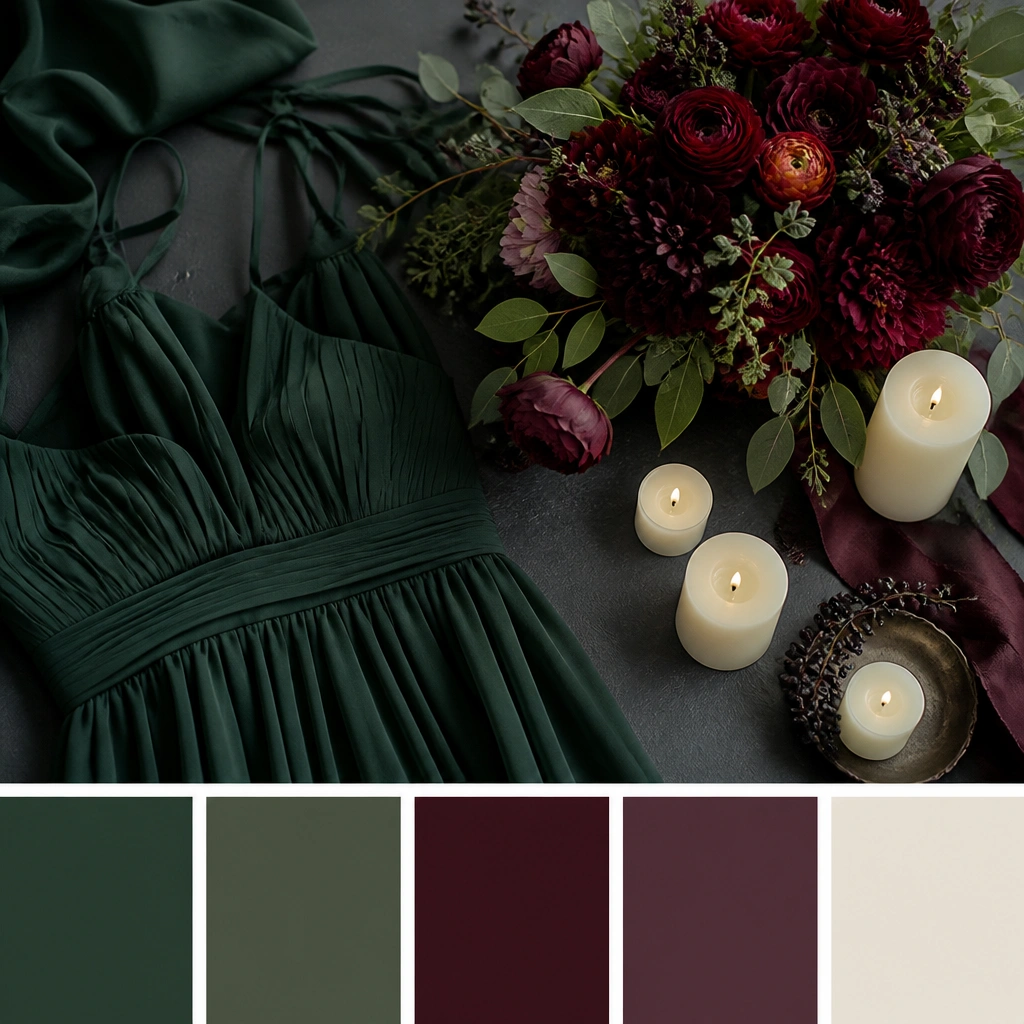
Forest green and burgundy are a power duo — they photograph beautifully because they’re both deep, saturated shades. Ivory prevents the look from becoming too heavy. This scheme is great for evening receptions in fall because the colors feel intentional under lower light.
Good to knowUse ivory for your linens and ceremony backdrop to create a bright focal point behind the couple.
6. Mustard + Mocha + Cream (Vintage Tea Party Fall)
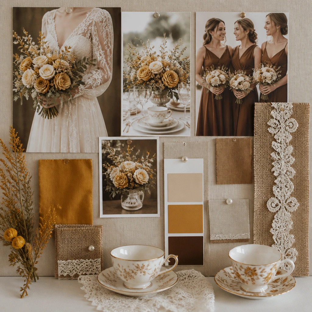
Mustard brings that nostalgic fall warmth, especially when paired with mocha browns for a vintage feel. Cream lace adds softness and keeps it bridal. This palette shines with textured décor — burlap runners, lace overlays, and patterned ceramics.
Good to knowIf your mustard feels too bright, pull it down with more mocha and cream — don’t add extra yellow; add more neutrals.
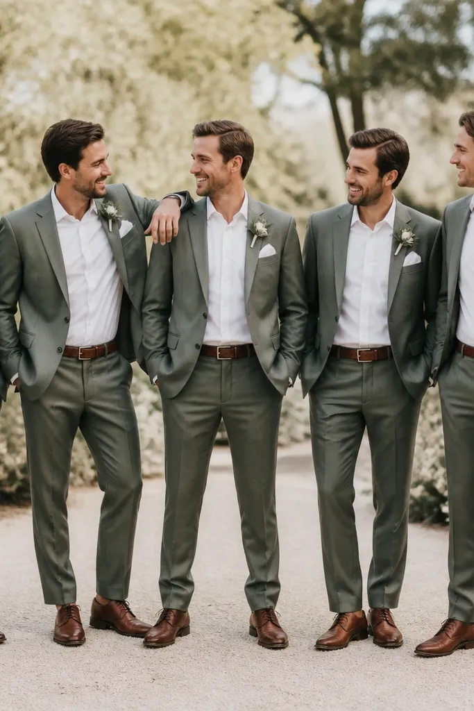
7. Sage + Terracotta + White (Modern Tuscan Autumn)
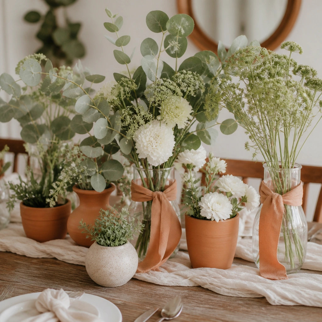
Sage is calming and modern, terracotta adds warmth, and white keeps it crisp. This scheme looks amazing for outdoor ceremonies because the colors mimic Tuscan landscapes. It also works well with minimalist invitations and clean table styling.
Use terracotta in small doses (terracotta planters, ribbon, place cards) so sage and white stay the main visual anchors.
8. Navy + Copper + Blush (Evening Sky & Warm Metal)
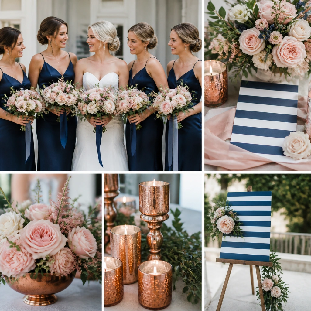
Navy feels like an autumn evening sky, and copper adds instant warmth without needing orange. Blush softens everything and keeps the bouquet looking romantic. This palette is especially flattering for both men’s attire (navy suits) and women’s dresses (satin or chiffon).
Good to knowChoose copper accents in matte finishes (tray, frames, bud vases) to keep reflections from blowing out in flash photos.
9. Charcoal + Champagne + Cranberry (Modern Moody Glam)
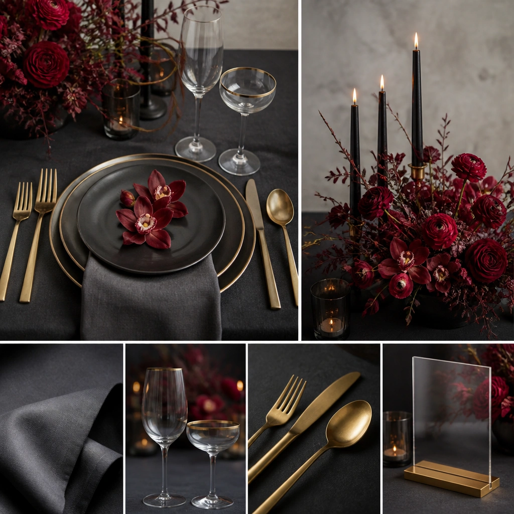
Charcoal gives you that modern, editorial vibe, while champagne gold adds a soft glow. Cranberry brings a pop that still reads autumn because it’s deeper than typical red. This is a great choice for venues with modern architecture or a black-tie feel.
Good to knowKeep florals varied — include cranberry berries plus one lighter red/pink bloom so the centerpiece doesn’t look one-note.
10. Peach + Olive + Chocolate (Soft Harvest Balance)
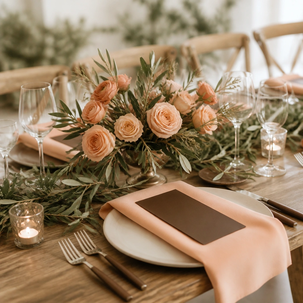
Peach and olive are a “soft harvest” match — warm but not overly orange. Chocolate brown anchors the palette and makes the peach look even more luminous. This scheme is ideal if you want cozy fall energy but still want a bright, airy bridal look.
Good to knowUse olive in greenery-heavy elements (garlands, wreaths) and peach in flowers, so the palette reads cohesive without repeating the same shade everywhere.