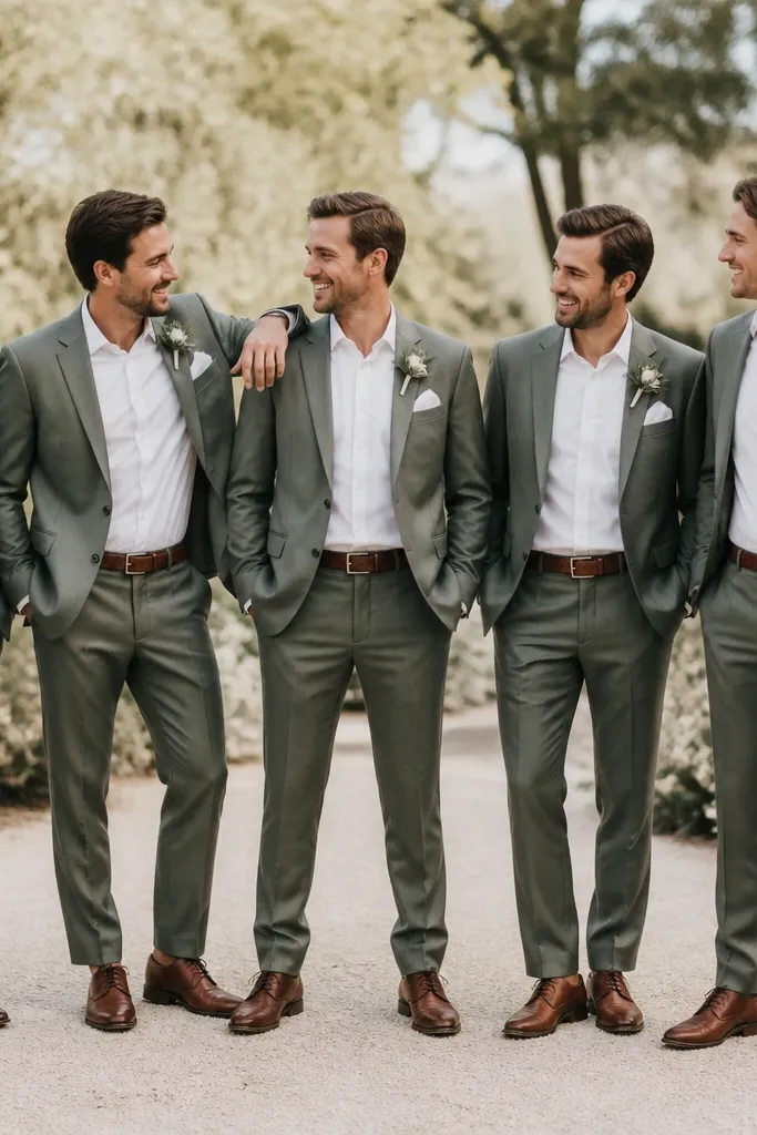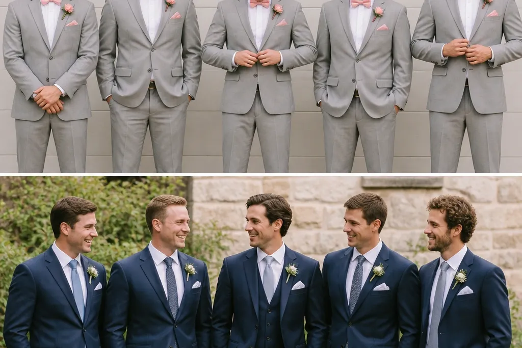

1. The “Same Color” Trap That Looks Different on Camera
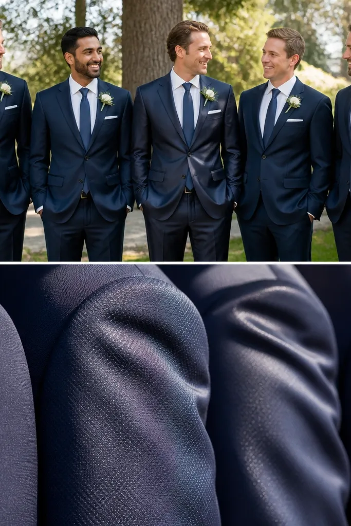
I thought navy was navy until we saw the photos. Matte wool blends and smoother worsted-style fabrics reflect light differently, so one groomsman can look “dressed up” while another looks dull or washed out. If you’re aiming for a cohesive look, you need the same fabric family (wool vs. polyester sheen) across the group.
When booking, ask the shop to show fabric swatches or photos under flash — not just daylight. If they can’t, choose a more forgiving texture like classic wool or a low-sheen blend.
2. Ordering Off One Person’s Measurements
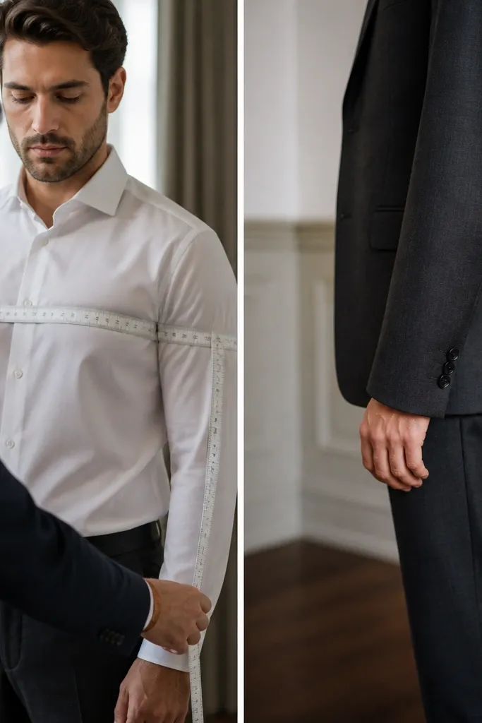
We only used one friend’s size chart and assumed the rest would “fall into place.” That’s how you end up with sleeves that bunch at the wrist or jacket shoulders that sit too low. Even if the chest measurement is correct, shoulder width and sleeve length are what make suits look expensive.
Good to knowFor each groomsman, measure chest, waist, shoulder seam-to-shoulder seam, and sleeve length. Confirm sleeve break — the ideal is about 1/4 inch of shirt cuff showing.
3. Forgetting the Shirt Collar Distance
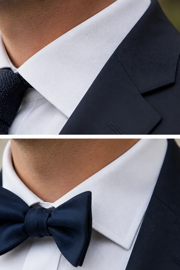
A collar that sits too tight can make everyone look uncomfortable and misaligned in photos. A collar that sits too far from the jacket lapel can make the neck area look bulky, especially with ties. Collar spacing matters more than you think because it frames the face.
Bring the suit jacket to the shirt fitting and check collar placement with the tie/bow tie on. Aim for collar points to sit neatly without gaping when standing normally.
4. Tie Width Mismatch (It’s More Obvious Than You Think)
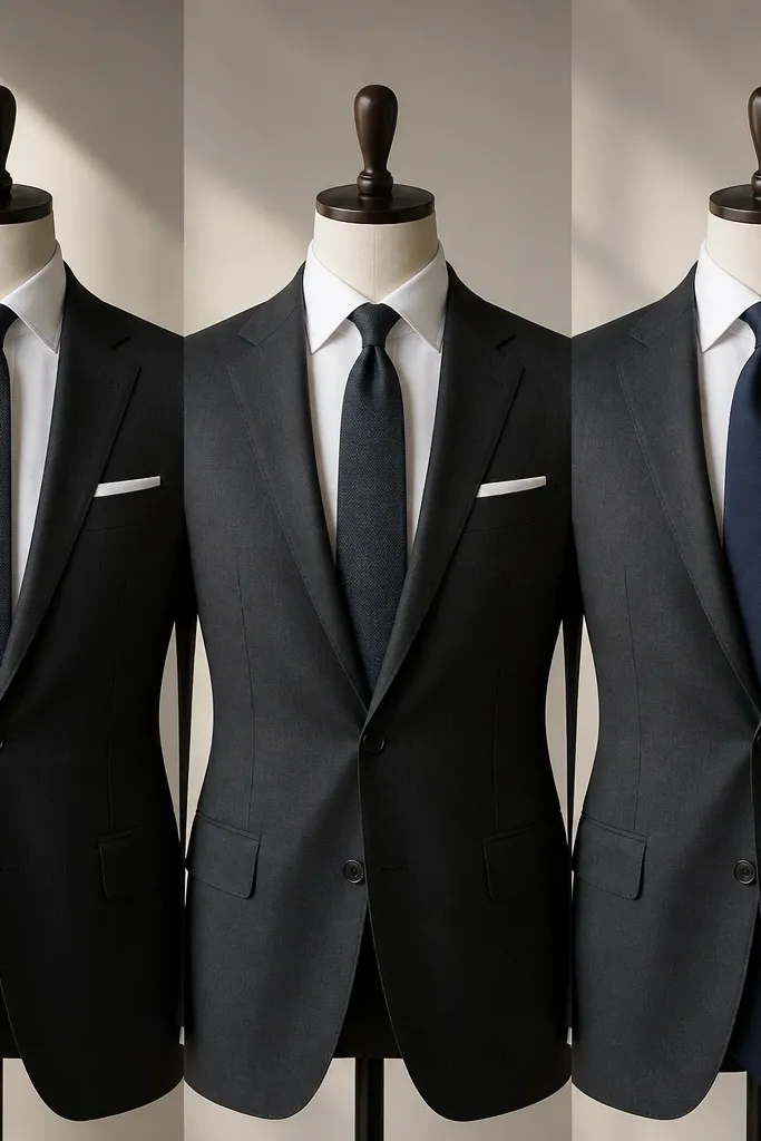
We had ties that were the same color but different widths. In group photos, that changes the visual balance of each person’s torso — especially with different lapel sizes. The groom’s tie becomes the “reference,” and everyone else looks off if the widths don’t match.
Good to knowMatch tie width to the groom’s tie and lapel style. A quick rule: standard lapels usually look best with a 3 to 3.25 inch tie width (adjust for very slim or very wide lapels).
5. Pocket Square That Fights the Tie Pattern
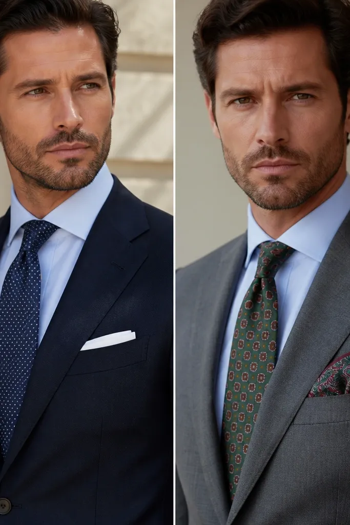
We tried to “add personality” with a pocket square that had too much going on. When the tie already has texture or pattern, a pocket square with similar visual weight makes the center of the outfit feel crowded. The best look keeps one statement element — either texture or color, not both.
Good to knowIf the tie is patterned, choose a pocket square in solid white or a single complementary tone. If the tie is solid, you can go with a subtle pattern or a textured fold (but keep it lighter than the tie).
6. Belts That Don’t Match Shoe Finish
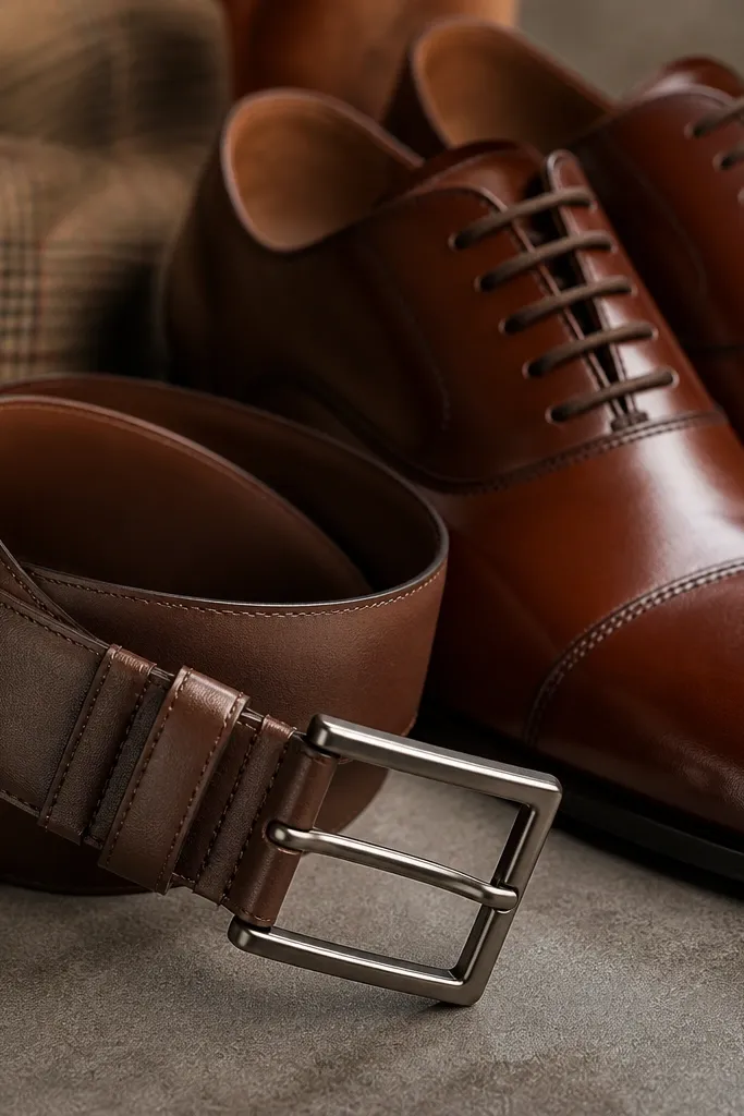
This mistake is small but shows up instantly in wedding photos. A matte belt with glossy shoes can look like the outfit was mixed from different closets. Also, belt thickness changes how the suit waist sits — too thick can pull attention to the midsection.
Match belt color and finish to the shoes — not just the hue. If your shoes have a polished sheen, choose a belt with a similar shine level and a comparable width.
7. Cuff Length and Shoe Socks Drama
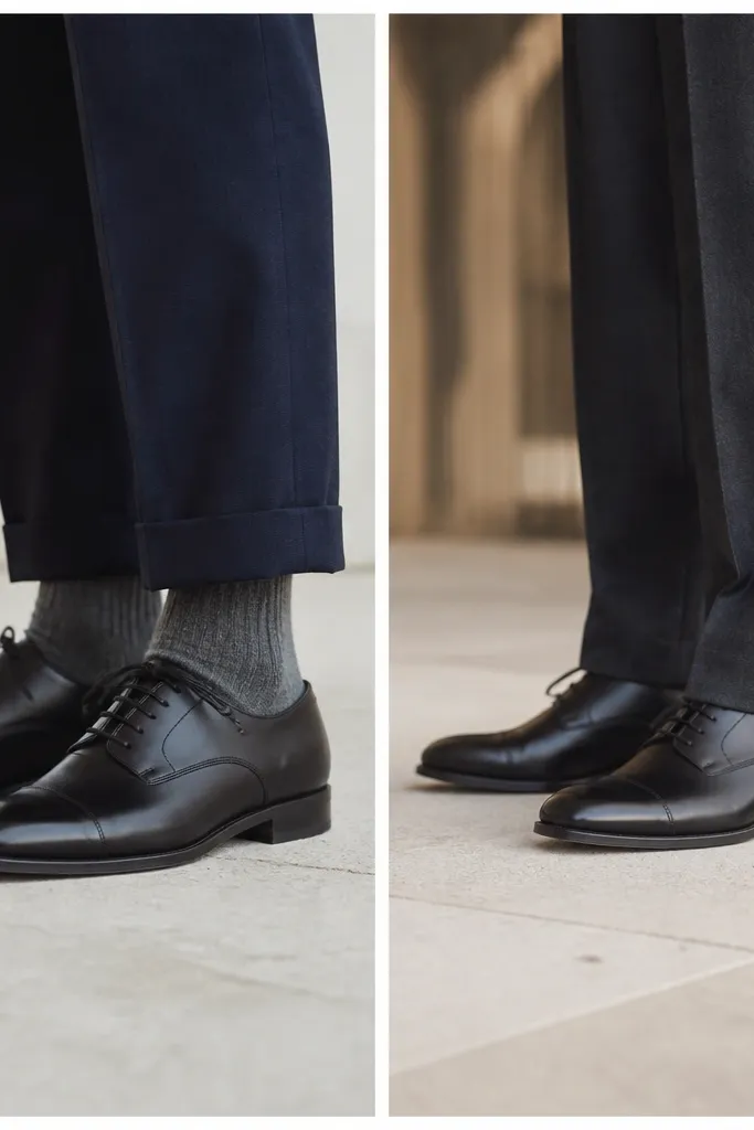
The hem break decides whether your groomsmen look tall and polished or like they borrowed pants. If trousers break too high, socks steal the show in candid photos. If they break too low, the fabric pools and looks sloppy when walking, sitting, or dancing.
Good to knowWhen trying suits on, wear the exact shoe pair you’ll use. Aim for a clean break — enough to cover most of the shoe and prevent sock exposure when standing and walking.
8. Shoes Too Casual for the Venue Level
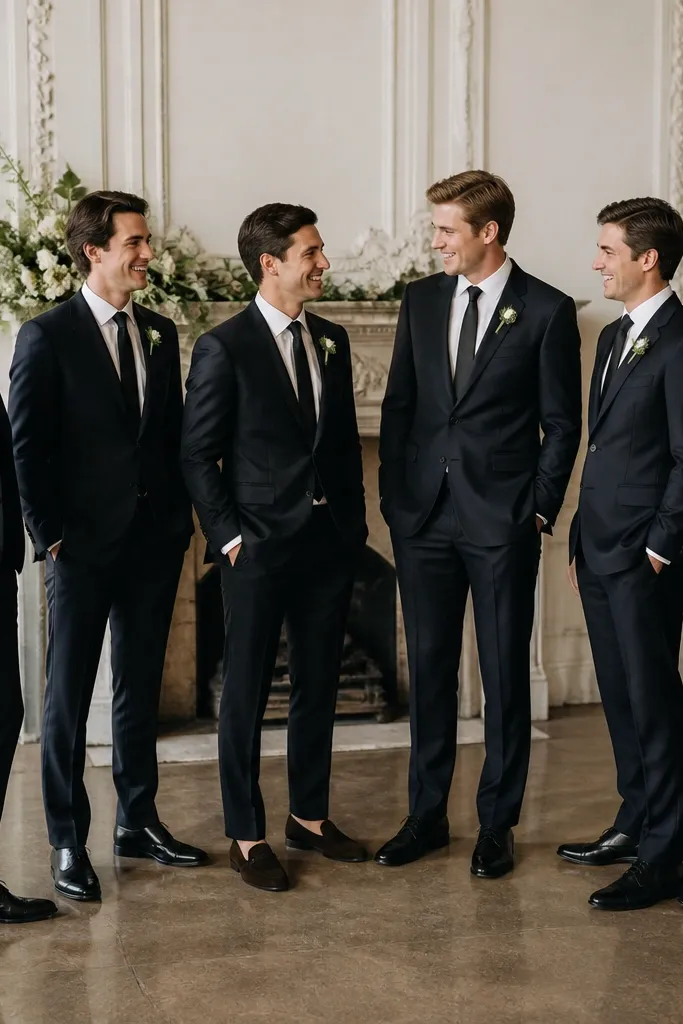
We didn’t think about how venue formality changes shoe expectations. Suede or casual loafers can look perfect in a daytime backyard setting but feel off in a ballroom or church photos. Shoe style also affects how the outfit reads — oxfords and cap-toe derbies look more formal than plain slip-ons.
If the venue is formal (church, ballroom, evening), choose polished leather oxfords/derbies. If the wedding is casual, you can go suede or loafers, but keep finish consistent across the group.
9. Letting “Alterations Later” Become Never
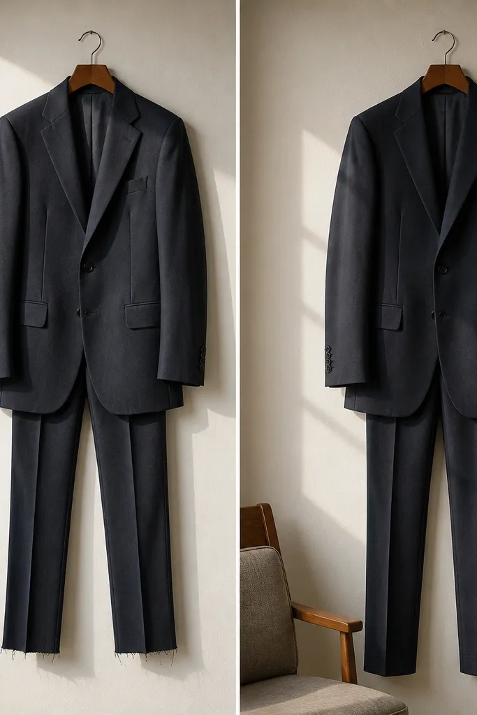
We planned to alter after ordering and underestimated how fast wedding season fills tailoring schedules. Unhemmed trousers and unfinished sleeve edges can throw off the entire silhouette. Even small changes — like taking in the waist by a half inch — make the difference between “looks okay” and “looks tailored.”
Book alterations immediately after the suits arrive. If you’re ordering rental or made-to-measure, ask for a fitting date at least 3 weeks before the wedding.
10. Women’s Groomsmen Attire Mistake: Wrong Skirt Length for Movement
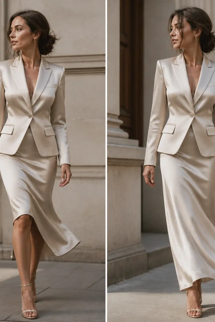
For women in groomsmen attire, skirt length can make or break the look when you’re walking down aisles or joining group photos. A too-short hem can feel casual in a formal ceremony, while a too-long hem can drag and look messy. Fabric also matters — satin catches light and can show wrinkles faster than structured suiting.
Good to knowFor a polished wedding look, choose midi that hits just below the widest part of the calf or ankle length with a clean hem. Test movement — walk, sit, and step up to a curb in the fitting.
11. Color Coordination Without Forcing Everyone Into the Same Shade
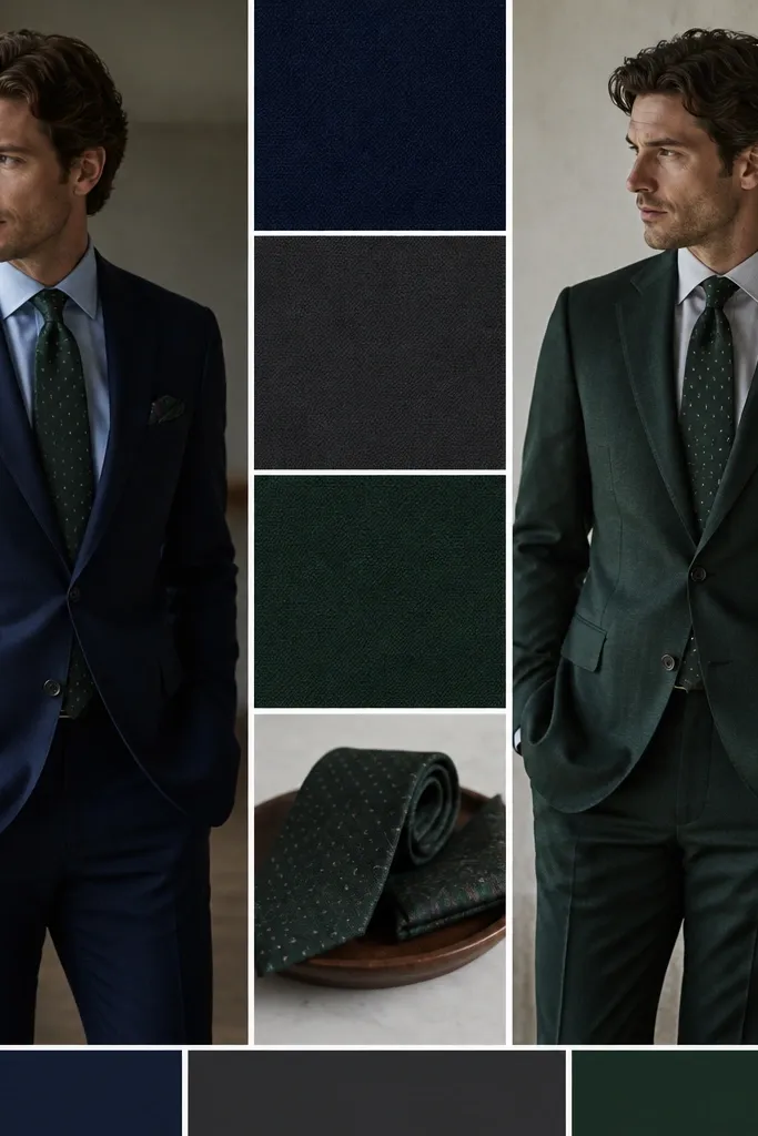
Not everyone looks good in the exact same dark shade — and forcing it can feel unfair. The mistake is treating “match” as one rigid color. A better approach is coordinating by undertone (cool vs warm) and sharing one repeating accent — like the tie color, pocket square tone, or boutonniere shade.
Good to knowPick one shared accent color and let suit shades vary slightly (navy/charcoal or deep green/black) while keeping fabric sheen consistent.