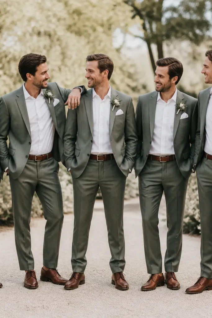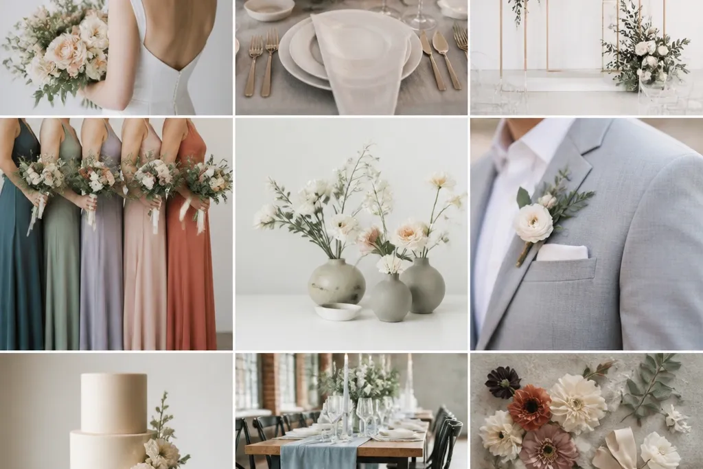
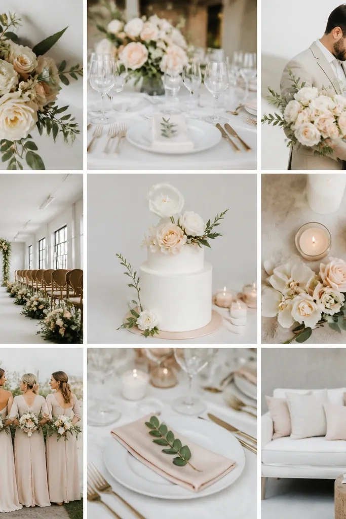
1. Chalk + Dove + Soft Sage
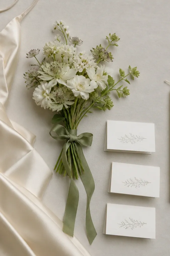
Start with chalky white (not bright optic), then add dove gray for depth, and finish with soft sage for a calm, modern accent. This palette stays flattering in both cool winter light and warm summer sunsets because the sage reads muted, not neon. Pair matte textures (crepe, matte chiffon) with a small amount of sheen (satin ribbon or a satin shoe liner) so the scheme looks intentional, not plain.
If you’re using sage flowers, swap to eucalyptus in winter for the same look with a more reliable supply.
2. Porcelain + Smoke + Blush Rose
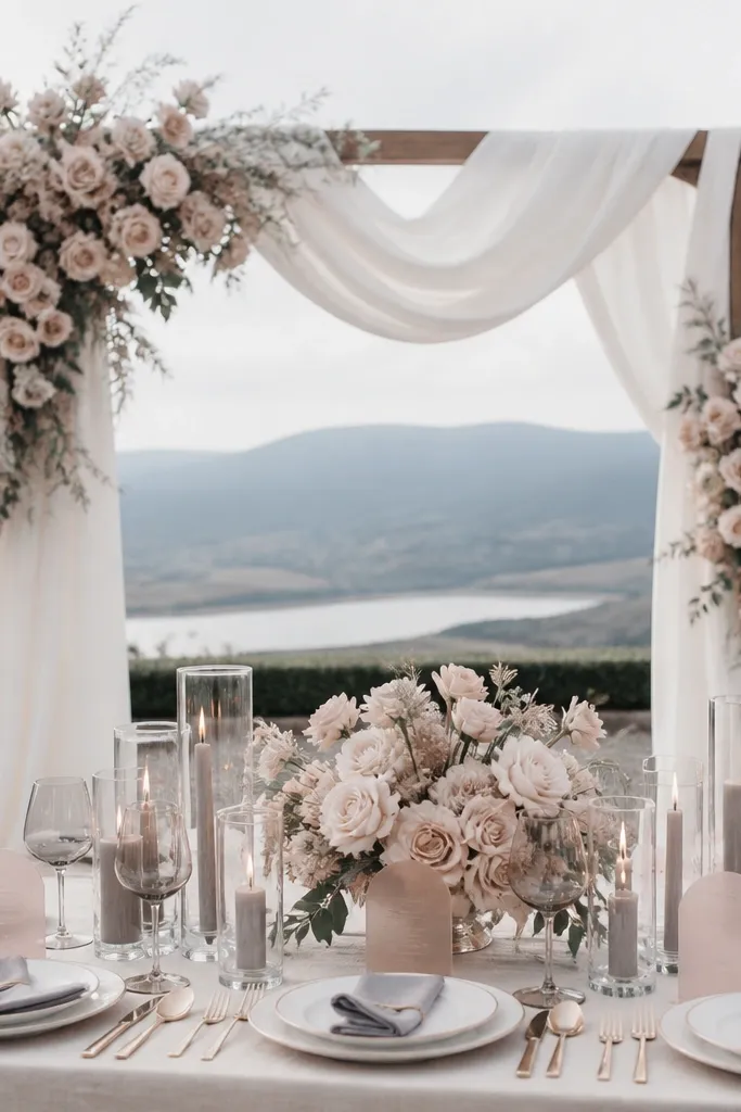
Porcelain white gives you that clean minimalist base, smoke gray adds modern structure, and blush rose brings a gentle romantic pop without breaking the neutral vibe. This works especially well for indoor venues because gray prevents the palette from washing out under warm bulbs. Keep the accent limited to florals and one accessory (like blush bridesmaid dresses or a rose-tinted clutch).
Choose blush fabrics with a dusty undertone (think mauve-leaning) so they don’t look too pink next to porcelain.
3. Sandstone + Warm Taupe + Terracotta Accent
This palette is modern and year-round because it mirrors natural tones across seasons. Sandstone and warm taupe create a flattering base, while terracotta adds warmth that feels great in fall and still looks fresh in spring. Use textured elements like linen, woven placemats, and dried grass to keep the minimalist colors from looking flat.
Good to knowIn summer, use fresh peach-terracotta flowers; in winter, lean on dried stems and terracotta-toned ribbons.
4. Ivory + Greige + Cobalt Micro-Accent
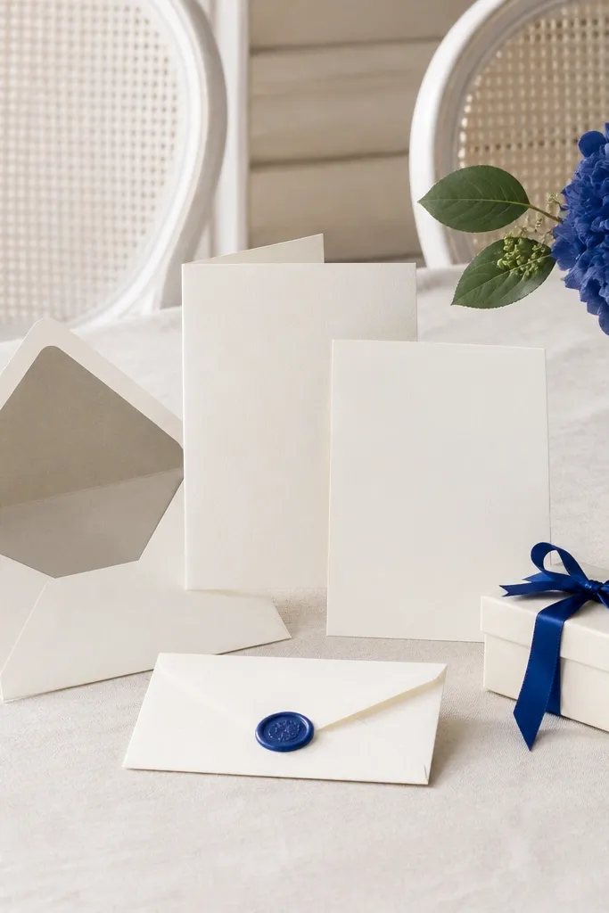
Ivory and greige keep everything soft and modern, and a cobalt micro-accent gives just enough contrast to look editorial in photos. The trick is scale: use cobalt in small doses (wax seal, napkin edge, one floral cluster) so the scheme stays minimalist. Greige is key because it bridges warm and cool lighting better than pure gray.
Good to knowLimit cobalt to 10-15% of visible items — think one color story moment per table, not full coverage.
5. Soft Black + Pearl White + Champagne Gold
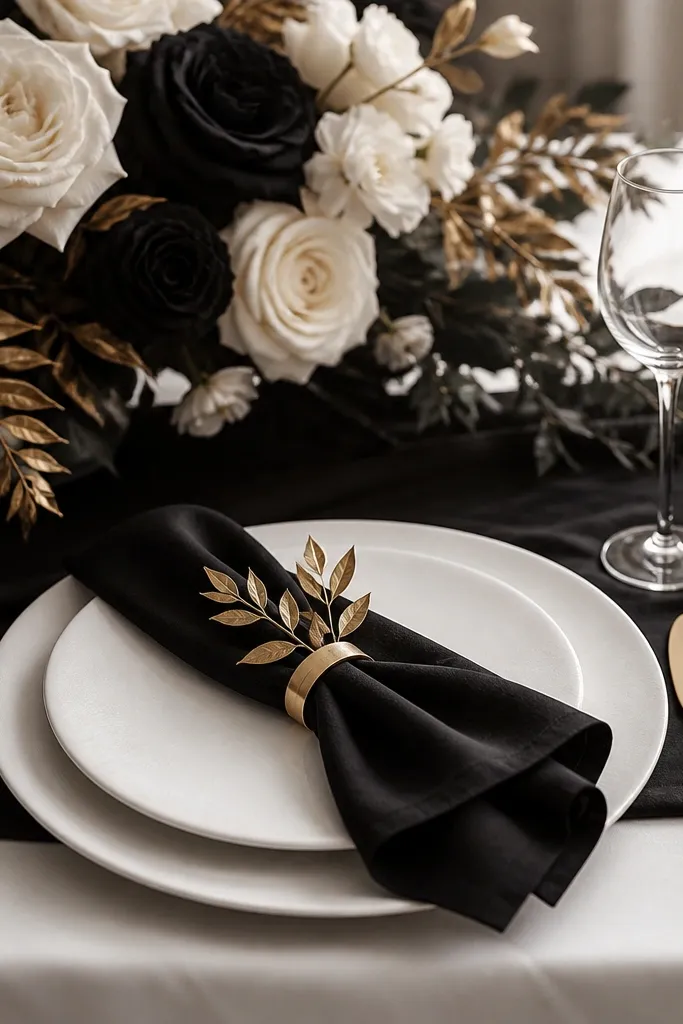
Pearl white and soft black create crisp modern contrast, while champagne gold warms the look without going full glam. This combination photographs beautifully at night receptions because the gold catches light and the black grounds the frame. Keep florals mostly white or cream, then add gold-tinted foliage or metallic ribbon for the accent.
Good to knowChoose champagne gold over bright yellow gold so it reads cohesive with pearl tones.
6. Ecru + Charcoal + Ink Blue (Minimalist Navy)
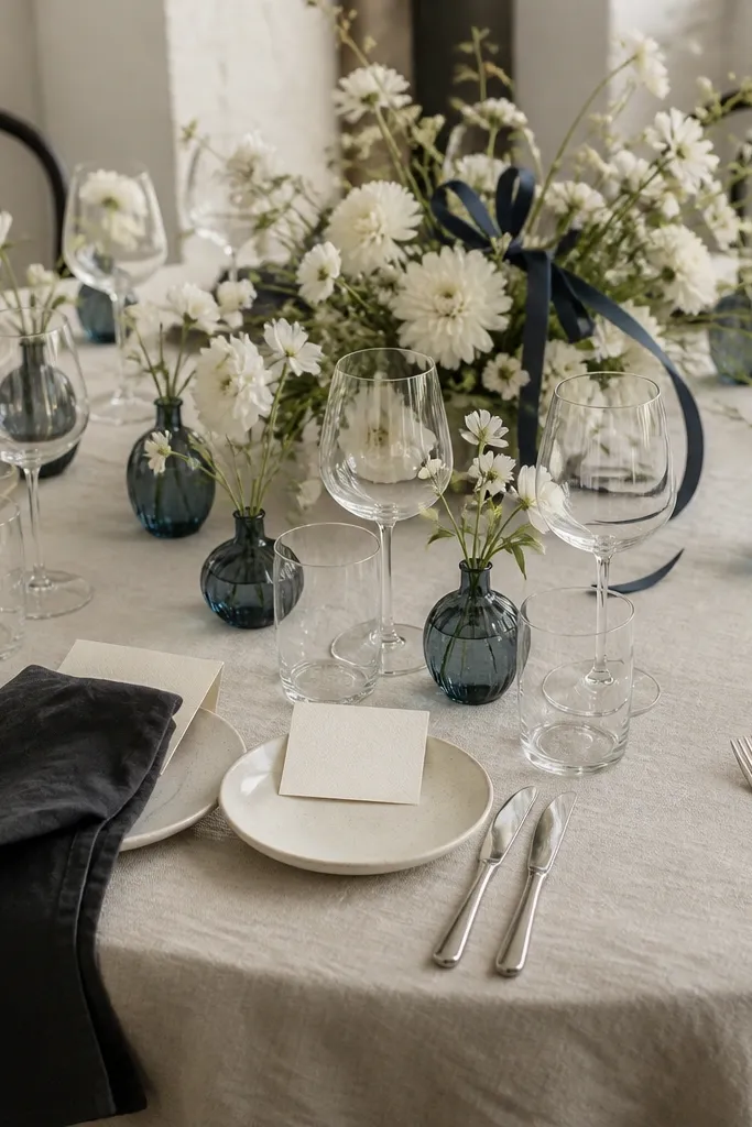
Ecru is warmer and softer than stark white, charcoal gives the modern structure, and ink blue provides a deep accent that works in every season. This is a great scheme if you want minimal but still a little bold. The key is to use ink blue as a “detail color” (vases, ribbon, a small floral cluster) so it doesn’t dominate the palette.
Good to knowIf your venue is very bright, charcoal can look too harsh — test swatches in the same room lighting before finalizing.
7. Cloud Gray + White + Silver Leaf
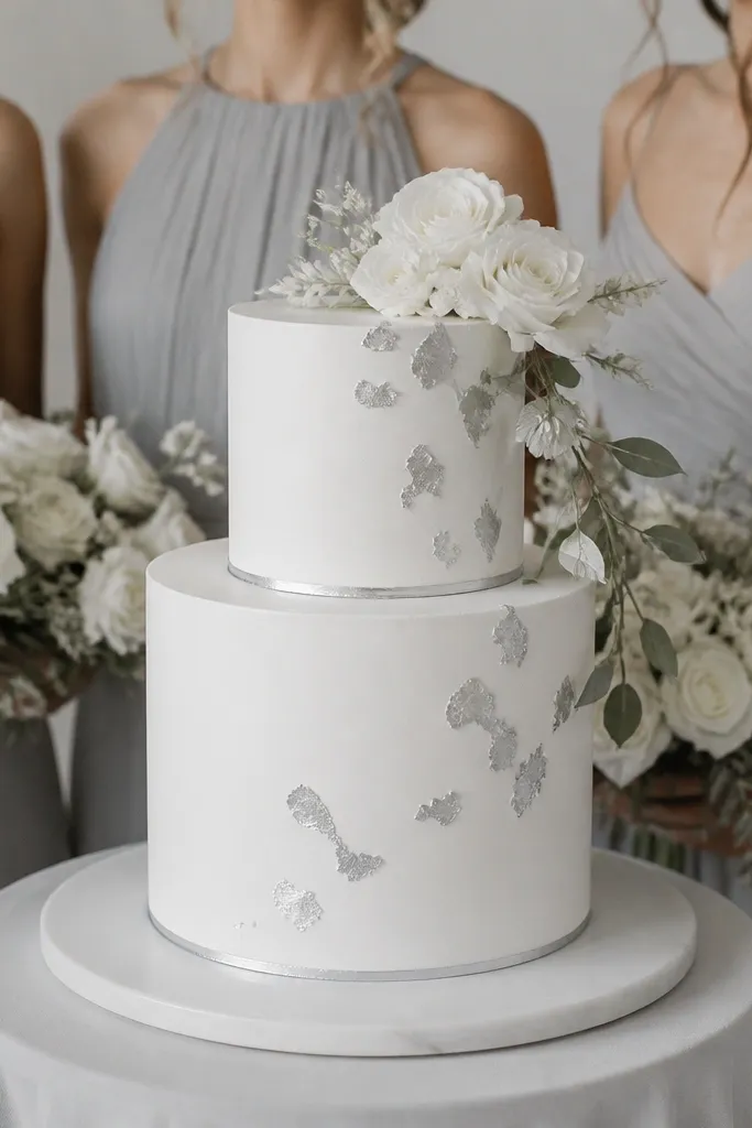
For a true minimalist, go monochrome: cloud gray and white, then finish with silver leaf for a subtle modern sparkle. This palette is year-round because it doesn’t rely on season-specific flower colors — you can keep florals white and adjust textures (more greenery in summer, more stems in winter). Silver leaf and metallic accents add dimension without adding new colors.
Good to knowUse a matte silver (not chrome) for a softer look that won’t overpower white florals.
8. Cream + Olive + White Blossoms
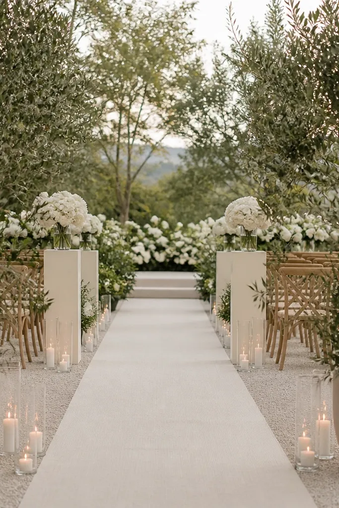
Olive is the ultimate minimalist “season stabilizer” because it reads neutral in spring and rich in fall. Pair cream (for the base) with olive (for the accent) and keep florals white so everything stays cohesive. Olive also works beautifully with natural wood tables and linen textures, which makes the palette look expensive without being loud.
Use potted herbs or olive-toned greenery for centerpieces — they double as decor and take-home gifts.
9. Oatmeal + Soft Navy + Dried Heather
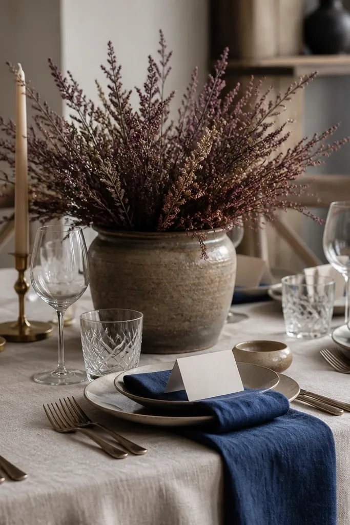
Oatmeal and soft navy create a grounded, modern contrast that still feels gentle. Dried heather (muted purple) adds a subtle secondary tone without turning the palette colorful. This scheme is especially great for off-season weddings because dried florals keep their shape and color longer than fresh bouquets.
Good to knowConfirm your heather shade in daylight — some batches lean more pink, and you want muted, not bright.
10. White + Light Gray + Peachy Apricot (Modern Blush Neutral)
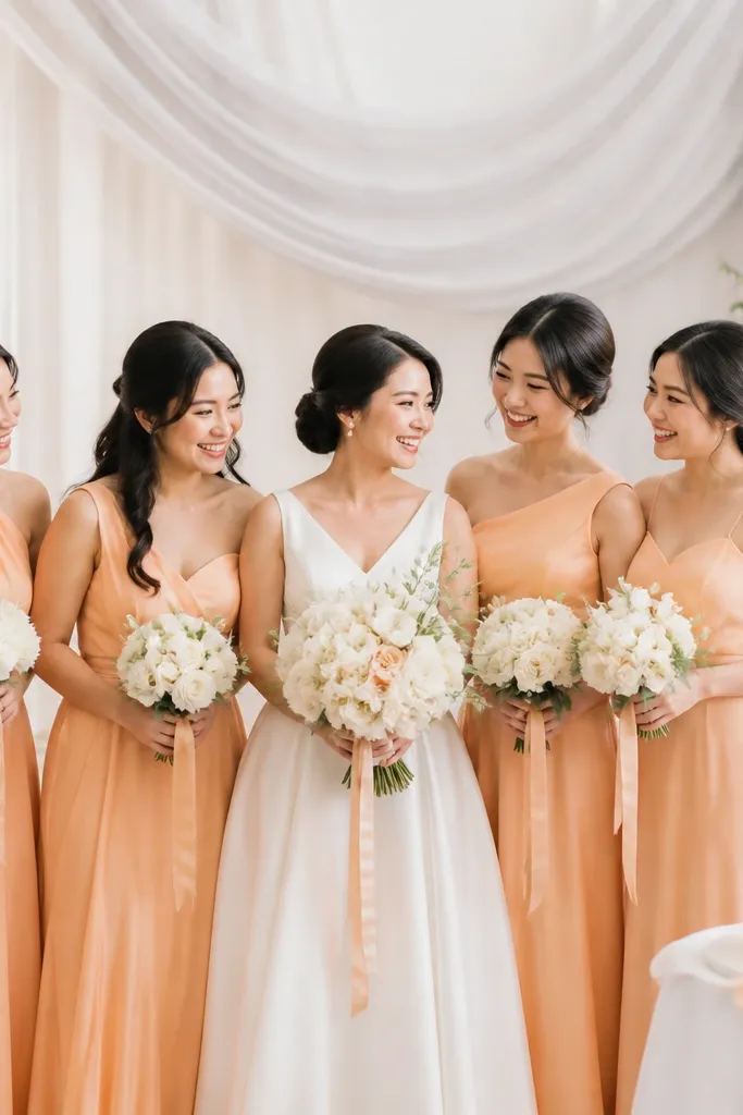
If you love blush but want it modern and less romantic-heavy, go peachy apricot as the accent. White and light gray keep the palette crisp, while apricot reads warm enough for summer and flattering for winter skin tones. Use apricot in accessories (ribbons, shoes, napkin bands) and keep bridesmaid dresses in a similar fabric family so they photograph evenly.
Good to knowMatch apricot to a ribbon shade first — if it looks right on camera, the whole palette will usually follow.