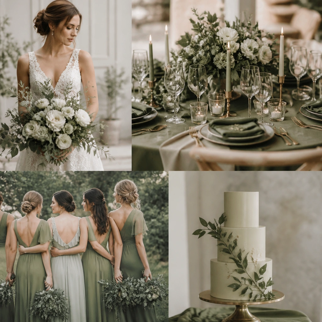
1. Olive + Cream + Blush Garden Romance
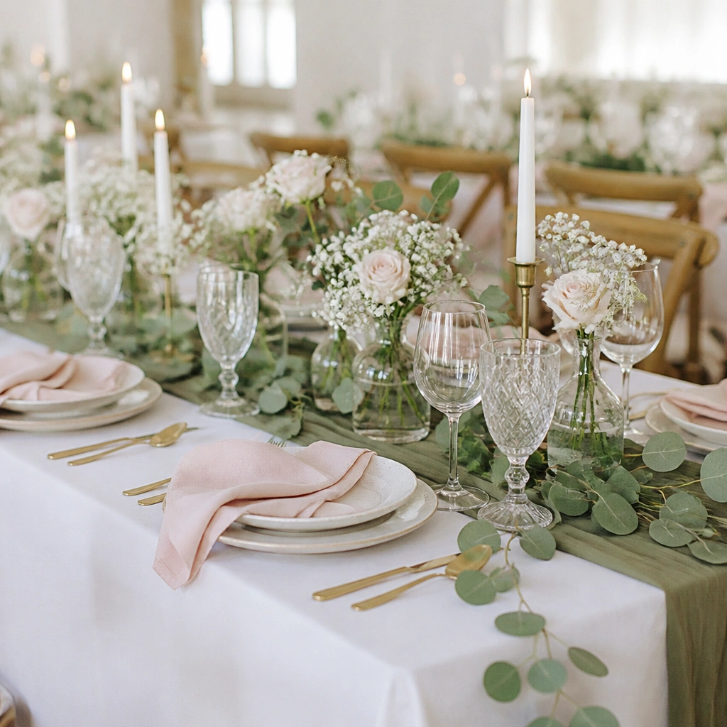
This scheme looks airy because cream balances olive’s depth and blush adds a soft, romantic glow. Stick to pale blush (not hot pink) so the greens stay the hero. Add texture with eucalyptus tips and delicate filler flowers to keep it from feeling too “decorated.”
Ask your florist for a “cream-forward” mix — most blooms in white/cream, with only 20-30% blush accents.
2. Olive + Ivory + Terracotta for Sunlit Warmth
Terracotta makes olive feel Mediterranean instead of dark. Use ivory as your base so the terracotta reads warm, not orange-red. Plants do the heavy lifting here — mix olive-toned foliage with dried grasses for movement.
Good to knowChoose terracotta in a muted clay tone; avoid bright terracotta that can overpower olive on photos.
3. Olive + Gold + White Botanical Luxe
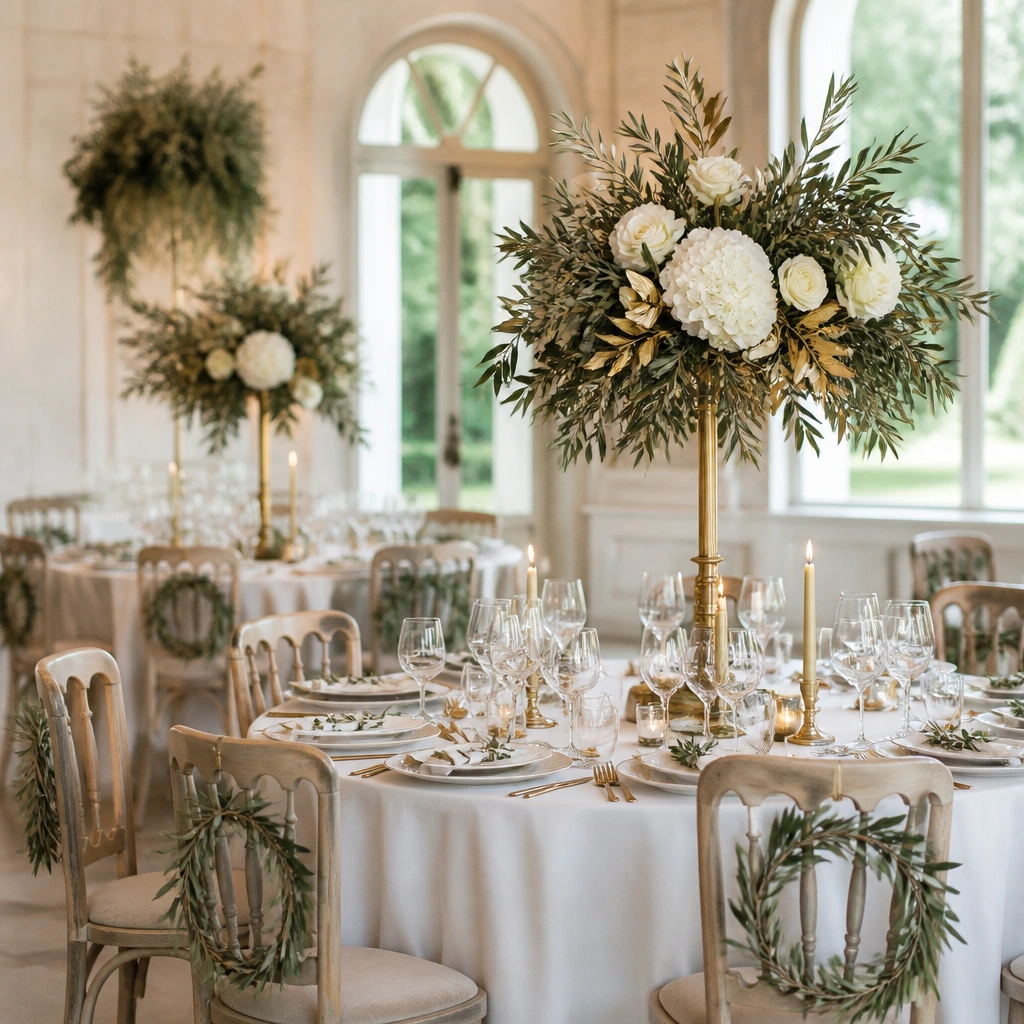
Gold turns olive into “elevated botanical,” especially with crisp whites. Keep white flowers mostly in the same bloom family (roses + ranunculus or anemone) so the palette feels intentional. Darker olive foliage adds contrast against gold without looking heavy.
Use matte gold accents (candlesticks, menu holders) to avoid a too-shiny look next to olive leaves.
4. Olive + Charcoal + Soft White for Modern Contrast
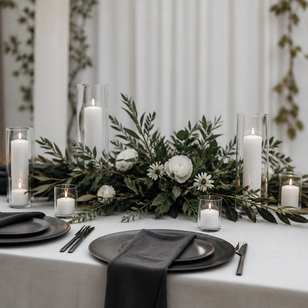
If you’re worried olive will look too casual, charcoal gives it structure. The key is keeping the florals light — mostly white with olive foliage, not dark flower-heavy bouquets. This palette is also great for evening weddings because charcoal photographs beautifully.
Good to knowLimit charcoal to textiles (napkins, runners) and let olive + white stay dominant in florals.
5. Olive + Dusty Blue + Eucalyptus Breeze
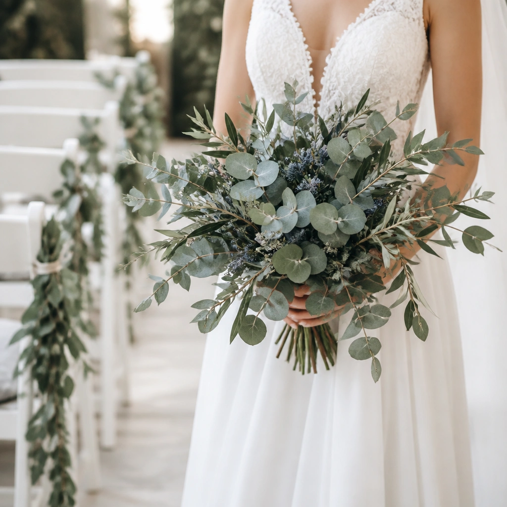
Dusty blue makes olive feel fresh and coastal without losing sophistication. Eucalyptus is the secret ingredient — its silvery-green tone bridges olive and blue, keeping everything cohesive. Use blue as small accents (sprigs or a few blooms) so olive remains the theme base.
Good to knowPick dusty blue with a gray undertone, not bright sky blue, to keep it wedding-elegant.
6. Olive + Sage + Natural Linen for Effortless Neutral
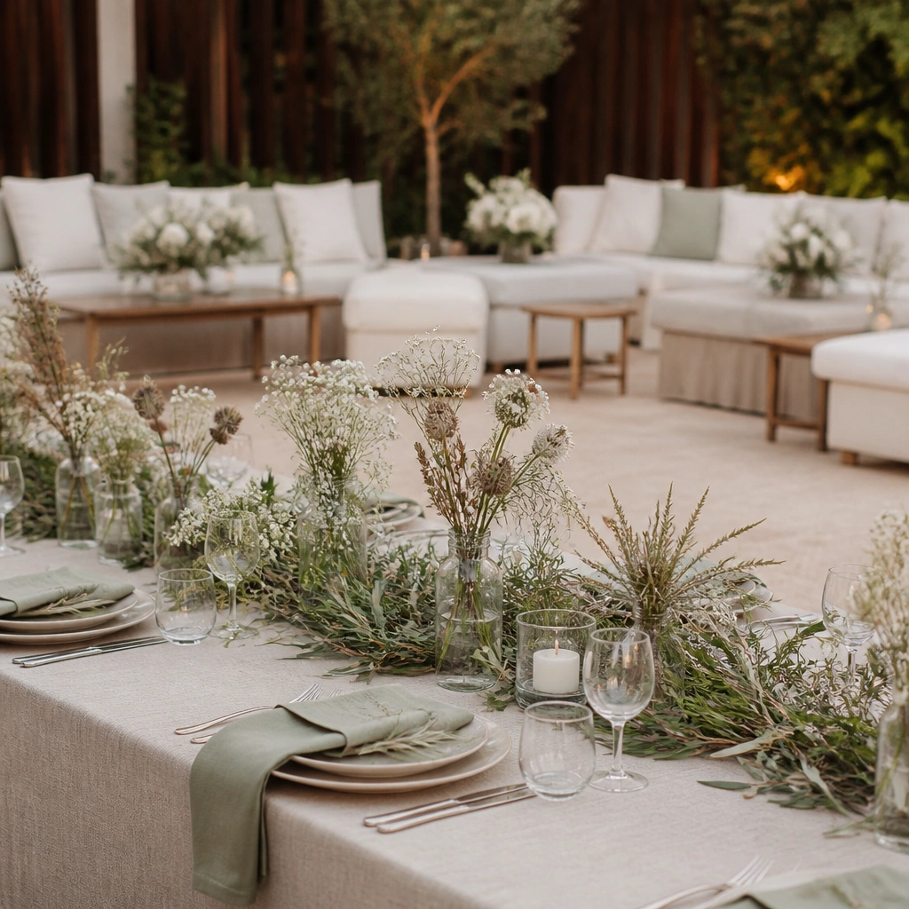
This is the “quiet luxury” version of olive — softened with sage and linen. Because both greens are muted, you don’t need bold accents. Add variety with seed pods and airy stems so the look reads full even when colors stay calm.
Choose linen shades that are slightly warm (oat/cream) so olive doesn’t look gray.
7. Olive + Burgundy + Dark Green for Autumn Depth
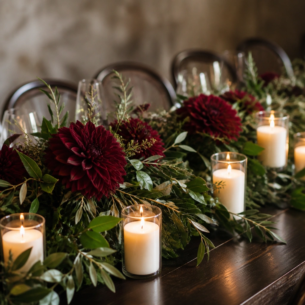
Burgundy gives olive a rich, fall-appropriate mood while still feeling romantic. Keep your olive darker (deep olive, not yellowed olive) so it supports burgundy instead of competing. This scheme shines with candlelight because the burgundy blooms glow against green.
Good to knowUse cream candles or ivory votives to prevent the table from feeling too dark.
8. Olive + Mustard + Pampas for Boho Garden Charm
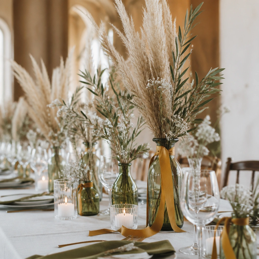
Mustard adds an earthy pop that pairs beautifully with olive and plant textures. Pampas grass brings height and movement, making the theme look intentional even with fewer floral blooms. Keep mustard in small doses — ribbon, napkin ties, or a few blooms — so it doesn’t turn the palette into a costume look.
Good to knowTie mustard ribbon around napkin bundles in a matte fabric (cotton or linen) for a softer effect.
9. Olive + White + Blackberries (Deep Berry Accent)
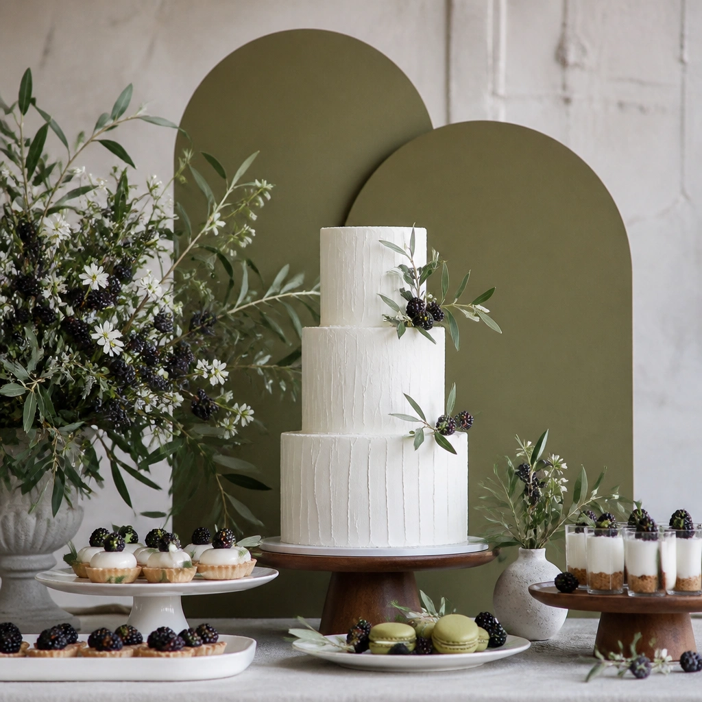
For a unique plant-forward twist, use dark berries as your accent color instead of a traditional red. Olive + white creates a clean base, while berry accents add drama without looking overly festive. This works especially well for vineyard or garden venues where natural fruit feels at home.
Good to knowUse berry-colored elements in decor (menus, signage ink, small berry stems) rather than painting everything dark.
10. Olive + Chocolate Brown + Warm White Candle Glow
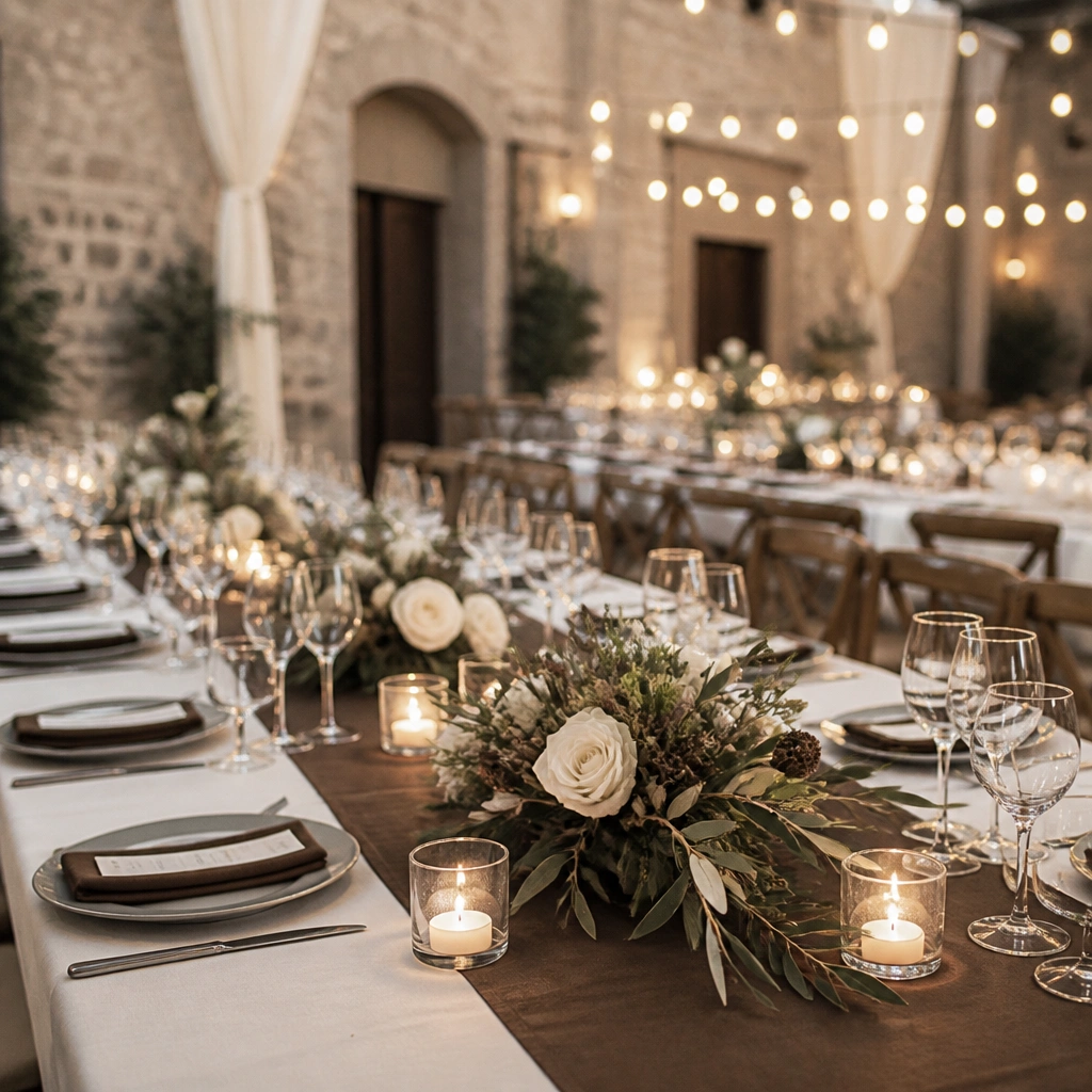
Chocolate brown makes olive feel grounded and cozy, especially in fall or winter. Warm white candlelight adds an inviting tone that keeps olive from looking too cool. Pair with seed pods and dried elements for a layered, lived-in botanical look.
Good to knowUse warm white bulbs (not daylight) so “warm white” truly reads warm next to olive.
11. Olive + Pure White + Navy for Crisp Nautical Elegance
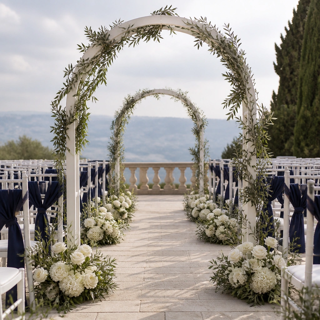
Navy adds crisp contrast that makes olive look intentional and structured. Keep the white pure (bright white) so the palette feels clean, not creamy. Use olive greenery to connect both colors visually, especially across aisle garlands and bouquets.
Good to knowChoose navy that leans deep and cool (not dusty) so it won’t clash with olive undertones.