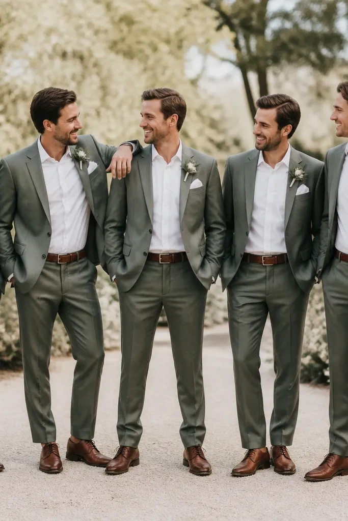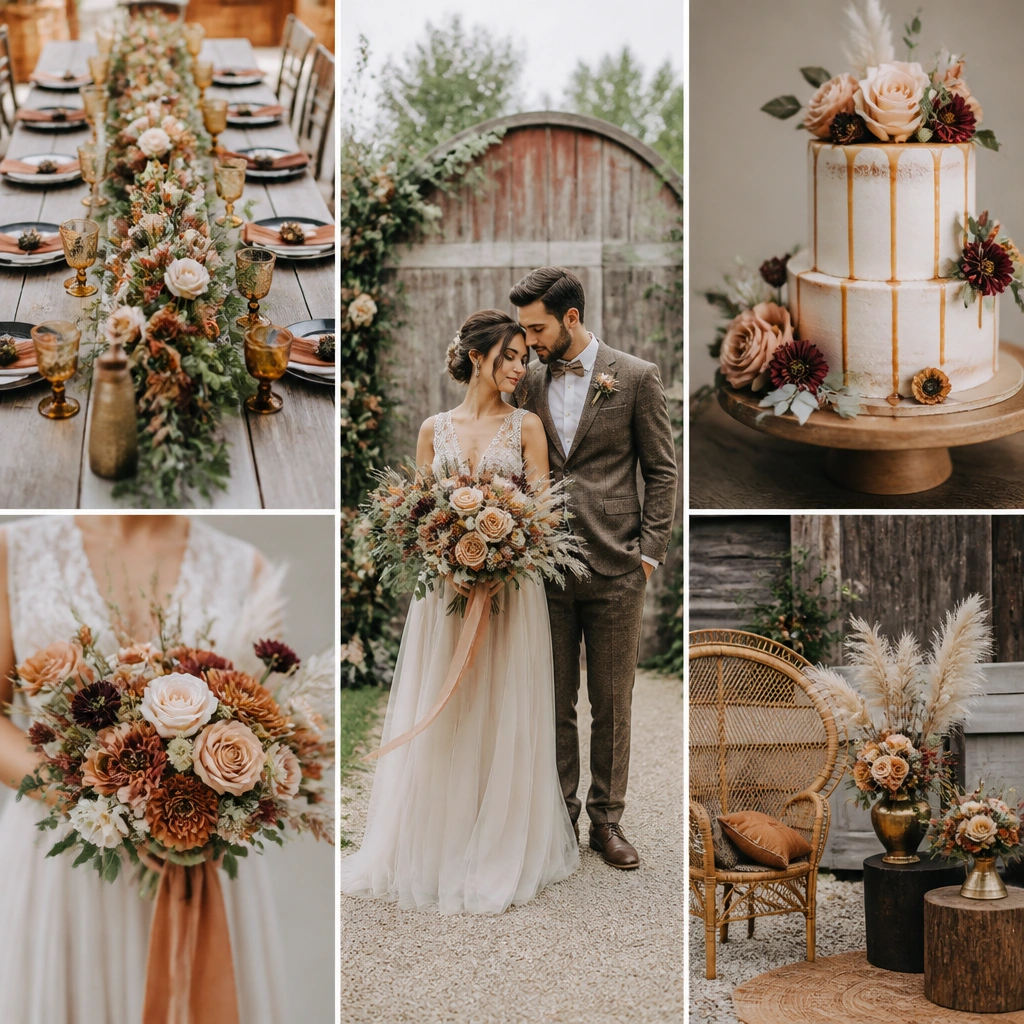
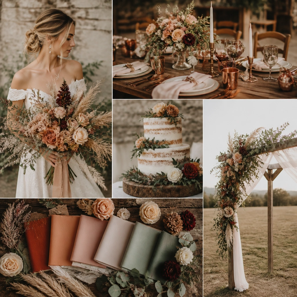
1. Clay + Sage Linen Table Runner Set with Drawer Labels
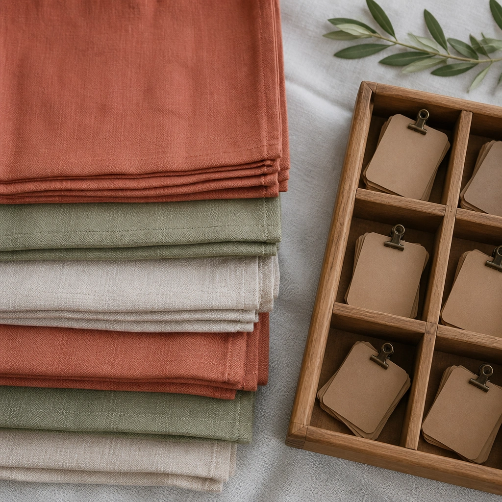
This look uses textured linen in warm clay and soft sage so the palette reads rustic, not washed out. Tie the storage to the aesthetic by using kraft labels and a simple numbering system (Table 1, Table 2) so runners match the exact tables you’ll style first. The fabric texture shows up beautifully in overhead wedding photos.
Good to knowFold runners the same way every time and label the drawer with the table number before you pack decor the night before setup.
2. Dusty Rose + Weathered Wood Seating Plan in Color-Matched Crates
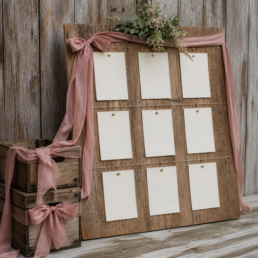
Dusty rose paired with weathered wood creates that romantic barn-vibe. Use matching dusty rose ribbon on your crates so you can grab seating décor quickly while keeping the whole space visually consistent. When the crates are staged together, the color story looks intentional even before guests arrive.
Good to knowPack seating signage (board, easel, markers) in one crate and tape a photo of the final setup to the inside lid.
3. Cream + Burnt Orange Candle Vignette with Airtight Candle Storage
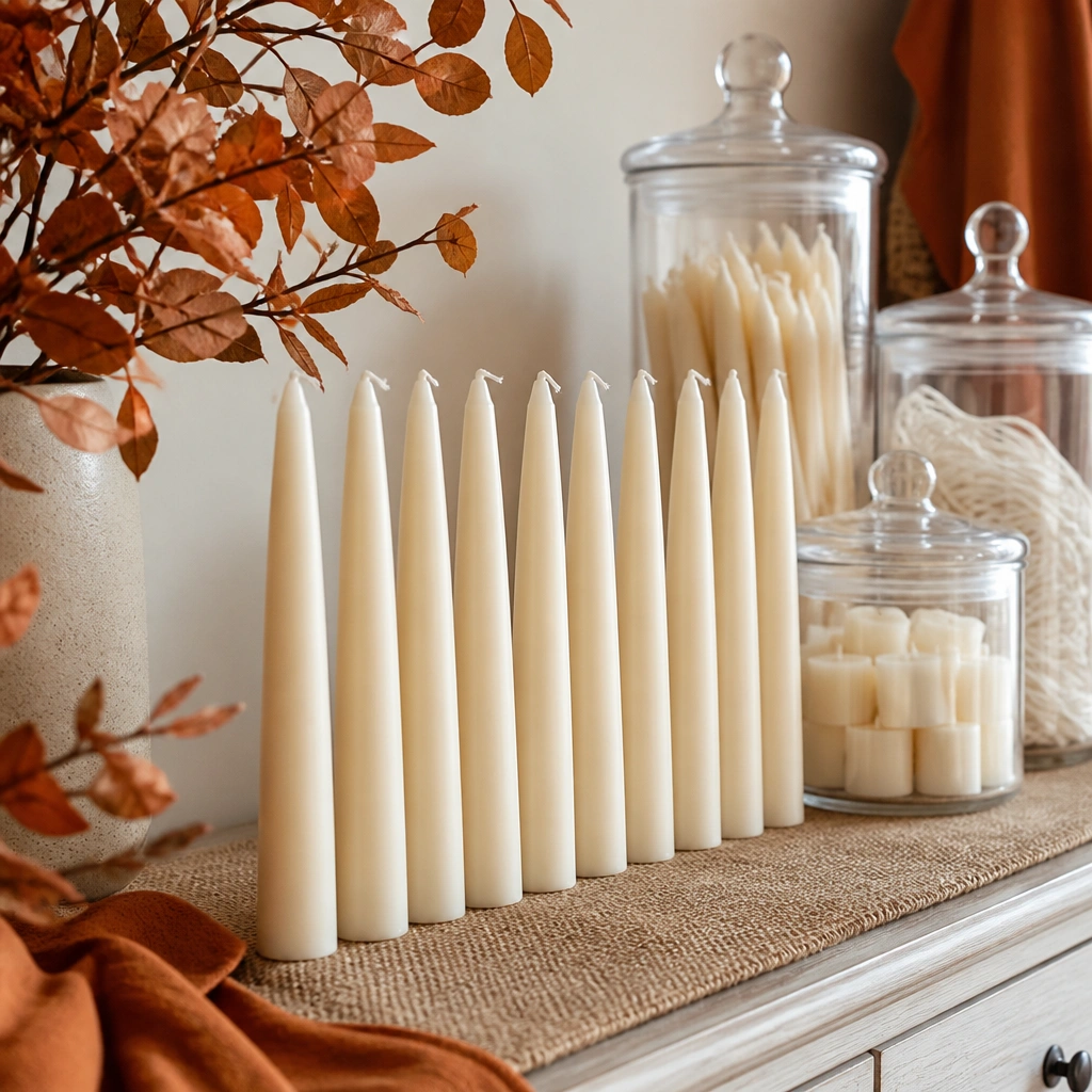
Cream and burnt orange are perfect for rustic weddings because they warm up natural wood and stone venues. Store spare candles in clear, lidded containers so they stay dust-free and you can see what’s left without opening everything. Add a burnt orange twine wrap around the container for instant visual cohesion.
Before the wedding, trim wicks to the same length and store them together in a small labeled jar to avoid last-minute cutting.
4. Moss Green + Terracotta Florals with Breathable Storage Bags
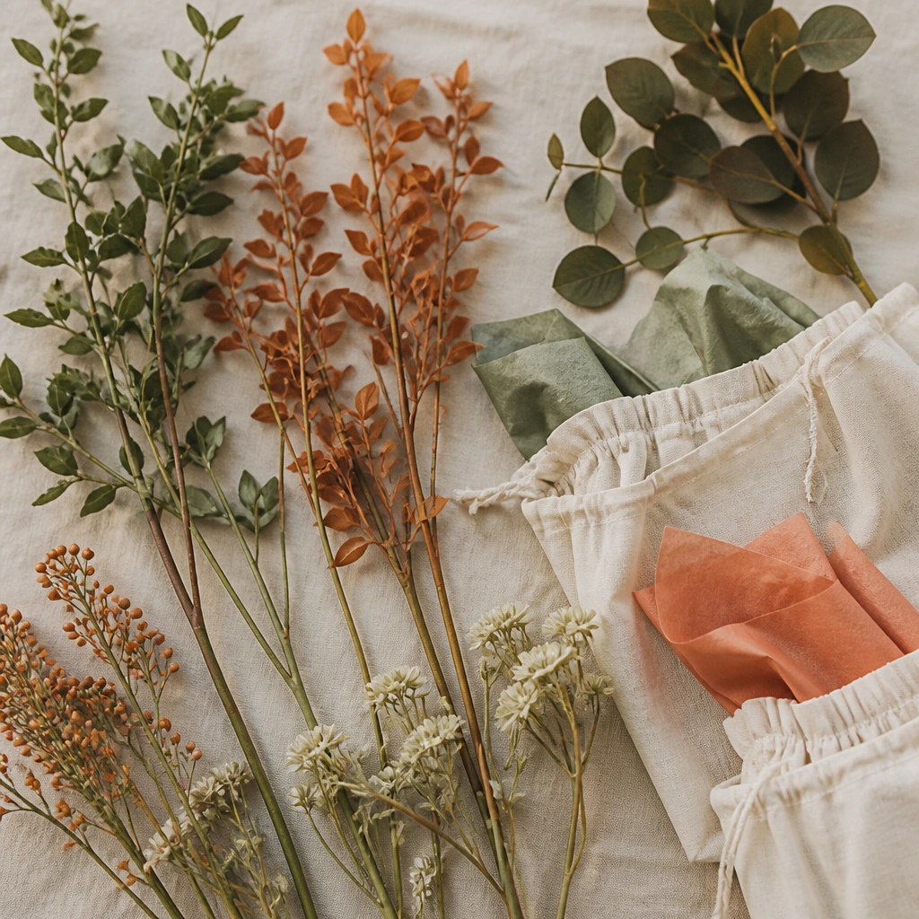
Moss green and terracotta look stunning against neutral walls and rustic textures like reclaimed wood. For items you’ll reuse (faux stems, greenery bundles, ribbon), store them in breathable fabric bags instead of sealed plastic so they don’t get musty or crease. Place tissue paper between stems in matching tones to reduce tangling.
Group by bundle type (arch greenery, aisle accents, centerpieces) and label the bags with a quick photo reference.
5. Antique Gold + Olive Napkin Rings Stored in Numbered Jars
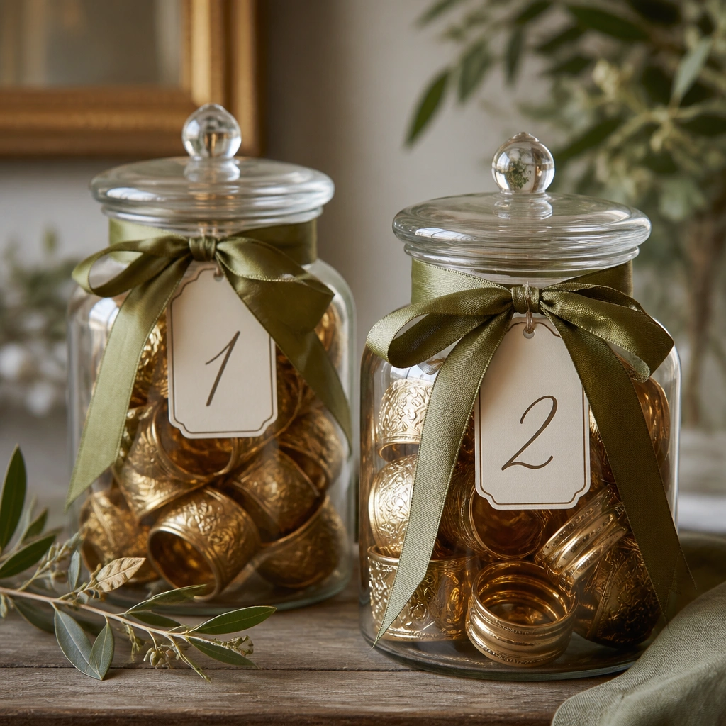
Antique gold and olive keep rustic palettes elevated, especially when paired with cream linens. Numbered jars make it easy to style napkins by table without hunting through drawers. The glass also looks great for pre-wedding flat lays because it catches warm light.
Good to knowUse a permanent marker on painter’s tape labels so ink won’t smear if jars get handled during setup.
6. Rust + Sand Place Cards with File-Style Storage Folders
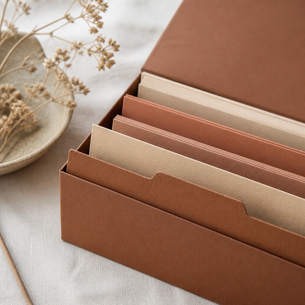
Rust and sand create a grounded, earthy look that pairs well with wood centerpieces and linen. Store place cards in a file-style folder organizer to prevent bending and to keep corners crisp. Add a tab color (rust marker or rust ribbon) so you can grab the right set fast when you’re staging tables.
Sort place cards by table before packing and keep the seating chart photo in the same folder for quick checks.
7. Sage + Oatmeal Seating Chair Sashes from a Roll-Up Storage Roll
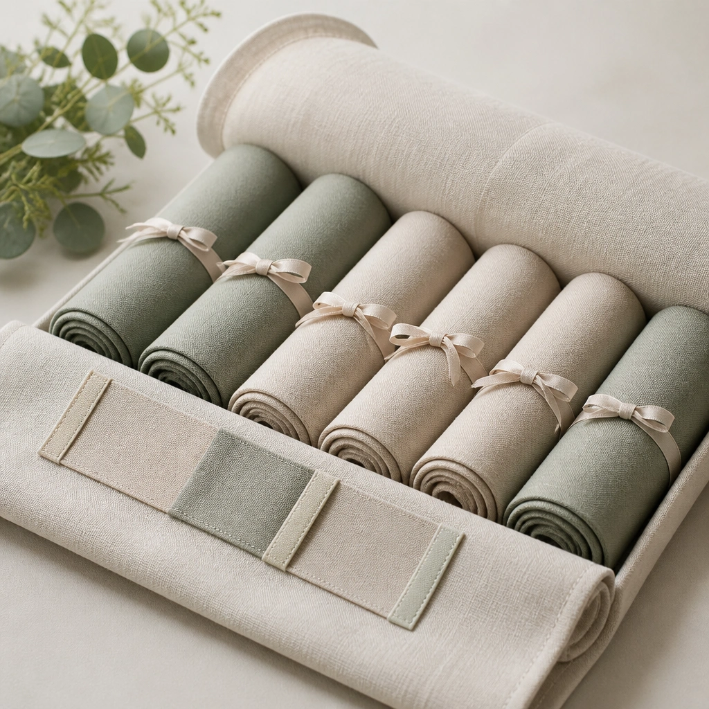
Sage and oatmeal give you that soft rustic contrast that photographs beautifully in daylight. Roll sashes instead of folding sharply to avoid stubborn creases, then store them in a fabric roll so they stay organized and easy to transport. The roll-up format also helps you count pieces quickly.
Good to knowTie a ribbon knot at the start of each roll and label the end so you can unroll in the same direction every time.
8. Warm White + Espresso Table Numbers with Stackable Keepsake Boxes
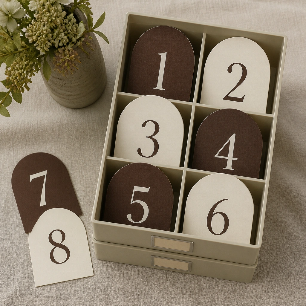
Warm white plus espresso reads classic and rustic at the same time, especially with wood and burlap textures. Store table numbers in stackable keepsake boxes with dividers so they don’t get bent or mixed up. This also makes cleanup easier because each box corresponds to a table range or section.
Good to knowPut a strip of painter’s tape on each number’s back with the table it belongs to, then peel it off cleanly at setup.
9. Dusty Rose + Clay Gift Tags in Clip-On Storage Clips
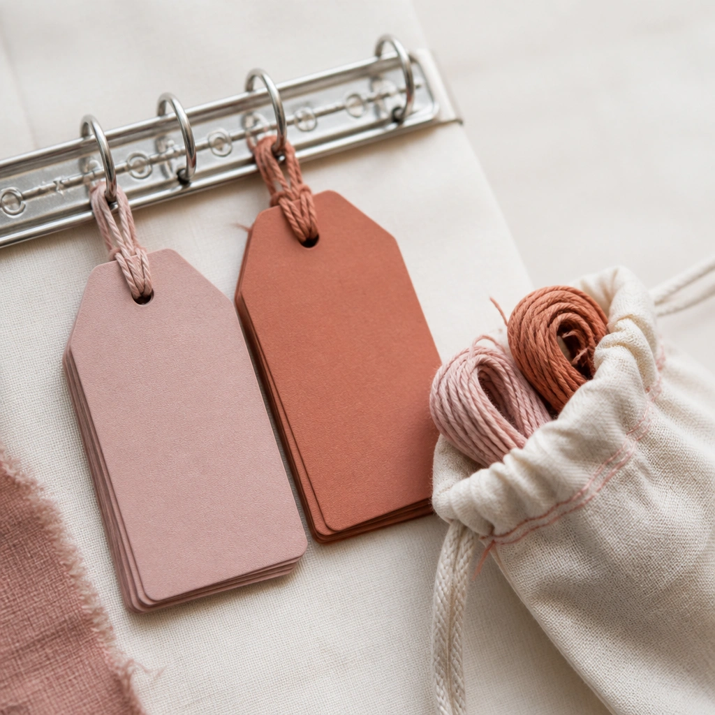
Gift tags are an easy place to reinforce your rustic palette, and dusty rose + clay looks especially warm next to kraft paper and twine. Clip-on storage keeps tags from tangling and lets you flip through sets quickly when you’re assembling favors. Matching twine in a small pouch prevents you from losing the exact color you styled for photos.
Use a binder ring to store tags by favor type (soap, candles, snacks) so you can assemble in batches.
10. Caramel + Cream Burlap Swatch Board with Color-Blocked Storage Tote
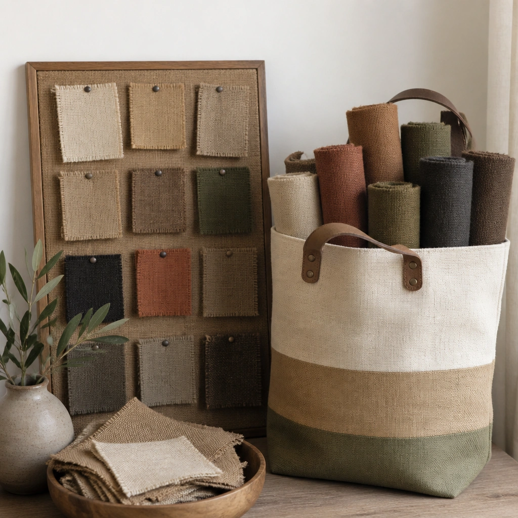
Caramel and cream burlap swatches help you match fabric tones before you commit to final styling. A color-blocked tote (one side caramel, one side cream) makes it obvious what goes with what, even in a busy prep day. This reduces the risk of mixing shades that look fine in daylight but clash in venue lighting.
Pin your final swatch on the tote label so you can compare fabric instantly when you’re packing or setting up.
11. Rustic Pantry-Style Signage Kit in a Labeled Clipboard Case
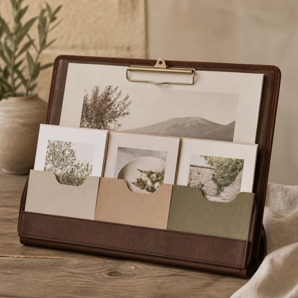
A signage kit keeps your rustic wedding looking intentional because guests see consistent fonts, colors, and materials. Use a clipboard-style case or flat organizer with labeled dividers so printed pieces don’t get wrinkled or lost. This works especially well with rustic palettes because you can coordinate signage color accents (rust stamps, sage stickers, cream card stock) across every sign.
Good to knowBring the case to the venue early and stage it by entrance — you’ll assemble the welcome area faster and reduce stress.