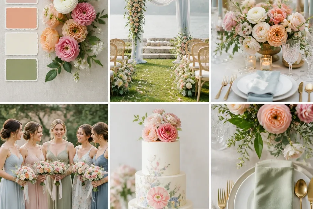
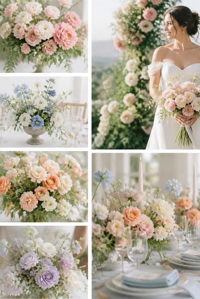
1. Blush + Sage + Soft Gold (Garden-Party Romance)
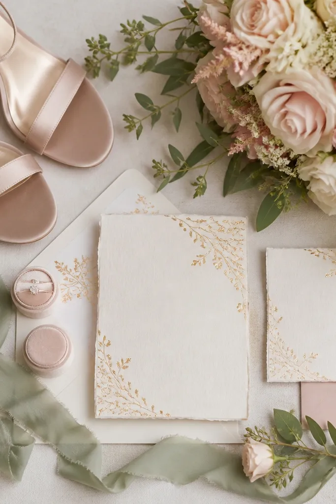
Blush (warm pink) plus sage (muted green) gives spring softness without looking neon. Add soft gold for warmth in candle holders, frames, or jewelry so the palette feels finished, not washed out. This scheme looks especially good with natural textures like linen, chiffon, and matte ceramics.
Good to knowPick your anchor first — blush or sage — then limit gold to accessories only (details, not full coverage).
2. Dusty Blue + Pearl + Champagne (Classic Spring Cool)
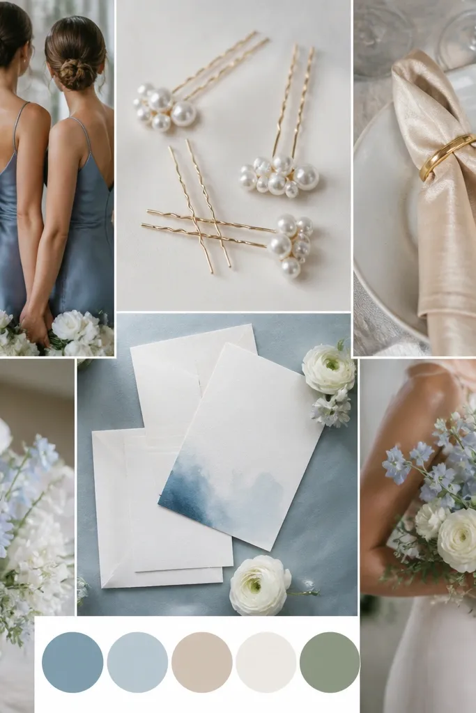
Dusty blue is a beginner-friendly “cool” color because it pairs with neutrals easily. Pearl and champagne keep it from feeling too icy, especially in daylight. This palette works with silk, crepe, and satin because the fabrics reflect light gently.
Good to knowTest undertones by holding your blue fabric next to your champagne napkin — they should look harmonious, not gray.
3. Coral + Apricot + Cream (Sunset Spring Energy)
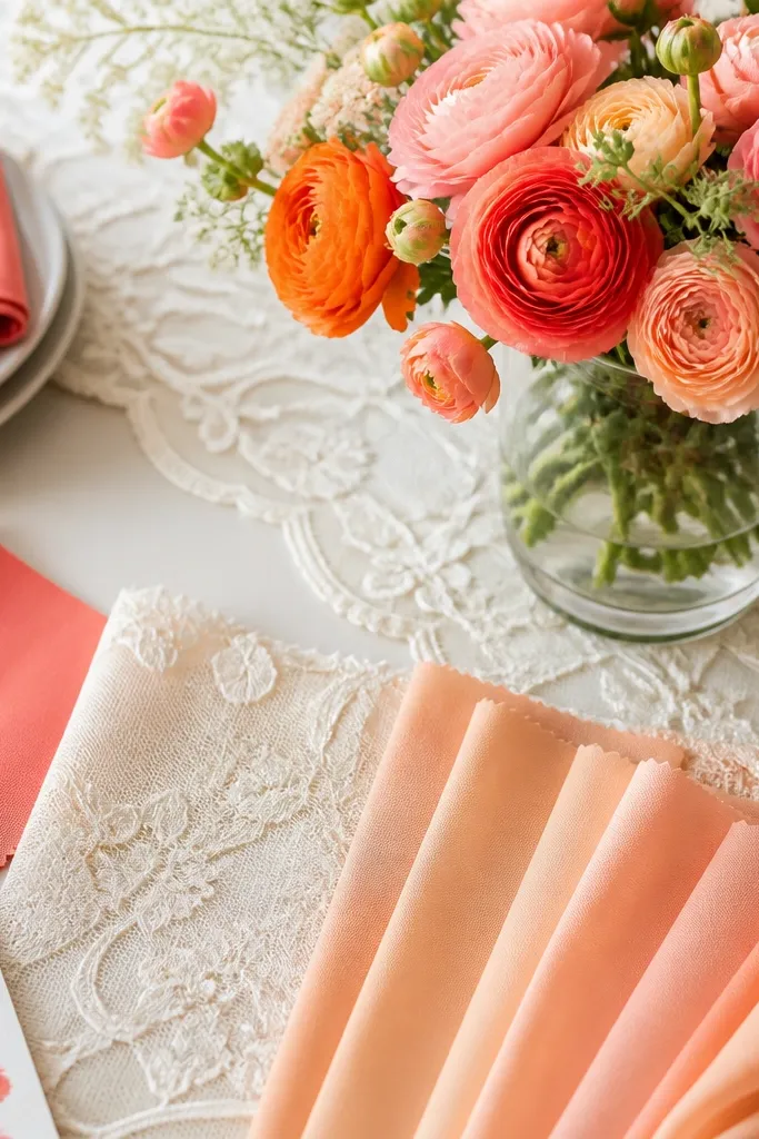
Coral and apricot create a lively gradient effect, while cream keeps the look breathable. It’s perfect for spring weddings that feel outdoorsy and joyful, especially with fresh flowers like ranunculus and tulips. Avoid pairing with harsh black; instead, use warm neutrals like ivory.
Good to knowKeep coral as 30-40% and use cream/ivory for the majority of the “background” elements to prevent overstimulation.
4. Lavender + Lilac + Silver (Soft, Dreamy, Not Pastel-Too-Much)
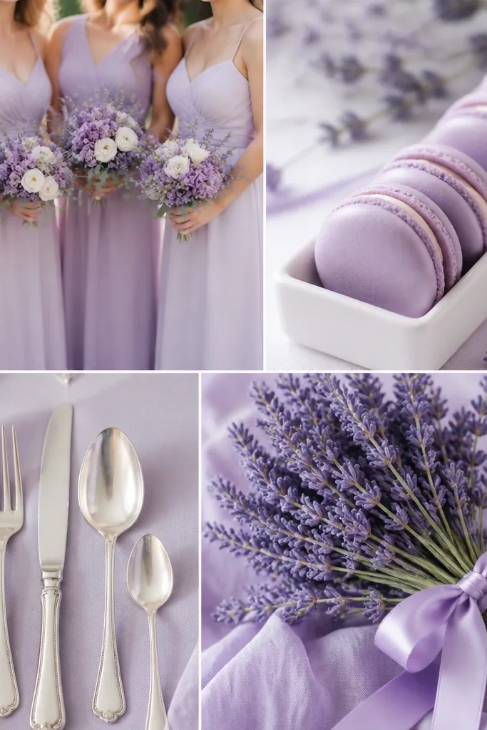
Lavender and lilac are close cousins, so the scheme looks cohesive without much effort. Silver adds sparkle in a way that doesn’t overpower the color story. Choose matte or lightly shimmering fabrics so the palette stays dreamy rather than “cotton candy.”
Good to knowUse one darker shade (lilac) for depth — like bridesmaid dresses or napkins — and keep lavender lighter for accents.
5. Emerald + White + Blush Pink (Spring Luxe with Contrast)
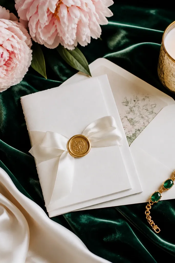
Emerald is richer than typical spring greens, so it reads “luxury” instantly. White prevents the palette from feeling heavy, and blush pink adds a flattering romantic echo. This works beautifully for both formal venues and garden spaces because the colors show up clearly in photos.
If emerald feels bold, start with it in smaller areas (florals, table runners) before you commit to full dress color.
6. Mint + Ivory + Light Tan (Fresh Coastal Spring)
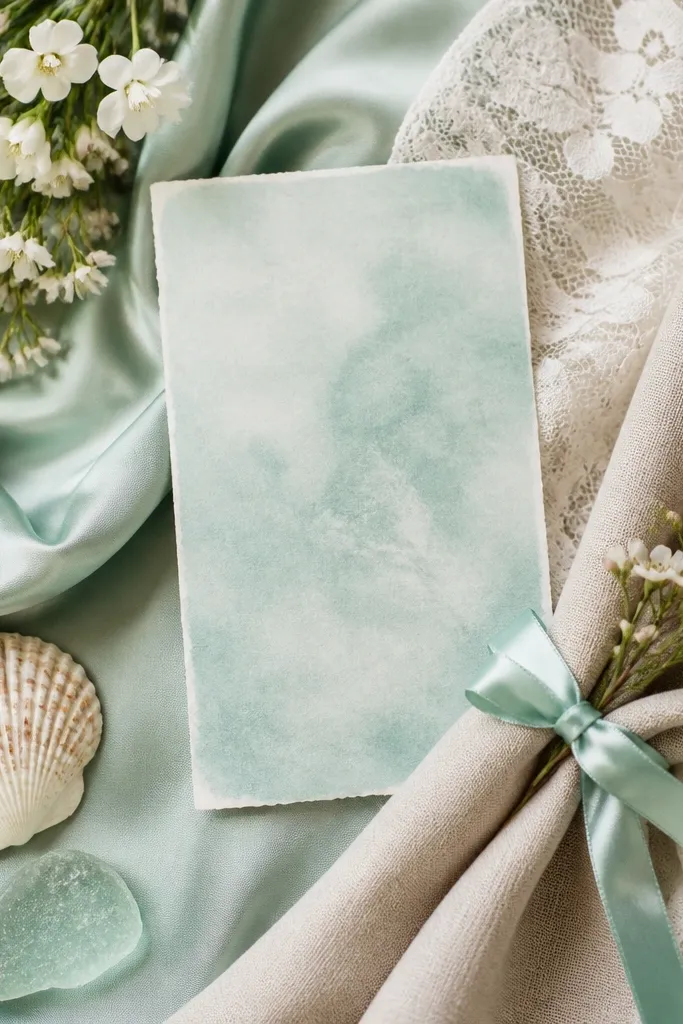
Mint is crisp and clean, and ivory keeps everything soft and bright. Light tan adds a “sun-warmed” neutral that makes mint look less stark. This palette is beginner-friendly because it’s forgiving in photos and pairs well with natural wood, rattan, and wicker.
Good to knowChoose mint that leans slightly green (not blue) so it matches most spring florals like sweet peas and baby’s breath.
7. Peach + Nude Rose + Gold Sand (Warm Romantic Spring)
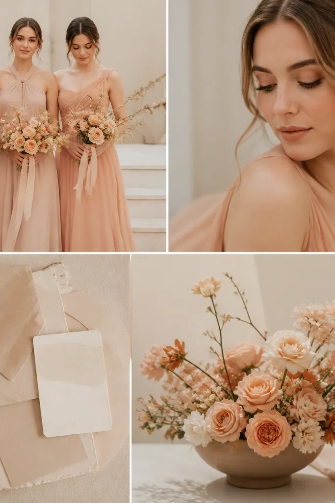
Peach and nude rose are extremely wearable, which makes this scheme easy for mixed skin tones in the wedding party. Gold sand (a muted beige-gold) ties in accessories without going too bright. Pair with peach roses, garden roses, and warm greenery for a naturally cohesive look.
Good to knowUse nude rose for a “bridge” tone between peach and neutrals so your scheme doesn’t look like two separate colors.
8. Butter Yellow + Soft Gray + White (Light + Modern Spring)
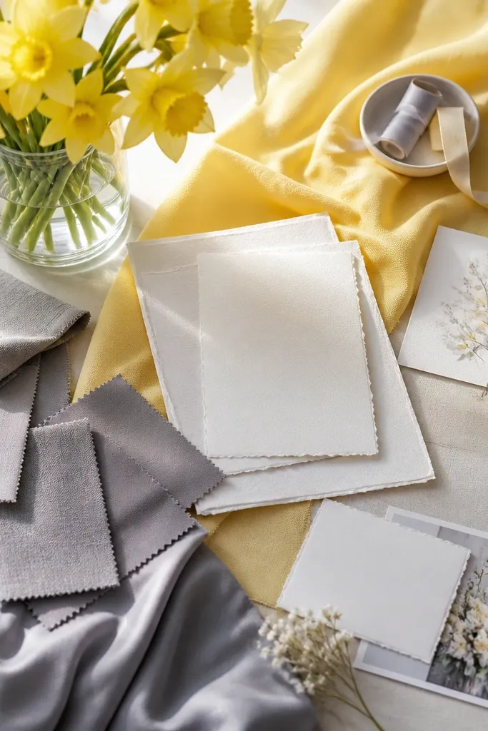
Butter yellow brings cheerful spring brightness, and soft gray adds a modern, calm counterbalance. White keeps the palette clean for invitations and ceremony backdrops. This scheme looks great in minimalist venues and photographs well because yellow stays vibrant without needing heavy saturation.
Good to knowChoose a butter yellow that’s slightly muted (not neon) so it doesn’t overpower the gray and white.
9. Teal + Cream + Copper (Statement Color, Easy Styling)
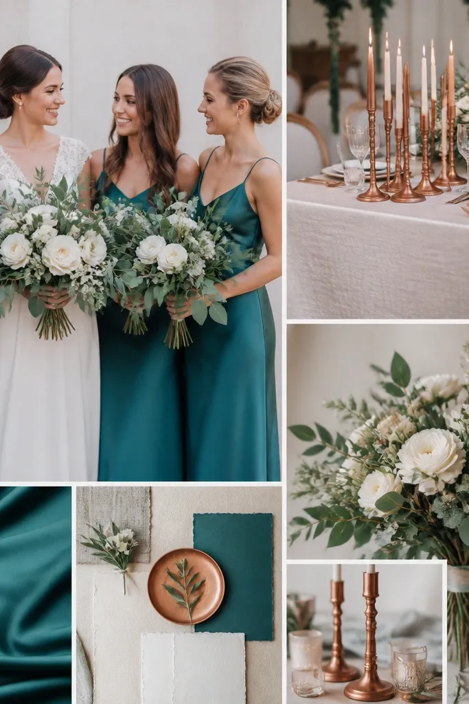
Teal reads like “spring evening” — stylish but still fresh. Cream keeps it bright and soft, while copper adds a warm metallic that complements teal’s green undertone. This palette works especially well with statement lighting, because copper reflects warm highlights.
Good to knowLimit teal to the most visible surfaces (dresses or main florals) and use cream everywhere else for balance.
10. White + Powder Pink + Soft Charcoal (Minimalist Spring Chic)
This scheme is for beginners who want “clean” without guesswork. Powder pink adds a hint of spring, while soft charcoal gives definition for signage and photo contrast. It’s especially flattering for modern venues, city weddings, and anyone who wants subtle color rather than loud palettes.
Good to knowUse charcoal for text, frames, and small accents — not large dress coverage — to keep it airy.
11. Rose Red + Blush + Leaf Green (Romantic + Botanical Pop)
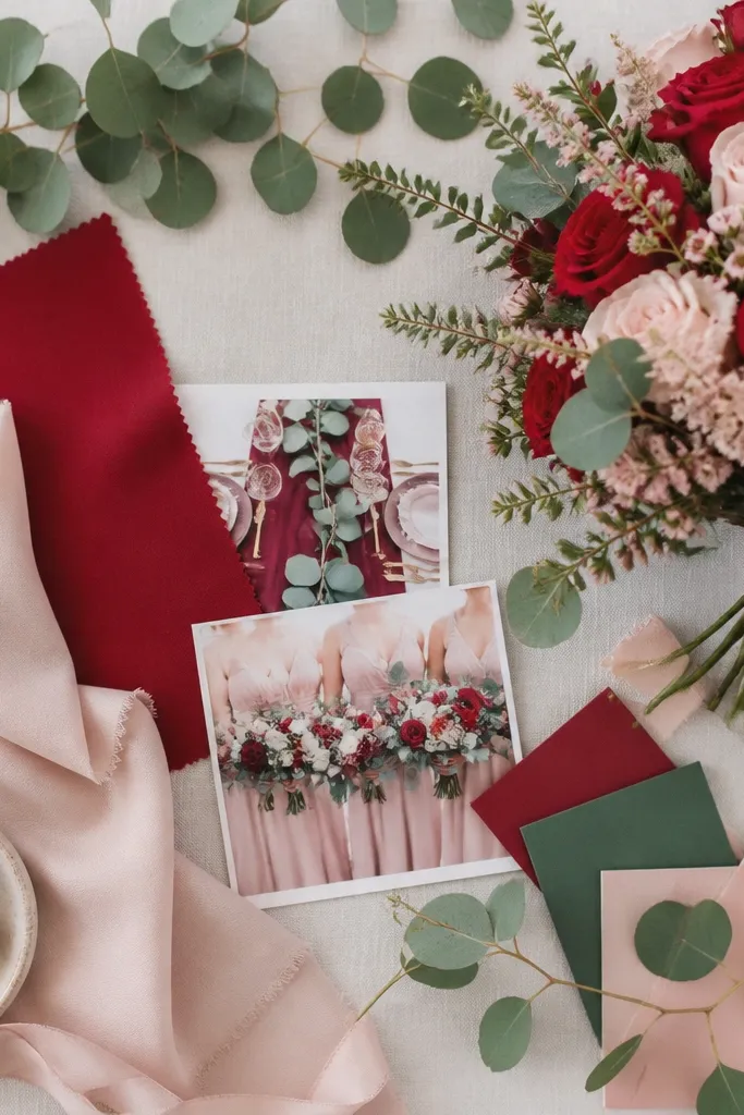
Rose red is a deeper spring romantic color that stands out without feeling heavy when paired with blush. Leaf green (more natural than sage) brings a botanical “fresh from the garden” vibe. This palette works well with eucalyptus, olive branches, and mixed greenery for texture.
Pick one red item to anchor the scheme (runner, bouquet focal, or invitation print) and keep the rest in blush/green for harmony.