1. Champagne Blush + Espresso + Soft Gold
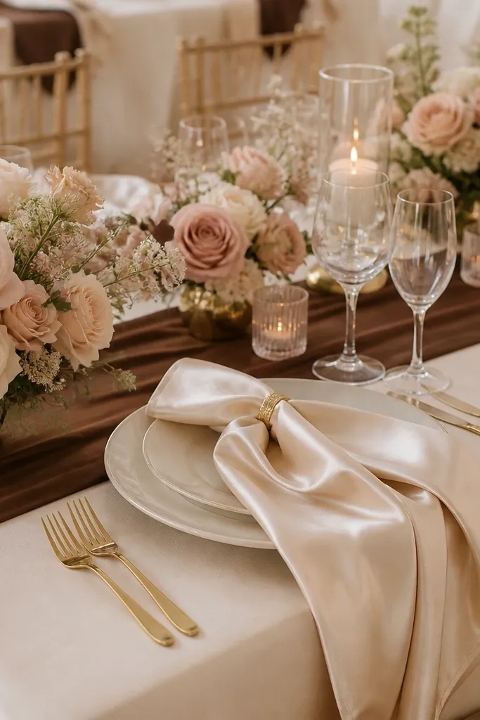
This scheme feels modern because the blush isn’t dusty — it leans creamy and bright. Espresso adds depth so the palette doesn’t wash out in daylight, and soft gold ties it all together without going too glam.
Choose one “anchor” fabric like satin (champagne) and repeat it in invitations or menu cards to make the palette look designed, not accidental.
2. Sage Green + Butter Yellow + Natural Linen
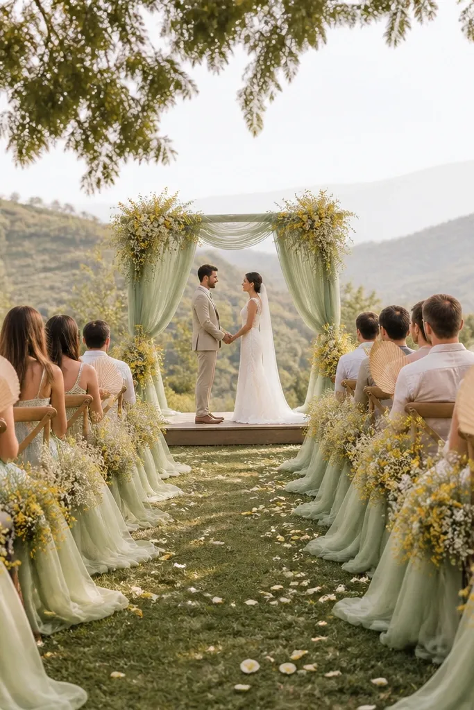
Sage and butter yellow create a fresh, modern spring vibe that photographs beautifully against wood, stone, and greenery. Linen keeps the palette grounded and makes the yellow feel softer instead of neon.
Good to knowUse matte textures (linen, cotton, cotton lace) for the yellow — glossy satin can make it look too bright in photos.
3. Dusty Rose + Terracotta + Antique Brass
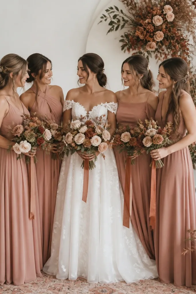
Terracotta adds a modern warmth that dusty rose alone can’t deliver. Antique brass keeps it elegant and vintage-leaning, which balances the earthy tones for a cohesive look.
Good to knowPick terracotta only as an accent (ceramics, napkins, or candle holders) so the rose remains the star.
4. Deep Navy + Powder Blue + Silver Mercury Glass
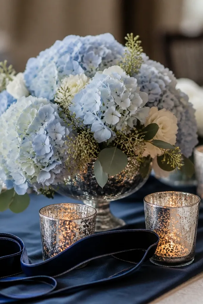
Navy makes everything feel instantly elevated, and powder blue adds a clean, modern pop. Silver mercury glass gives sparkle without the heaviness of full gold.
Good to knowIf your venue is bright, anchor the table with a navy runner to prevent the powder blue from looking washed out.
5. Emerald Green + Black Cherry + Gold Leaf
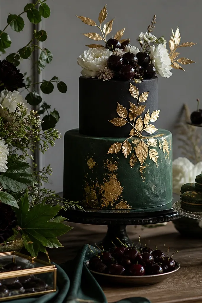
This palette is dramatic but still wearable because emerald is rich, not harsh. Black cherry adds a wine-like depth, and gold leaf (even sparingly) turns it into a modern luxe moment.
Good to knowUse gold leaf as a detail only — on signage corners, place card frames, or a single cake topper — to avoid looking overdone.
6. White + Soft Gray + Blush Pearlescent Highlights
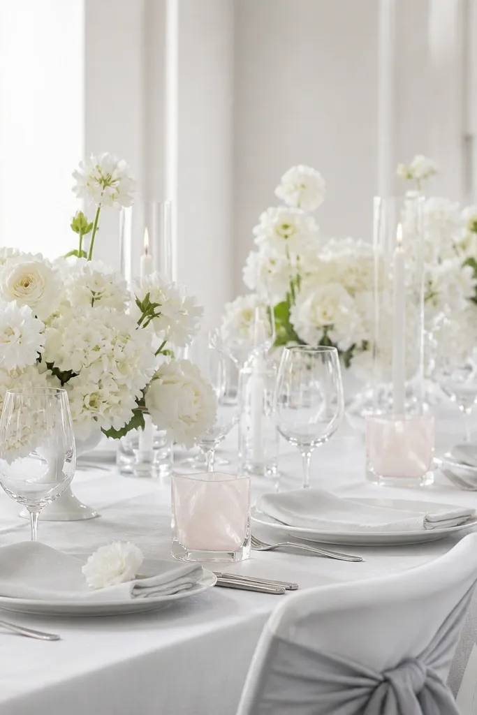
If you love clean, modern photos, this is your palette. The trick is adding pearlescent blush highlights so the gray doesn’t feel flat, especially in indoor lighting.
Good to knowStick to one “shine” element (pearlescent acrylic, satin shoes, or pearl jewelry) so the look stays sleek.
7. Terracotta Clay + Sage + Antique White
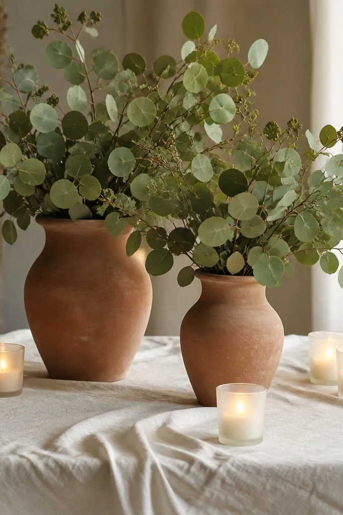
Terracotta clay plus sage creates a modern earthy palette that works for both garden and barn venues. Antique white keeps it airy, so it doesn’t feel too rustic-heavy.
Good to knowChoose eucalyptus or olive-green foliage to match the sage tone — it’s more forgiving than trying to match exact flower shades.
8. Coral Pop + Teal Depth + Matte Charcoal
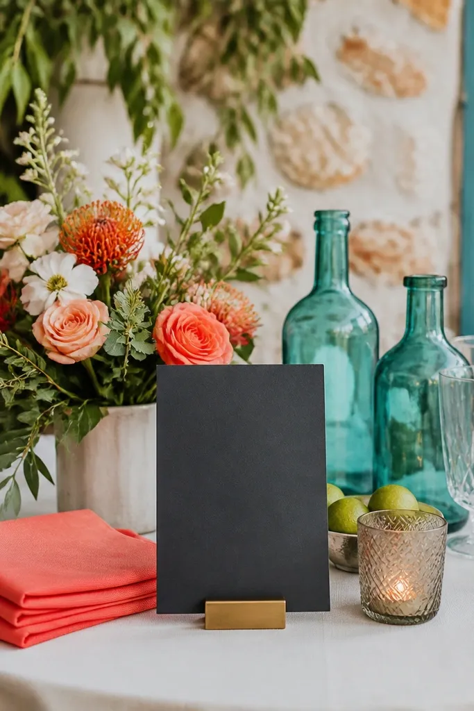
Coral and teal is bold, but matte charcoal makes it modern instead of beachy. Teal depth adds contrast that looks amazing in evening photos and helps coral read as a true pop color.
Good to knowLimit coral to 30-40% of the visual elements (napkins, blooms, or bridesmaid dresses) and let teal/charcoal do the grounding.
9. Lavender Haze + Smoky Mauve + Champagne
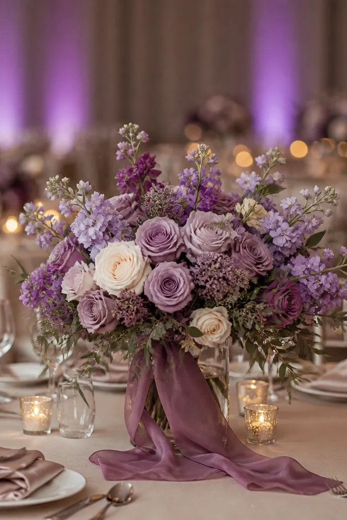
Lavender haze looks ethereal, but pairing it with smoky mauve keeps it mature and modern. Champagne linen warms the palette so it doesn’t look icy in winter lighting.
Ask your florist for “lavender-toned” varieties (not bright purple) so the flowers match the hazy vibe of the scheme.
10. Black + Ivory + Emerald Accent (Modern Minimal)
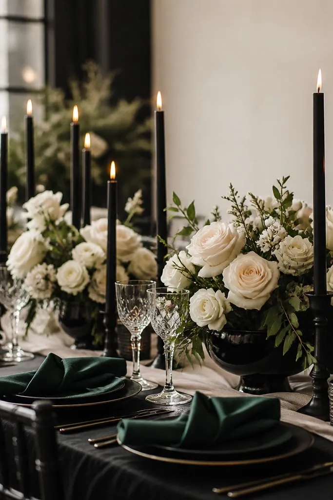
This is high-contrast and very Pinterest-worthy, but it stays modern because the emerald is used as a clean accent. Ivory keeps everything soft and romantic, preventing the black from feeling too severe.
Good to knowUse crisp, structured folds for napkins (or tailored fabric) — the sharpness makes the palette look intentional and luxe.