1. Champagne + Soft Blush + Cocoa (Warm “French Bakery” Luxury)
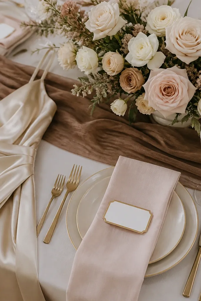
This scheme looks expensive because champagne and blush share warm undertones, while cocoa adds depth instead of harsh contrast. Use satin or crepe in champagne, then keep blush to sheer chiffon or matte crepe so it doesn’t look neon in photos. Add chocolate-brown accents only in small areas like menu cards, ribbon, or wooden frames.
Good to knowIf you’re unsure of the exact blush, choose “dusty blush” (more beige than pink) and test swatches next to your champagne fabric in daylight.
2. Dusty Rose + Ivory + Antique Gold (Old-Hollywood Soft Glam)
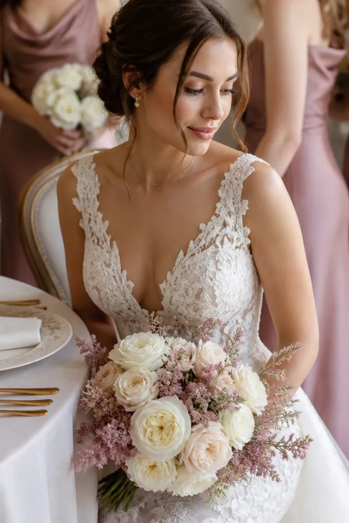
Dusty rose reads high-end when paired with ivory and muted metals. The key is “antique gold” (slightly darker, not bright yellow) because it harmonizes with the softness of dusty rose. For florals, mix ivory garden roses with dusty rose peonies or ranunculus to keep texture rich, not flat.
Good to knowFor invitation suites, use ivory cardstock and antique-gold foil, then limit rose ink to titles only.
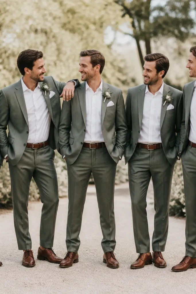
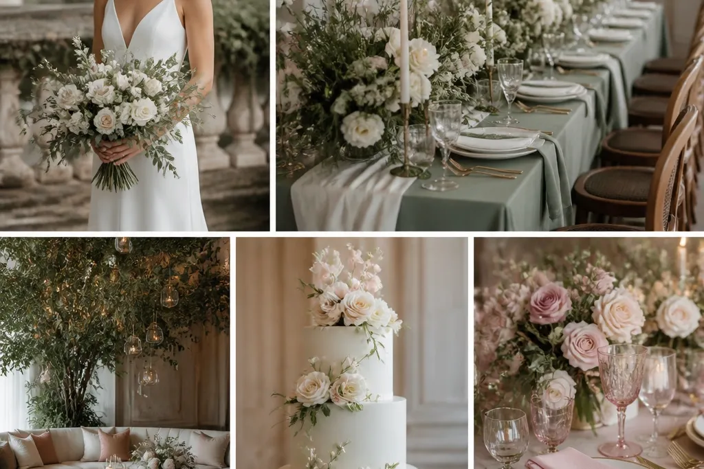
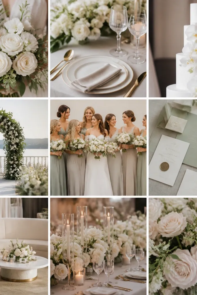
3. Sage Green + Ecru + Warm White (Modern Garden, Not Country)
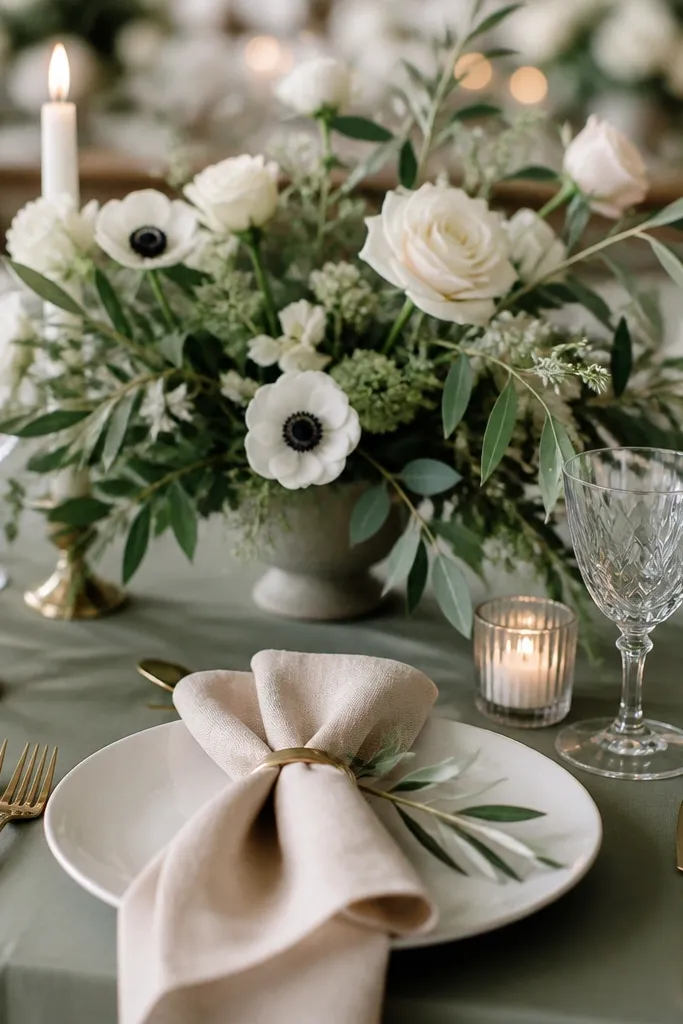
Sage + ecru creates that “calm luxury” vibe because both are muted and naturally flattering to skin tones. Warm white candles and cream flowers prevent the palette from looking too earthy or rustic. Keep sage in matte fabrics (cotton sateen, crepe) and avoid neon greens.
Choose one sage item to lead (tablecloth or dresses) and keep everything else ecru/white to prevent color overload.
4. Steel Blue + Pearl Grey + White (Cool-Toned Editorial Chic)
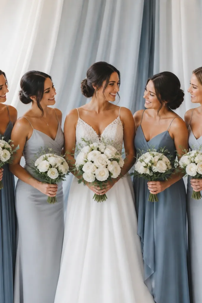
This palette looks expensive because steel blue is bold but controlled, and pearl grey softens it. In photos, the contrast feels tailored when the neutrals are “pearl” (slightly warm/soft) rather than stark gray. Use white florals with cool undertones like white anemones or calla lilies to keep the look crisp.
Good to knowMatch your metal choice: silver or brushed nickel works best with steel blue and pearl grey.
5. Emerald + Ivory + Black Tea (Jewelry-Box Rich)
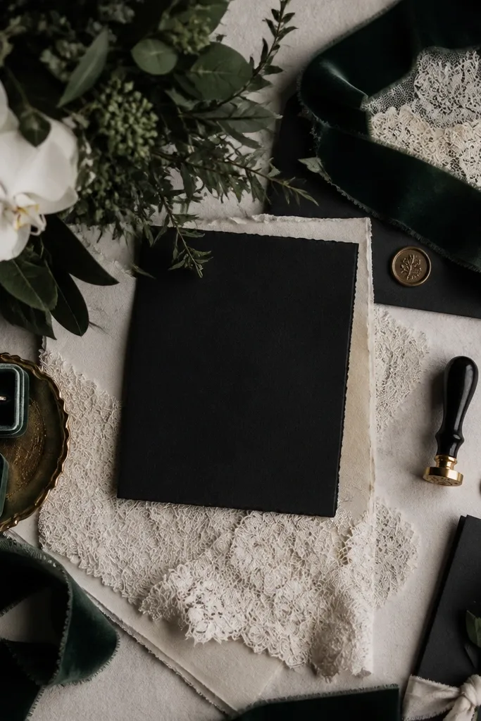
Emerald looks lush when it’s paired with ivory and a dark neutral that isn’t pure black. “Black tea” stationery (charcoal-brown) adds sophistication without making the palette feel goth. Velvet and satin amplify emerald’s depth, especially in evening lighting.
Good to knowKeep emerald to 40-50% of the visuals and let ivory do the balancing so the palette stays elegant, not heavy.
6. Marigold + Cream + Terracotta (Sunlit Mediterranean Luxe)
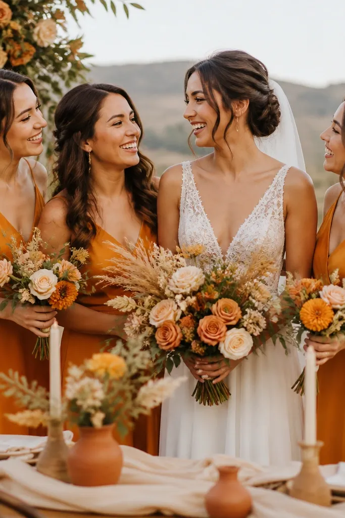
Marigold can look expensive when it’s paired with cream (not white) and terracotta for a grounded, sun-warmed harmony. This color story flatters golden-hour photos because all tones sit in the warm spectrum. Use matte fabrics and textured elements like dried wheat or olive branches to add depth.
Avoid pairing marigold with icy blues — instead, choose warm browns, creams, and terracotta for a cohesive luxury look.
7. Blush Lilac + Soft Grey + Porcelain White (Romantic “Designer” Pastels)
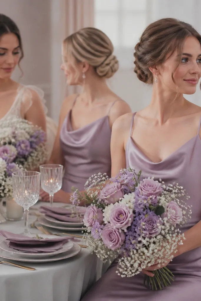
Blush lilac is a “pretty but grown-up” color when balanced with soft grey. Porcelain white keeps the scheme bright without turning it into a bubblegum palette. For florals, use lilac-toned sweet peas or hydrangea mixes and keep the white elements airy for an expensive, light feel.
Use grey in small doses (linens, signage, napkin bands) so lilac stays the hero.
8. Black + Ivory + Dusty Plum (Modern Luxe Contrast)
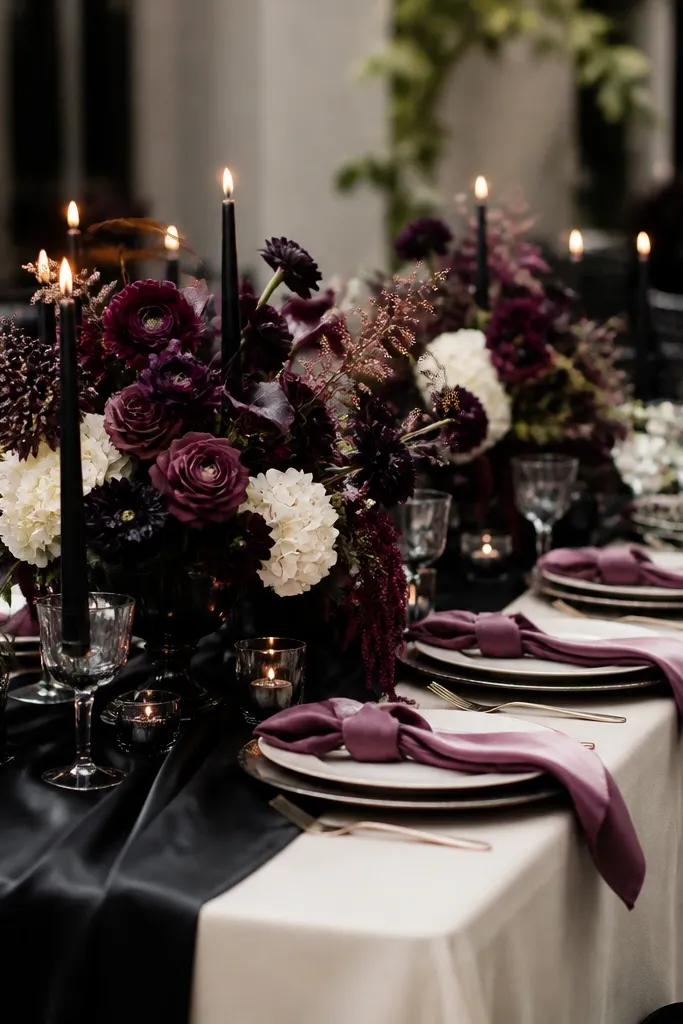
High-contrast palettes look expensive when the dark color is softened with a muted accent. Dusty plum adds romance to black without losing the sleek feel. Choose ivory in lace or textured fabric so it reads rich against black, especially in indoor lighting.
Good to knowFor centerpieces, combine deep plum blooms with ivory flowers so the arrangement shows dimension instead of looking one-note.
9. Teal + Seafoam + Pearl White (Coastal, But Elevated)
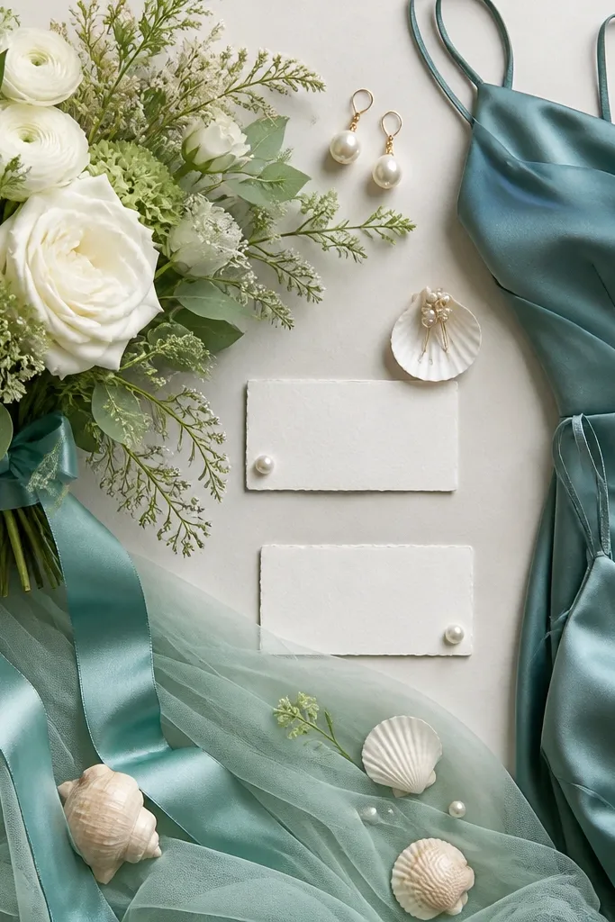
Teal reads luxurious when it’s paired with seafoam (a softer green-blue) and pearl white. This keeps the palette from looking like a beach theme, and instead feels like a resort editorial. Use tulle or chiffon for seafoam so it catches light gently in photos.
Add pearl or mother-of-pearl details to invitations and signage for a “costume jewelry” expensive effect.
10. Rose Quartz + Blush Nude + Gold-Leaf Cream (Soft Glam Without the Glitter)
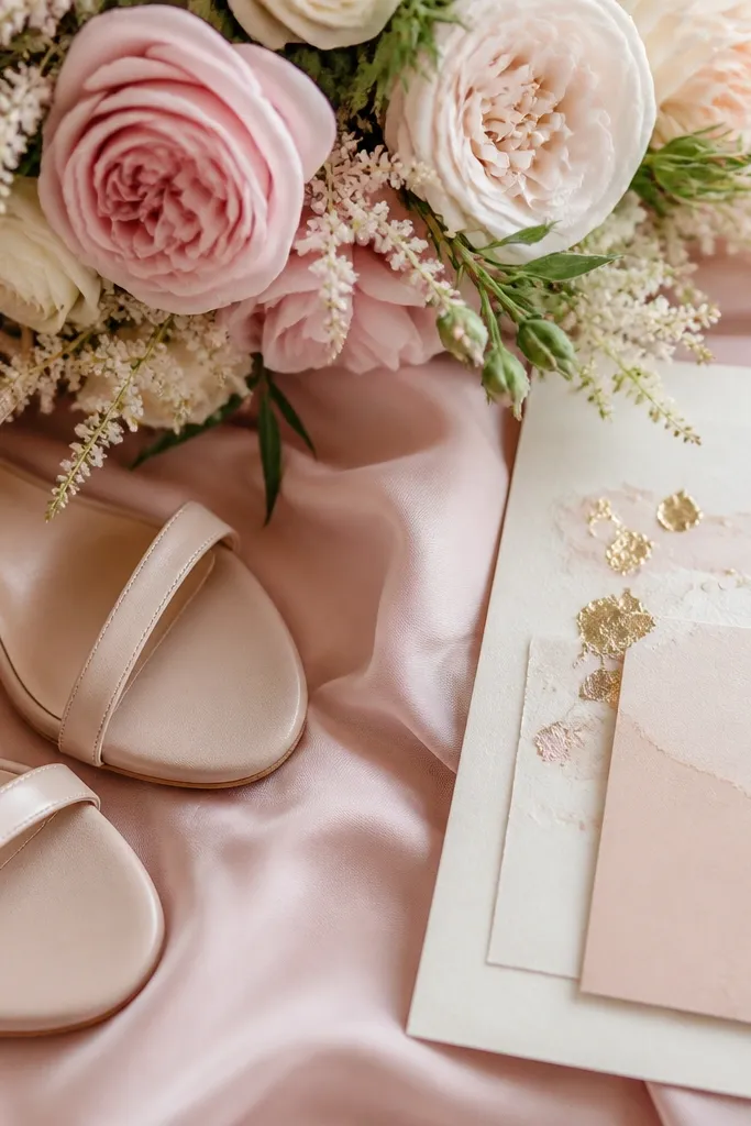
Rose quartz is stunning when it’s muted and combined with blush nude neutrals so it doesn’t look like a candy pink. Gold-leaf cream paper elevates the palette instantly because the warmth matches rose quartz undertones. Keep metallics to paper, frames, or hair accessories, not everywhere, to avoid a “crafty” look.
Good to knowPick one gold texture (foil, embossed, or leaf) and repeat it across invitations, place cards, and signage for cohesion.