1. Blush + Champagne Dress Swap (Warm-Tone Rescue)
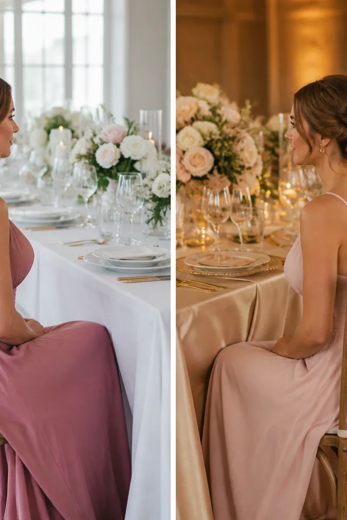
The “before” look feels flat because dusty rose can skew cool under daylight, while cool linens pull the whole scheme gray. The “after” uses blush paired with champagne satin details — warm neutrals make the palette look richer without adding new colors.
If your wedding is in daylight, choose warm neutrals (champagne, ivory, warm beige) and avoid pure cool-white linens with blush-heavy palettes.
2. Navy + Gold Accent Instead of Silver (Photo Glow Fix)
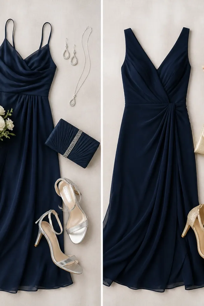
Silver accents can make navy look harsher and slightly green in camera. Swapping to gold (especially brushed or matte gold) warms skin tones and makes navy read crisp, not cold. It’s a simple transformation that shows up instantly in wedding photos.
Good to knowPick one metallic and commit — if your palette includes navy, choose gold or champagne metallics over silver for clearer skin tones in pictures.
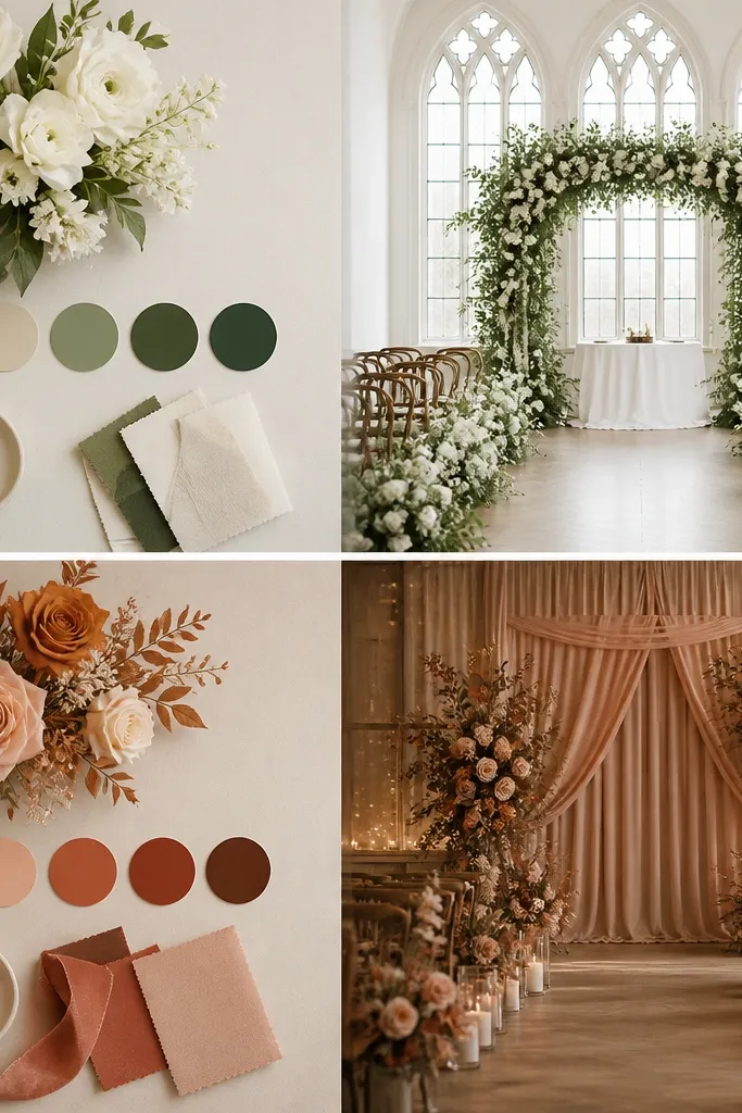
3. Canyon Terracotta with Cream (Stop the Orange Overload)
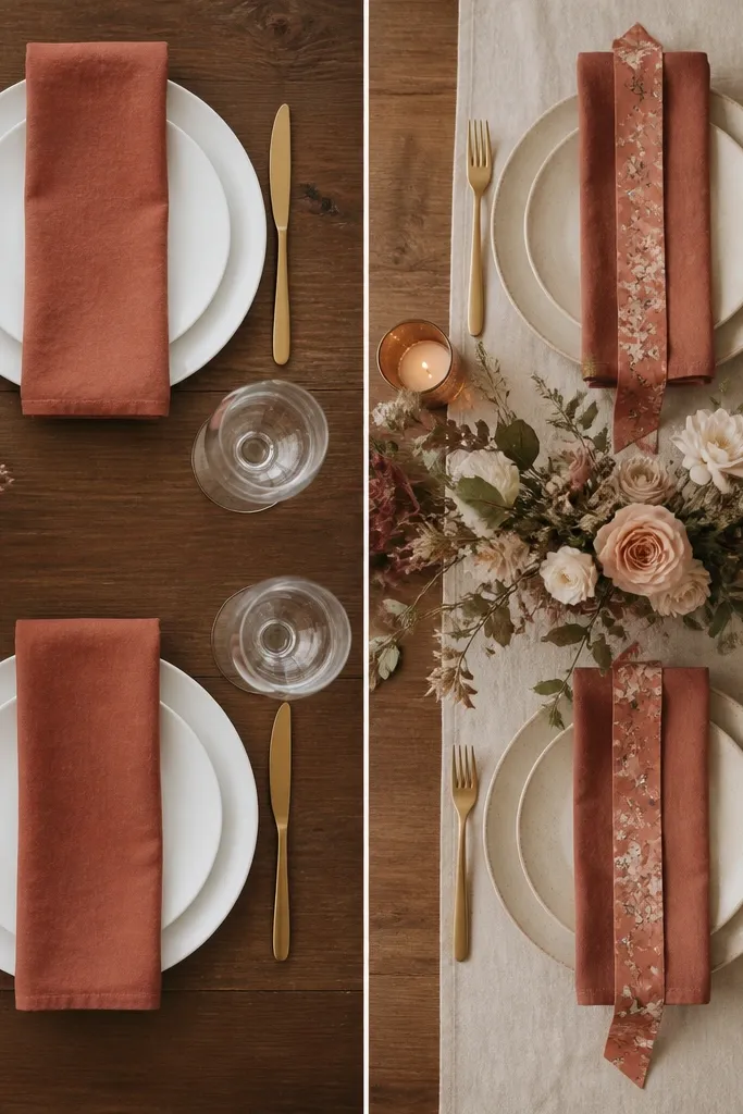
Terracotta can go “too orange” when paired with stark white. The “after” balances it using cream — it softens the color and keeps terracotta earthy instead of loud. This also makes florals look more natural because stems stay warm, not icy.
For terracotta schemes, replace bright white with cream or oatmeal in at least one visible element (runner, signage backing, or table linens).
4. Dusty Mauve + Cocoa (The Cozy Neutral Upgrade)
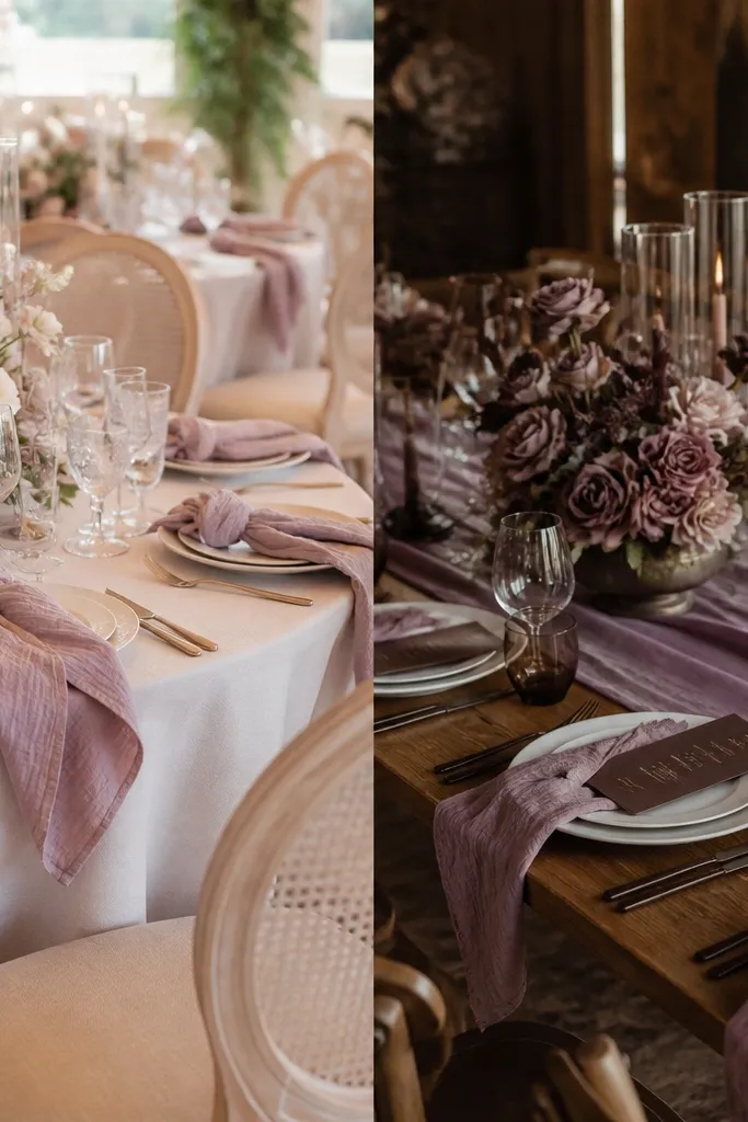
When mauve is the hero but neutrals are too light, it can look slightly washed out. Adding cocoa-brown anchors deepens the palette and gives the mauve room to shine. It also creates contrast that looks expensive in close-up photos.
Good to knowAdd one cocoa element within arm’s reach of the camera — menu cards, a clutch, or a ribbon on the bouquet.
5. Evergreen + Ivory Florals (Cool-Green Consistency)
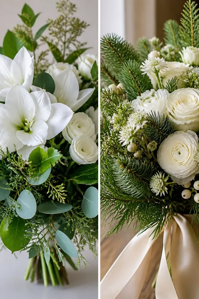
Mixed greens often include yellow-leaning types that fight with evergreen. The “after” keeps the green family consistent by pairing evergreen foliage with ivory blooms — the scheme stays cool and cohesive. In photos, evergreen looks richer and less “chartreuse.”
When ordering flowers, ask for a “cool green” mix and specify ivory (not bright white) for the main petals.
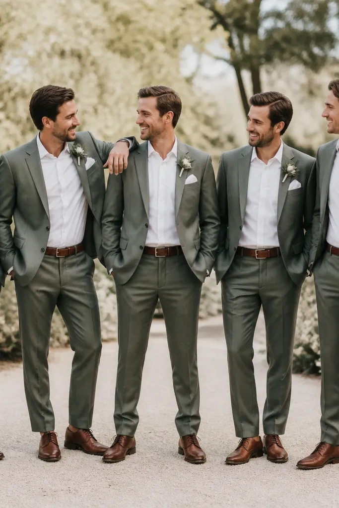
6. Sage + Soft Gray (Calm Color Temperature Matching)
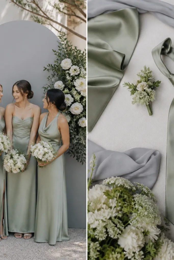
Sage can look muddy if paired with overly blue gray. The “after” chooses soft gray with a hint of warmth, and adds a small sage satin detail so dresses and décor agree. The result is calm, airy, and flattering.
Good to knowUse fabric-to-fabric matching: hold your sage swatch next to the gray fabric under the same lighting as your venue photos.
7. Rose Pink + Warm Taupe (Fixing the “Bubblegum” Problem)
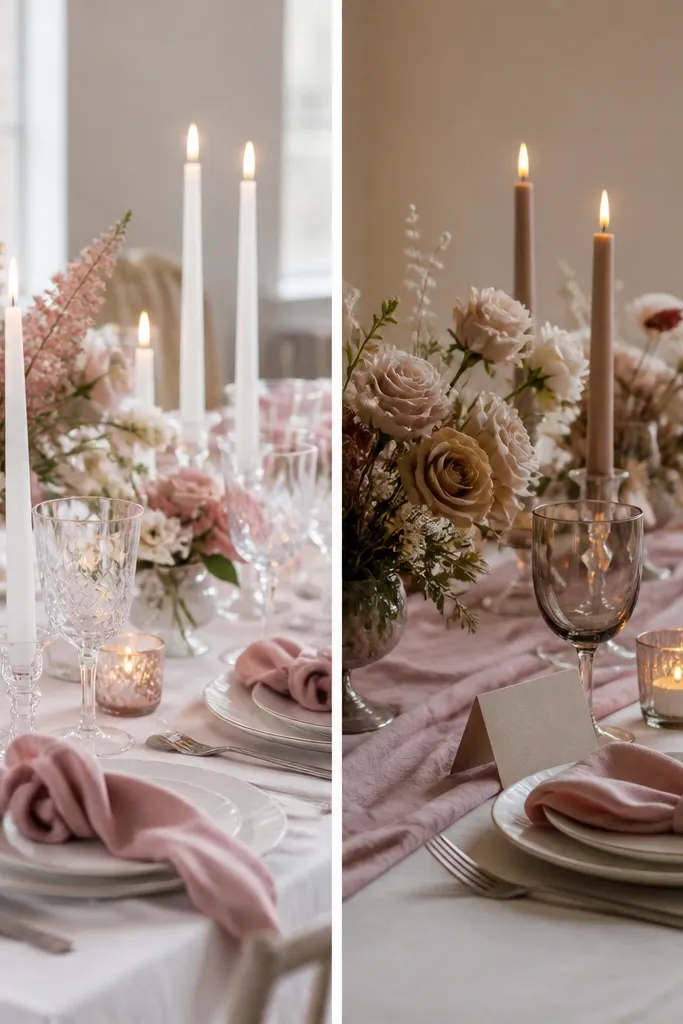
Bright rose pink can read like “bubblegum” when surrounded by stark whites. Warm taupe neutralizes the intensity and gives the pink a more romantic, grown-up feel. This is a palette correction, not a brand-new theme.
Good to knowIf your pink feels too loud, replace one bright-white element with warm taupe (candles, place cards, or chair sashes).
8. Black + Blush (Modern Contrast Without Harshness)
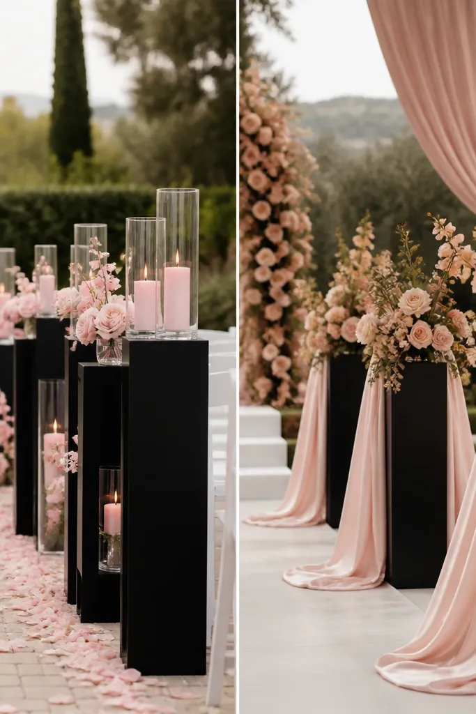
Black can look severe if the blush is too pale or cool. The “after” uses blush satin and warm blush florals so the contrast feels chic, not jarring. It also improves depth in photos because satin catches light softly.
Add satin or silk-look fabric in blush — matte blush can look flat next to black.
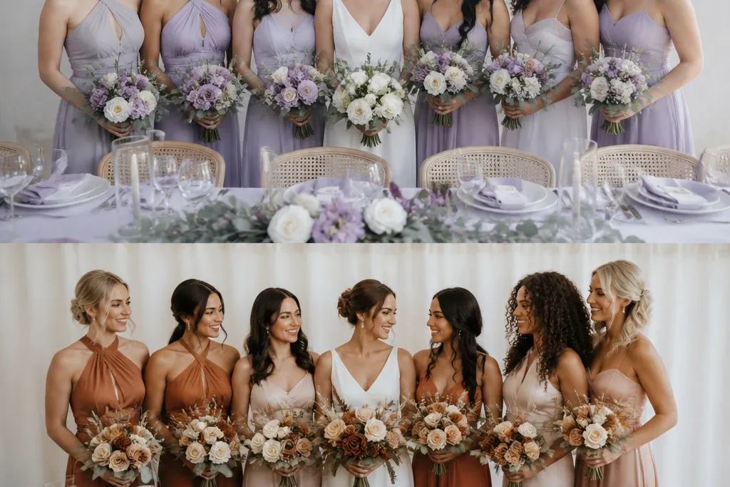
9. Royal Purple + Cream (Richness Boost, No Neon)
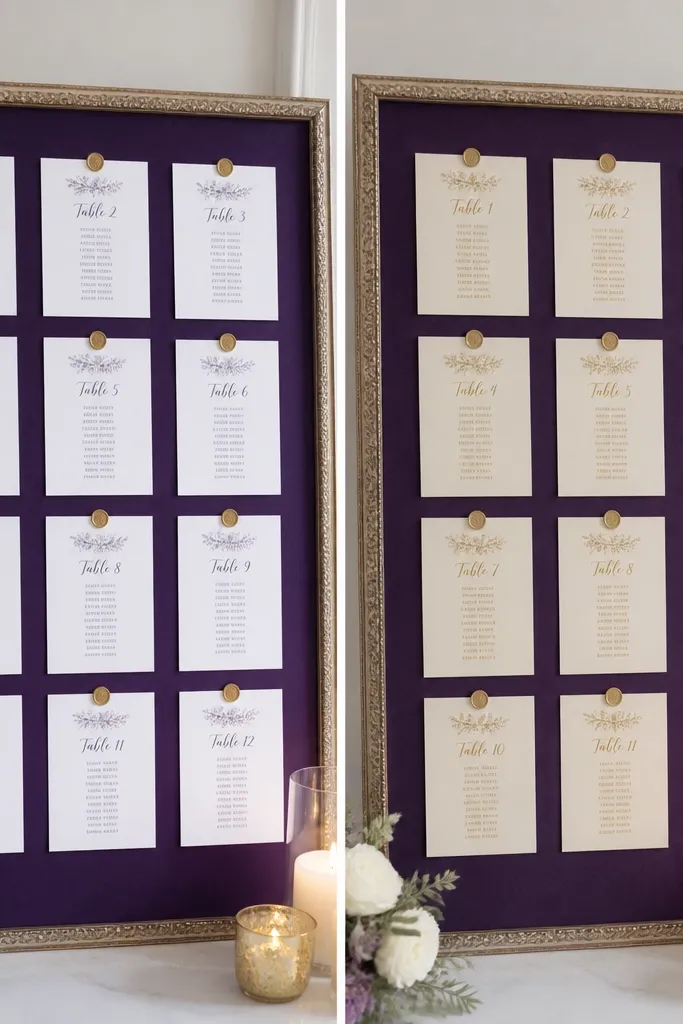
Royal purple becomes neon-ish when paired with bright white paper. Cream cardstock and warm neutrals make it look regal and photo-friendly. Plus, cream gives skin tones a warmer glow when guests pose near table signage.
Good to knowPrint or buy cream cardstock (not white) for signs to keep purple deep and flattering.
10. Teal + Oyster (Sea-Glass Palette That Reads Clean)
Teal can look too cold next to icy whites, making the whole palette feel sharp. Oyster beige smooths the contrast and keeps teal looking “sea glass” instead of industrial. This combo also helps florals look cohesive because stems don’t compete with table colors.
Choose oyster or warm beige for tablecloths, and use teal as the only bold color in that area.
11. Monochrome Rose + Layered Texture (Depth Upgrade)
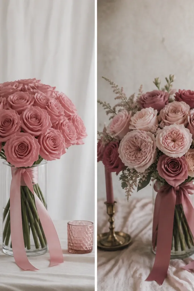
A single-color scheme can look “samey” because everything absorbs light similarly. The transformation is texture — mix matte crepe, satin accents, and darker rose ribbon so the palette feels dimensional. In photos, layered texture reads as luxury even when colors are limited.
Good to knowIf you’re doing one color, add at least two finishes: satin + matte, plus one deeper shade ribbon for contrast.