
1. Blush + Warm Champagne (no pink-on-pink overload)
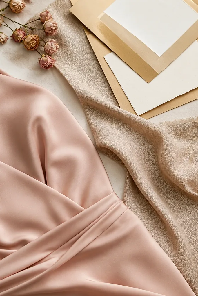
Blush can go cool (rosy) or warm (peachy). Pairing it with warm champagne keeps the entire scheme cohesive and flattering for most skin tones, especially in indoor lighting. The gold accents add warmth without turning everything orange.
Good to knowBuy or borrow two fabric swatches — one blush and one champagne — then hold them next to your face in the same lighting as your venue.
2. Sage + Ivory + Antique Gold (the “green that reads soft” combo)
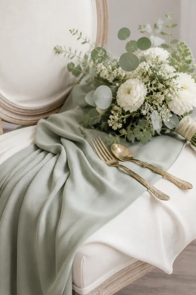
Sage looks expensive when it’s paired with true ivory (not stark white). Antique gold is less harsh than bright yellow gold, so the color stays muted and romantic. This scheme also photographs well because the green is low-saturation.
Avoid pairing sage with pure black or neon accents — keep contrast through textures, not electric colors.
3. Dusty Rose + Cocoa Brown (rich, not muddy)
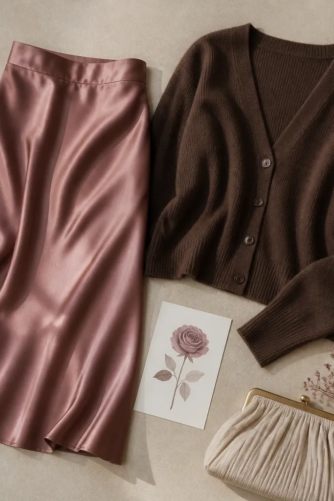
Dusty rose has enough gray to feel vintage, but it can turn flat if you add too many cool grays. Cocoa brown brings warmth and depth so the palette looks intentional. This color story works especially well for fall and venues with wood tones.
Good to knowIf your rose looks gray in photos, swap one element to a warmer texture (knit, leather, suede) instead of changing the whole palette.
4. Navy + Powder Blue + Silver (cool-toned, crisp photos)
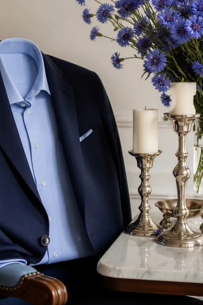
This is a classic cool scheme that avoids the “blue that turns purple” issue by keeping undertones aligned. Powder blue reads bright without stealing attention from navy. Silver accents keep everything crisp rather than warm-gold orange.
Choose one metal direction — silver or gold — and keep it consistent across stationery, jewelry, and décor.
5. Terracotta + Soft Cream + Olive (earthy without looking like a theme park)
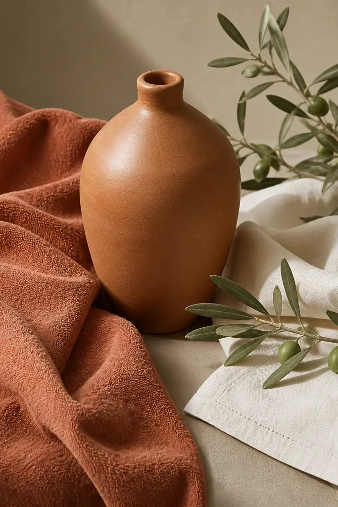
Terracotta can look orange if it’s too saturated. Soft cream balances it and olive adds depth without making the palette too dark. The result feels earthy and elevated, not overly themed.
Good to knowUse cream (not bright white) and keep terracotta as the hero color — everything else should support, not compete.
6. Emerald + Ivory + Deep Teal (the “one jewel, not three jewels” rule)
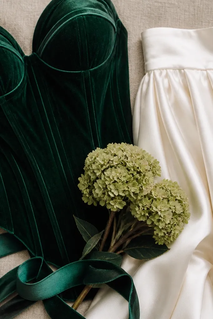
Emerald is the hero; deep teal is the supporting shade. When you add multiple competing jewel tones, skin and fabrics can look chaotic in group photos. Ivory keeps the palette bright and prevents the greens from absorbing light.
If you want both emerald and teal, limit the teal to ribbon, accents, or smaller décor pieces.
7. Black + Rose Quartz + Clear Glass (modern contrast that stays elegant)
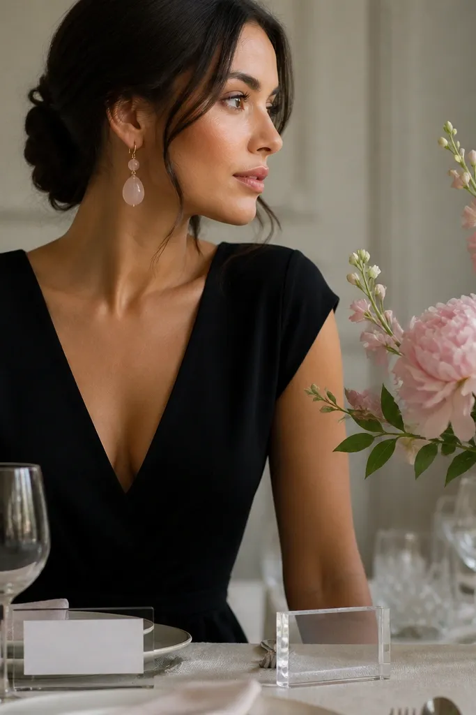
Black makes rose quartz pop, but it can feel harsh if the pink is neon. Choose rose quartz tones (soft, milky pink) and let clear glass replace heavy metallic décor. This keeps everything sleek and photo-ready.
In your venue lighting, check how the pink looks — if it turns too bright, swap to a dusty or milky pink fabric.
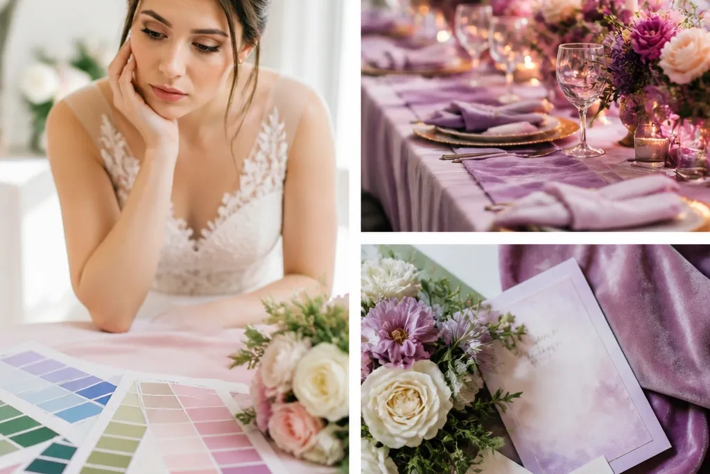
8. Lilac + Light Grey + Silver Pearl (pastel that doesn’t wash out)
Lilac can wash out under cool overhead lighting, so pairing it with light grey adds structure. Silver pearl details reflect light softly, keeping the scheme airy but not flat. This is a great option for spring weddings that still want sophistication.
Good to knowUse matte fabrics for base colors (grey, lilac) and add shine only through small accents like jewelry or satin bows.
9. Hot Coral + Ecru + Gold (bright scheme without overpowering)
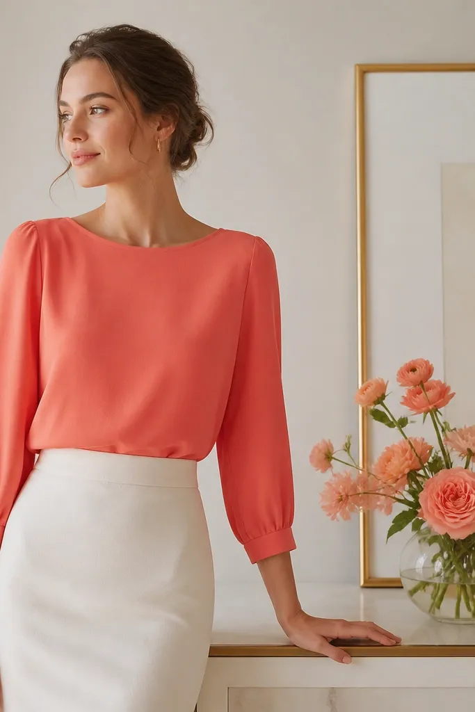
Hot coral is bold, but it needs a neutral that’s warm and textural. Ecru keeps it classy and prevents the coral from turning “salmony” in photos. Gold ties it together and makes the palette feel celebratory.
If coral feels too intense, reduce it by 50% — use coral only on one main area (bridesmaids or florals), not everywhere.
10. Cream + Terracotta Stripe + Greenery (pattern-led color schemes)
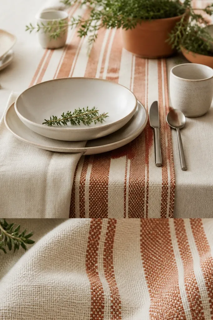
When people pick solid colors only, the palette can look boring. A stripe pattern gives you built-in harmony: the cream neutral becomes your base, terracotta provides warmth, and greenery ties it to the venue. This also hides minor color mismatches because the pattern “bridges” shades.
Good to knowIf you use a pattern, keep the rest of the palette solid and choose colors pulled directly from the pattern.