1. Blush + Warm Ivory with Champagne Metallic Pops
Blush and warm ivory read romantic and expensive because they sit close together on the color wheel. Add champagne metallic (candles, frames, or flatware) to create that luxe “glow” in photos without needing pricey floral volume. This scheme is forgiving on skin tones — it flatters both warm and cool complexions.
Buy napkins and/or a table runner first in blush and ivory — then match signage paper and favor tags to those exact shades.
2. Dusty Rose + Mauve Bridesmaid Dresses, One Neutral Table
If you want a “tonal” wedding with minimal shopping, go dusty rose + mauve. Instead of searching for rare flowers, use faux or seasonal blooms in similar tones — your eye blends them into one cohesive story. Keeping the table mostly cream or oatmeal prevents the palette from looking muddy.
Good to knowChoose a mauve fabric swatch (from an online swatch set or a fabric store) and use it to guide floral and candle colors.
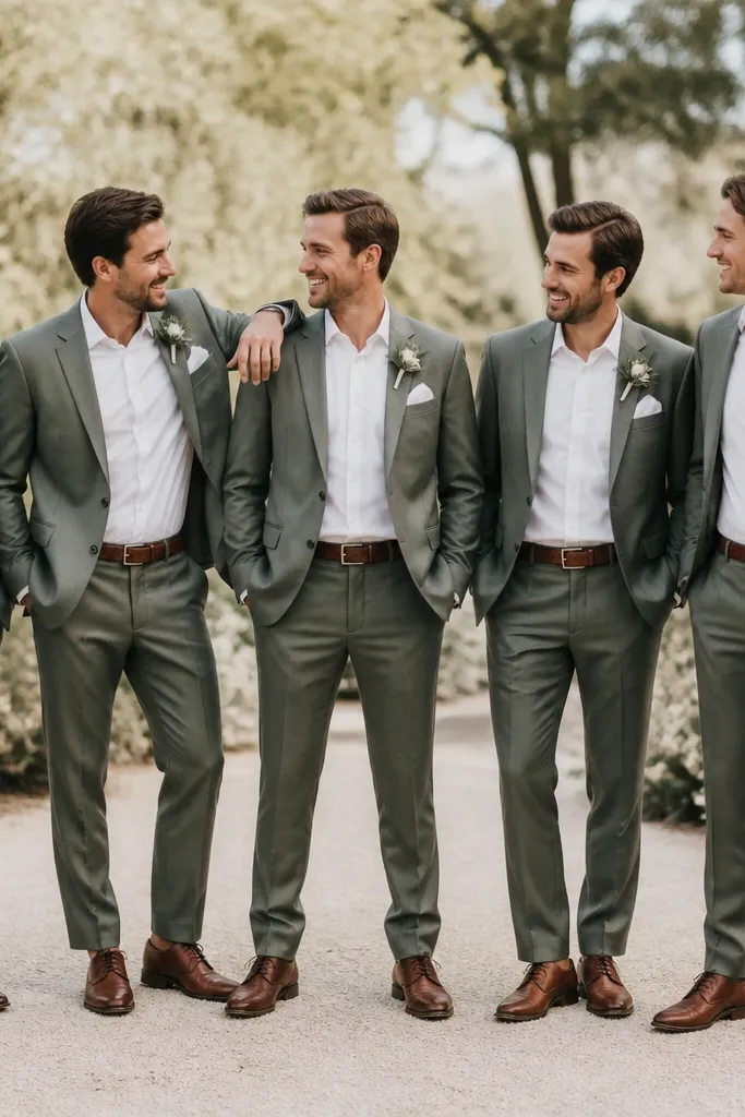
3. Sage Green + Oat Milk (Perfect for Garden Vibes)
Sage + oat milk looks fresh, modern, and budget-friendly because greenery and neutral ceramics are easy to source. You can build the scheme using potted herbs, eucalyptus-like faux stems, or even store-bought craft greenery. The oat neutral makes the greens look intentional instead of “random garden.”
Good to knowUse glass bottles or jars as vases — fill them with greenery sprigs and a few white blooms for a high-end look at low cost.
4. Navy + Soft White + Silver Accents (Coastal Meets Classic)
Navy is one of the best budget wedding colors because it hides stains and looks crisp on camera. Pair it with soft white (not bright optic white) to keep it warm. Silver accents (foil balloons, frames, or metallic candle sleeves) give you contrast without needing elaborate florals.
Good to knowFor instant cohesion, pick one navy textile — a runner or napkin set — and repeat it across signage and menus.
5. Terracotta + Cream + Burnt Orange (Warm Boho on a Budget)
Terracotta and cream create that “sunset” look without needing expensive flower varieties. Use burnt orange for depth in bouquets and centerpieces, then keep the base neutral so the palette feels curated. Terracotta ceramics and woven textures make it feel boutique even with simple greenery.
Good to knowShop online for terracotta-inspired ceramics and use them as your centerpiece “hero” instead of large floral arrangements.
6. Olive Green + Black + Gold (Minimal, Luxe, and Clean)
This scheme looks expensive because it’s high-contrast and minimalist. Olive provides warmth, black adds drama, and gold ties everything together. You don’t need lots of flowers — a few olive branches and white filler blooms can look intentional when the rest of the styling is clean.
Good to knowChoose matte black accents (candles, frames, menus) and keep your florals mostly white + olive for a sharp look.
7. Coral + Blush + Peach (Photo-Friendly Summer Glow)
Coral schemes are budget-friendly because they read vibrant even with smaller bouquets. Pair coral with blush and peach so it looks layered instead of one-note. The key is balancing saturation: keep the tablecloth light (blush/cream) and add coral only through napkins, flowers, and signage.
Buy a coral ribbon and use it on programs, aisle markers, and favor boxes — one item builds the whole theme.
8. Dusty Blue + Silver Gray + White (Winter or Coastal Cool)
Dusty blue plus silver-gray creates a soft, icy vibe that still feels romantic. This works especially well for winter weddings because many winter florals and greenery look naturally “cool-toned.” Use white flowers as the base so the blue doesn’t get overwhelmed.
Good to knowSearch for “frosted” or “iridescent” candle holders — the shine mimics expensive winter decor.
9. Purple Lilac + Lavender + White (Soft, Budget-Friendly Romance)
Lilac and lavender look elegant without requiring deep jewel tones. Keep white as the anchor so the palette stays airy. For budget flowers, use a mix of purple-toned blooms (real or faux) and add texture with greenery or light-colored filler flowers.
Use one shade of purple for linens and another for florals — it adds dimension without doubling your shopping list.
10. Blackberry + Cream + Rose Gold (Modern Berry Glam)
Berry colors can look pricey because they’re rich and dramatic on camera. Blackberry with cream keeps it balanced, and rose gold adds a warm metallic that flatters skin tones. You can keep flowers smaller and rely on deep-toned napkins and votives for the “wow.”
Good to knowPick rose-gold accents first (candles or charger plates) — then match your berry shade to the metallic undertone.
11. White + Sage + Gold Foil (Minimal Garden Luxe)
If you love clean design, white + sage + gold foil is one of the cheapest ways to look luxe. Gold foil details (printable invites, menus, or sticker labels) read high-end instantly and don’t require heavy decor. Sage greenery can be DIY’d with store-bought sprigs and simple placement.
Create a “foil moment” — one place where gold is used repeatedly (menus, table numbers, signage).
12. Charcoal + Blush + Clear Acrylic (Modern Glam Without the Bulk)
Charcoal and blush give you modern romance, and clear acrylic pieces make the table feel airy. This scheme is budget-friendly because you can use fewer flowers — the color contrast and acrylic shine do the heavy lifting. Add a couple of textured elements (blush satin napkins or a matte runner) to keep it from looking flat.
Good to knowIf you can only buy one “extra” item, choose clear acrylic table numbers or place card holders.