1. Blush + Champagne + Soft Gold (Warm Light Friendly)
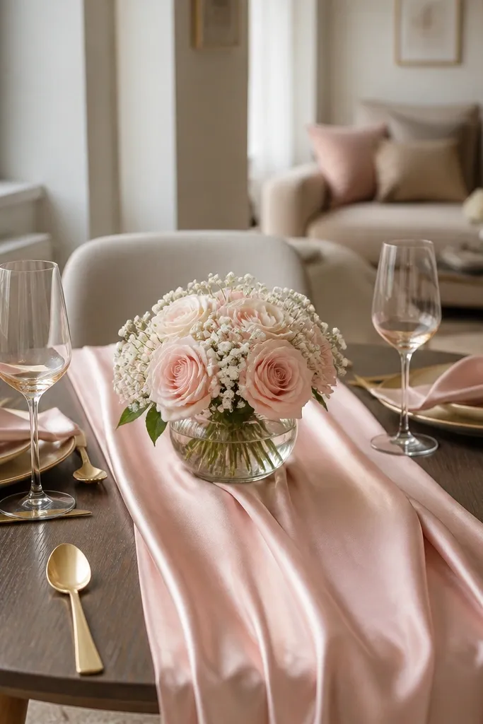
This palette flatters warm indoor lighting and makes small spaces feel instantly “set.” Blush reads romantic without overpowering, and champagne tones keep everything from looking too dusty or too pink. Add soft gold in candle holders or thin picture frames to create sparkle without taking up visual space.
Good to knowPick one material for the accent — like gold foil invitation paper or gold candlesticks — then repeat it 3 times max around the room.
2. Sage Green + Ivory + Dried Wheat (Natural, Not Cluttered)
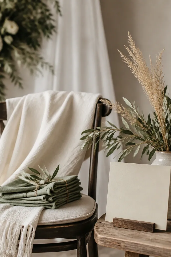
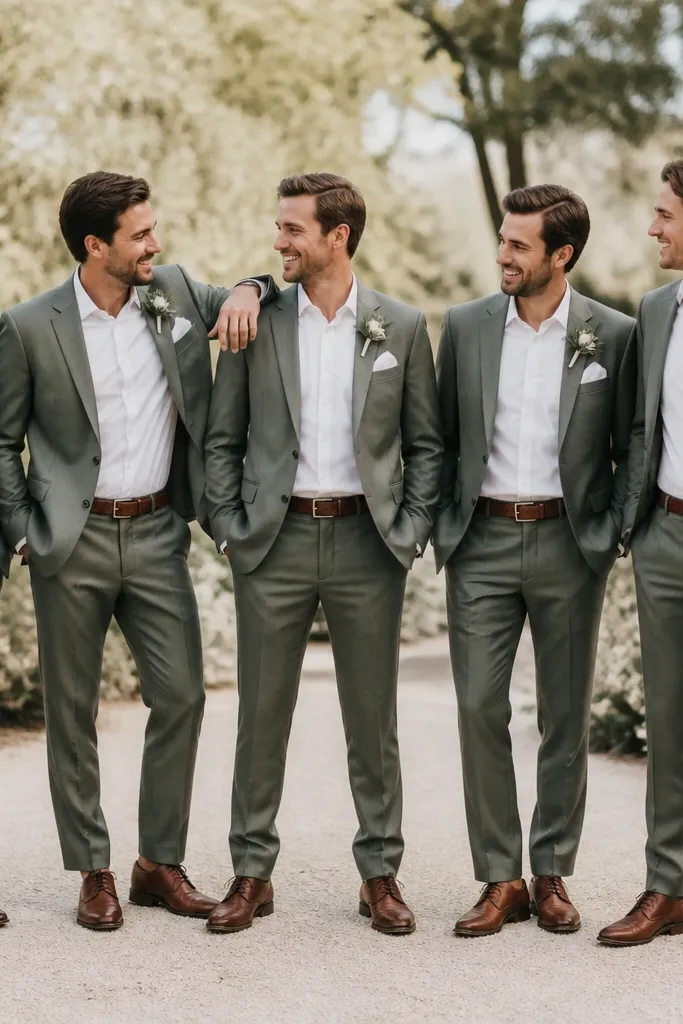
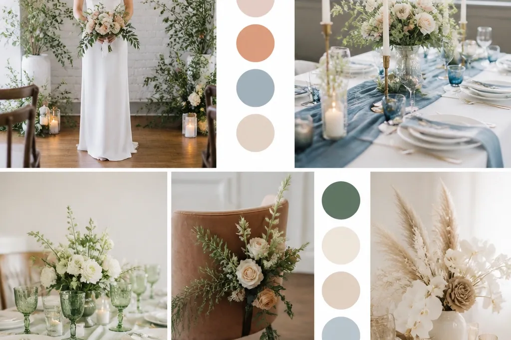
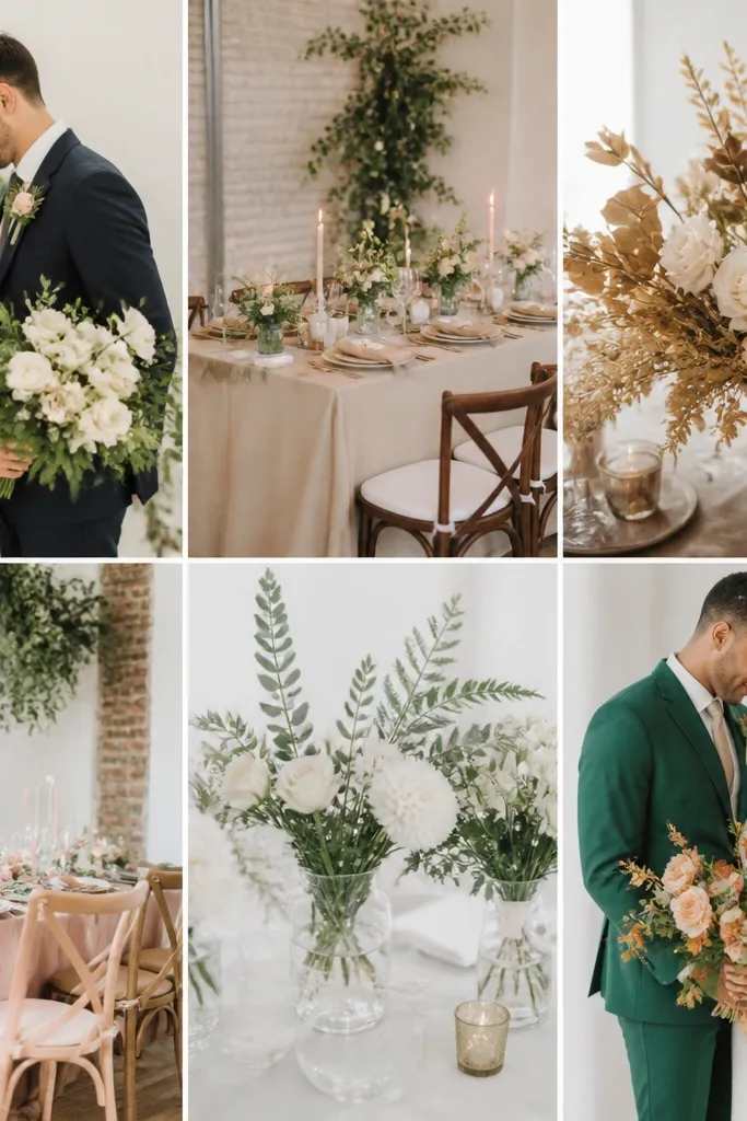
Sage and ivory create a calm, airy look that doesn’t compete with limited wall space. Dried wheat adds texture so your photos still feel rich even with fewer flowers. This scheme also works well for both men and women styling because it pairs cleanly with cream, tan, and soft gray fabrics.
Use dried elements (wheat or eucalyptus) for the centerpiece so you can style once and reuse through the weekend.
3. Dusty Rose + Cocoa Brown + Antique Brass (Cozy Apartment Vibe)
If your apartment has darker walls or fewer windows, this palette adds warmth without feeling heavy. Dusty rose brings romance, cocoa brown grounds the look, and antique brass adds “old money” glow. The key is keeping florals compact and using ceramic or matte textures so the colors look intentional, not busy.
Good to knowChoose one dark base fabric (brown tablecloth or runner) and keep everything else lighter to avoid a cramped visual block.
4. Navy + White + Cornflower Blue (Crisp Coastal-Luxe)
Navy makes small rooms look tailored because it creates a strong frame behind your focal point. White keeps it bright, and cornflower blue adds a vivid pop that shows up in photos even with busy city backgrounds. This scheme also looks sharp on men’s suits and women’s dresses when you want the palette to feel “put together” fast.
Limit cornflower blue to ribbons, a few blooms, or signage — not the whole room.
5. Lilac + Soft Gray + Silver (Modern City Minimal)
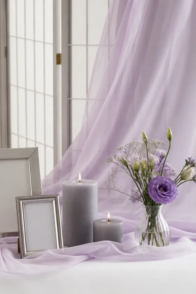
Lilac is romantic but still modern, and pairing it with soft gray prevents the palette from turning too sweet. Silver accents (think metallic balloon clusters or reflective trays) add dimension without adding bulk. Great for apartments because the look stays clean and doesn’t require a lot of physical space to shine.
Use sheer fabric for lilac instead of thick drapes — it gives color while keeping the room visually lighter.
6. Black + Cream + Red Cherry (High-Contrast, Photo Pops)
High-contrast palettes are a cheat code in small spaces because they read clearly in tight frames. Black anchors the scene, cream brightens it, and red cherry accents create a punchy focal point for photos. Keep flowers small and use red in a controlled way — like one bouquet or one dessert table pop.
Good to knowIf you’re using black fabrics, choose matte (not shiny) to avoid glare under indoor lights.
7. Terra Cotta + Oat + Olive (Warm Earth, Minimal Decor)
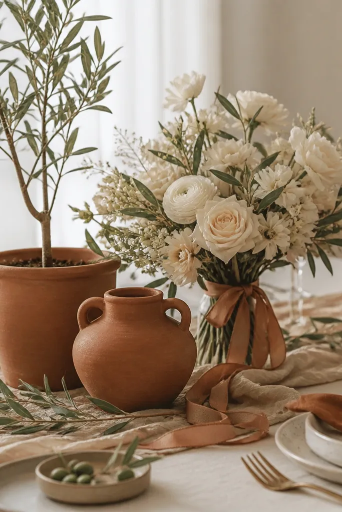
Terra cotta and oat look amazing in apartments because they blend with everyday neutrals — wood floors, beige walls, and warm lighting. Olive adds a natural green without needing lush greenery everywhere. This scheme is also easy for mixed audiences since it flatters a wide range of skin tones and works with both casual and formal outfits.
Good to knowSwap bulky vases for small terracotta planters — they’re compact and still feel intentional.
8. Emerald + Ivory + Gold Leaf (Statement Without Space)
Emerald reads rich and luxurious even when you use less decor. Pair it with ivory so the room stays bright, and add gold leaf details through signage, place cards, or a thin garland. The trick for small spaces is making one “statement corner” rather than trying to color every surface.
Good to knowPick one focal point (chair, backdrop, or dessert table) and concentrate the emerald there.
9. Peach + Mint + White (Fresh Spring Energy)
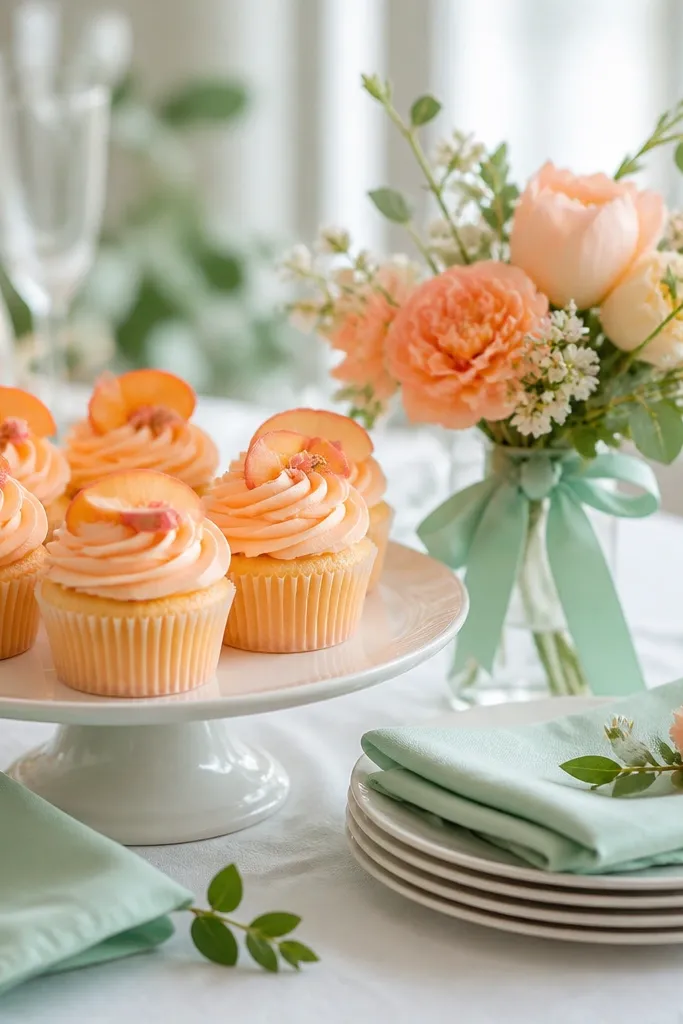
Peach and mint create a lively spring look that still feels light enough for compact rooms. White linen acts like a visual reset, so the palette doesn’t feel overwhelming. Use mint mainly in paper goods and small accents (ribbons, napkins) while keeping florals mostly peach/white for cohesion.
Test the palette under your actual room lighting by placing swatches next to your phone camera — mint can go icy or muted depending on bulbs.
10. Terrific “Two-Color Rule” Scheme: Ocean Teal + Blush + Clear Glass
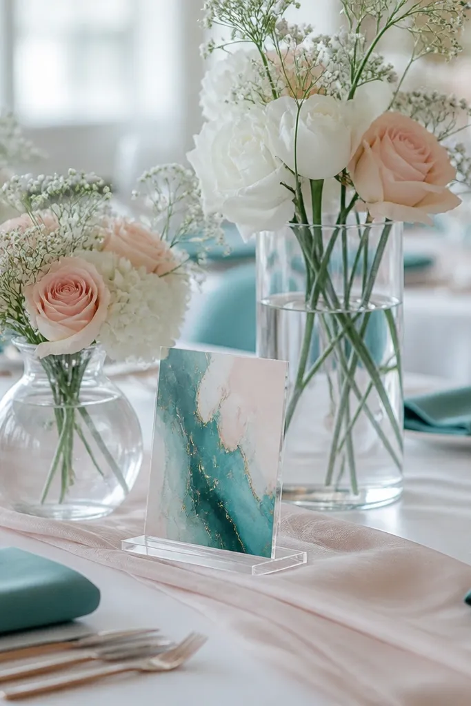
If you want maximum impact with minimum items, use ocean teal as the anchor and blush as the soft counter-color. Clear glass (vases, serving trays) keeps the space feeling open, which is huge in small apartments. This scheme also photographs well because teal gives strong color contrast without needing large backdrops.
Good to knowChoose one “repeat” item like teal napkins or blush candles and place it in at least three separate spots.