1. Peach Sorbet + Cream + Sage (warm spring glow)
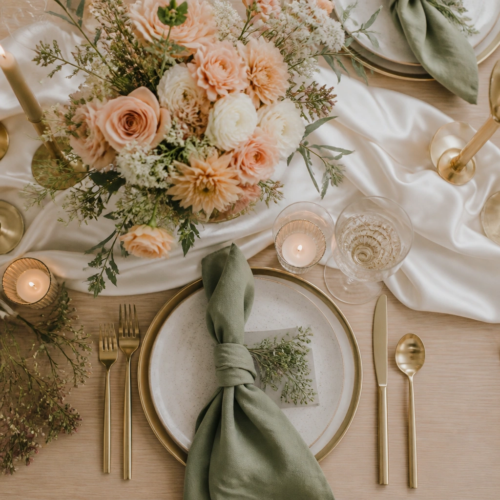
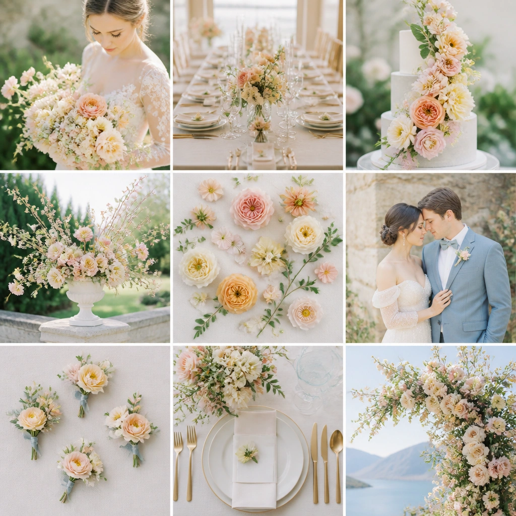
This scheme is built for warm skin tones and golden-hour photos. Peach (sorbet or coral-peach) pops against cream, while sage adds a fresh, botanical balance without feeling like you’re doing “green wedding” everywhere. Think: peach garden roses or ranunculus, cream linen, sage greenery (eucalyptus or olive).
Good to knowPick one peach shade and repeat it in at least three places — bouquet, bridesmaid dresses, and a small signage accent (like a wax seal).
2. Cool Blush + Dusty Rose + Powder Blue (romantic sky)
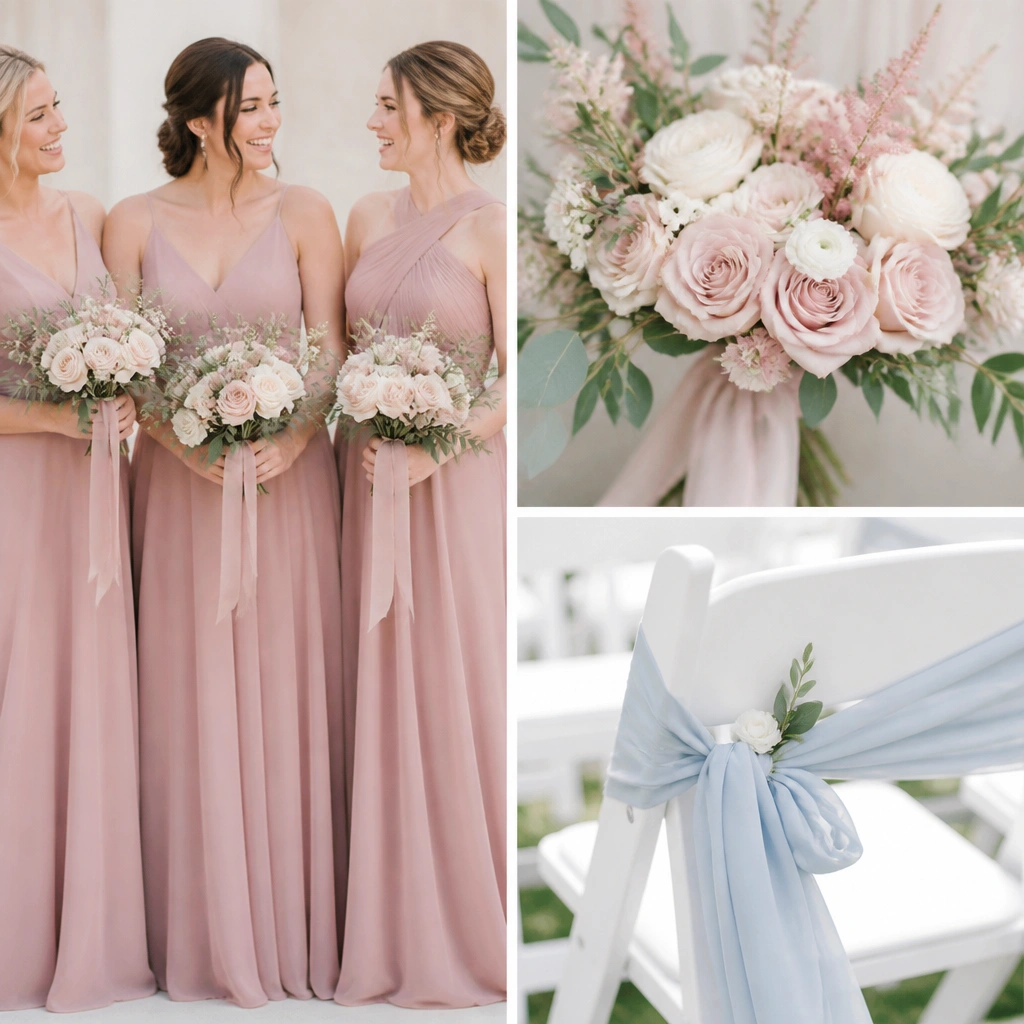
Cool-toned blush and dusty rose look extra airy in spring because they mirror the softness of early-day light. Powder blue keeps the palette from becoming too “all pink” by adding a sky-like contrast. Use pale blue in satin ribbon, small glassware, or a subtle table runner instead of covering everything.
If your main flowers are pink, keep blue in accessories (ribbon, napkins, candles) so the palette stays elegant, not busy.
3. Champagne Gold + Ivory + Soft Green (classic spring luxe)
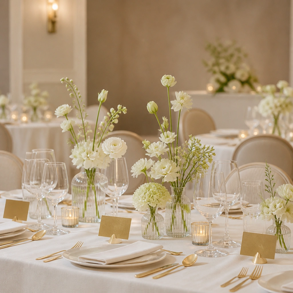
This is the “safe but not boring” spring palette for people who want wedding photos to look timeless. Ivory and champagne gold create a warm neutral backbone, while soft green adds life and a fresh finish. Choose flowers like white lisianthus or garden roses with greenery to keep it cohesive.
Use gold only in small elements — place cards, candle holders, or embroidery thread — so it reads luxe instead of flashy.
4. Lavender Haze + Lilac + White (spring pastels, photogenic)
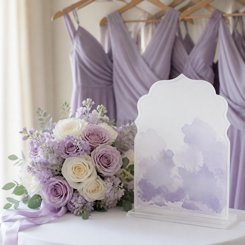
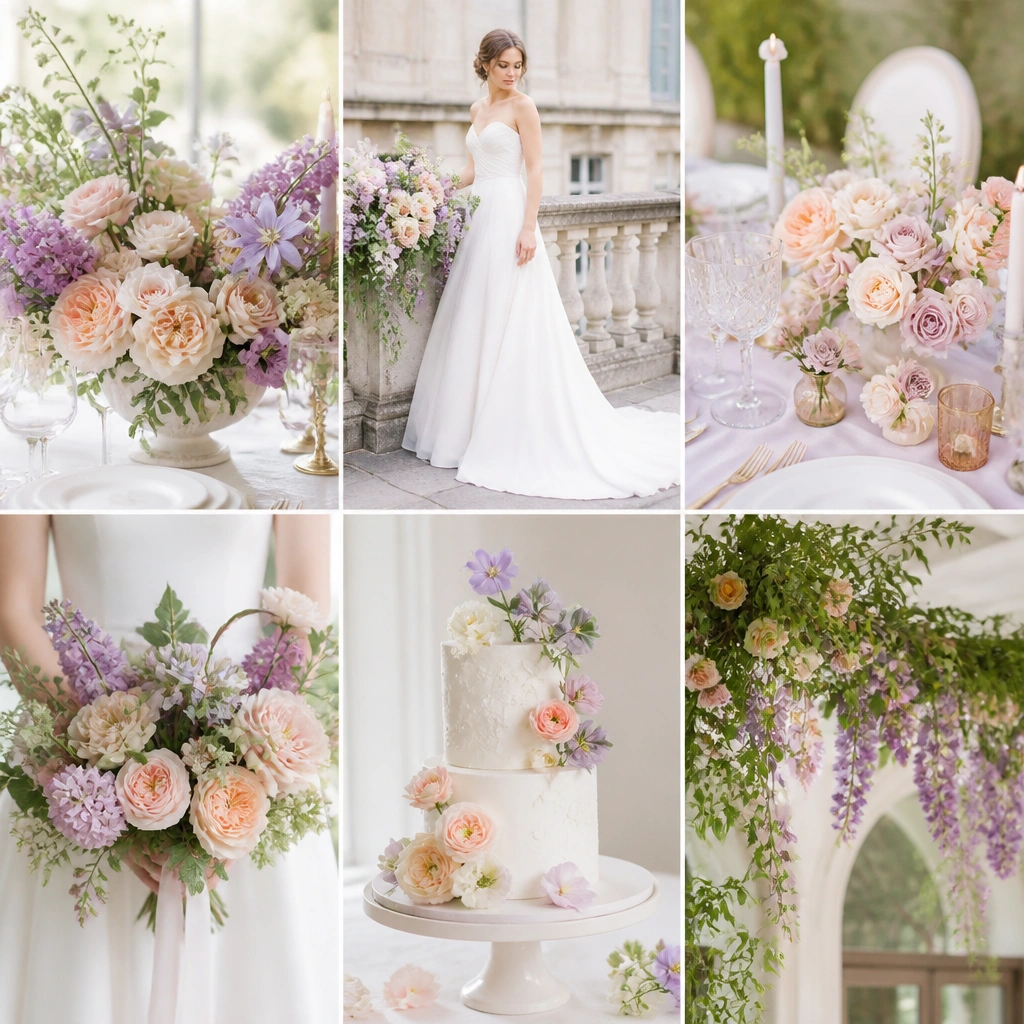
Lavender and lilac can look magical in spring because they photograph like a filter — smooth, dreamy, and coordinated. White keeps the palette bright and prevents it from turning heavy. Add texture with organza or chiffon so the colors look dimensional, not flat.
Good to knowTest your lavender undertone by holding the fabric next to your bouquet — if it looks gray, switch to a slightly more violet lavender.
5. Coral + Tangerine + Sand (sunset garden energy)
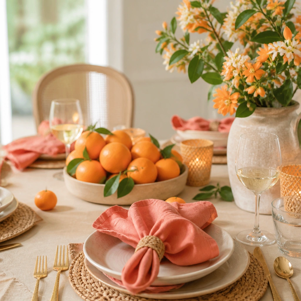
For spring weddings with outdoor light, coral and tangerine bring instant warmth and energy. Sand-colored neutrals make the palette wearable and keep it from feeling like an event theme. Use citrus-like details (oranges, tangerine-toned blooms) in centerpieces and keep dress shades either coral or a softer tangerine highlight.
Good to knowChoose one “strong” orange tone and use the other as a highlight — otherwise the palette can compete in photos.
6. Mint + White + Light Grey (clean, modern, airy)
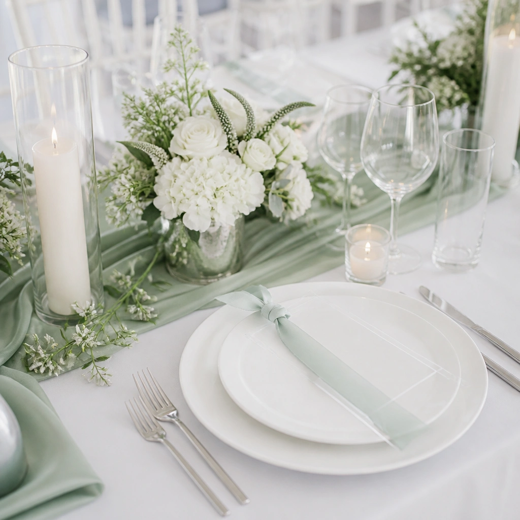
Mint looks crisp in spring because it sits between green and blue — fresh without being loud. White keeps everything bright, and light grey adds modern balance for suits, signage, or chair ties. This palette is great for couples who want a contemporary look that doesn’t rely on heavy décor.
Use mint in larger surfaces (table runner, bridesmaid dresses) and keep florals mostly white so the mint stays the star.
7. Butter Yellow + Ivory + Olive (garden brunch charm)
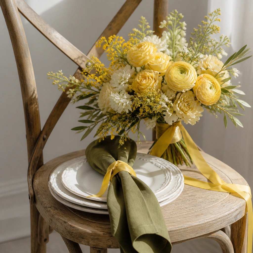
Butter yellow reads cheerful and springy, especially with ivory as the neutral and olive greenery as the stabilizer. The key is softness — choose butter yellow (not neon) so it looks romantic rather than highlighter. Olive adds depth and makes the yellow feel grounded.
Good to knowPair yellow flowers with greenery that has both light and dark leaves (not just one shade) for a more expensive look.
8. Rosewood + Blush Beige + Espresso (elegant spring depth)
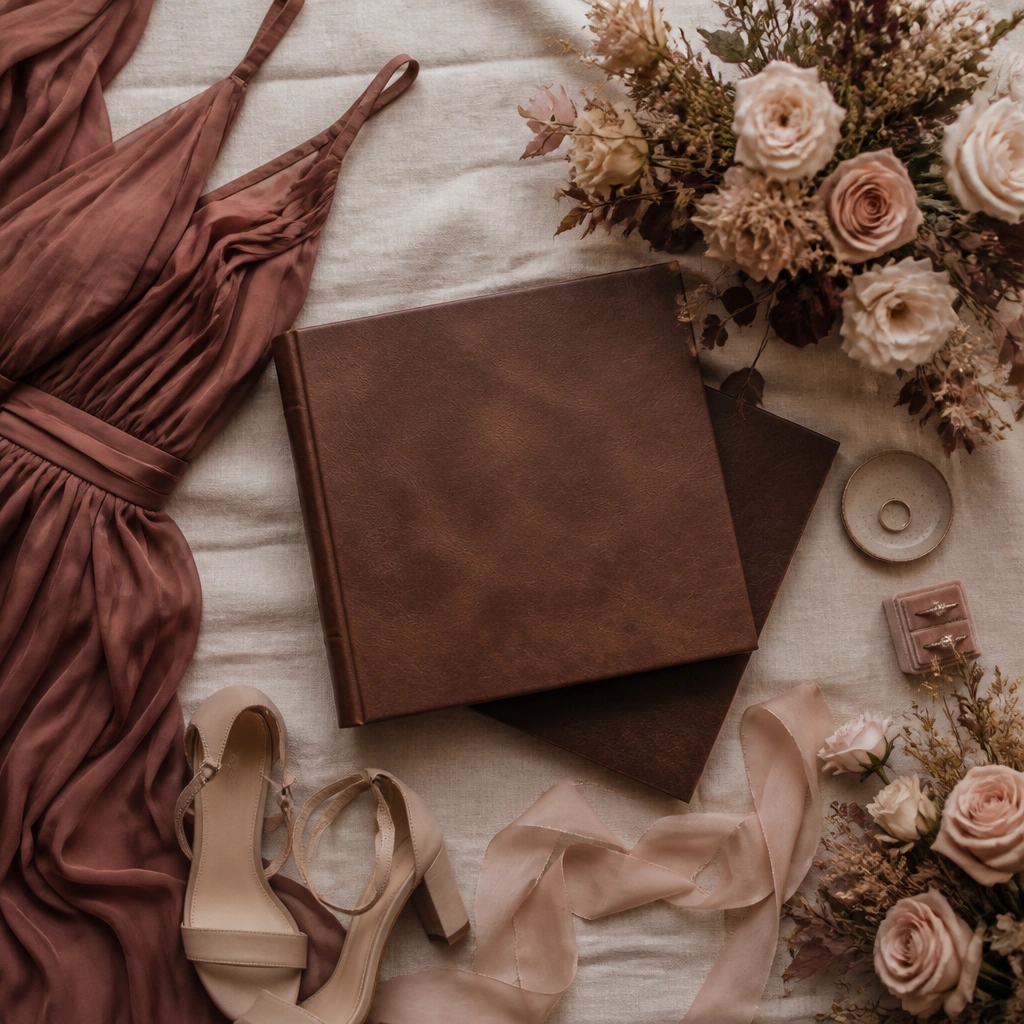
Rosewood plus blush beige gives you spring romance with a deeper undertone. Espresso-brown (in leather, dark wood, or deep ink) adds contrast for photos and makes the palette feel intentional, not pastel-only. It’s especially flattering if your venue has warm wood tones or you want a refined aesthetic.
Keep the bouquet light (blush + cream) and use rosewood mainly in dresses or accents so the overall look stays airy.
9. White + Sage + Soft Peach Accents (subtle, beginner-friendly)
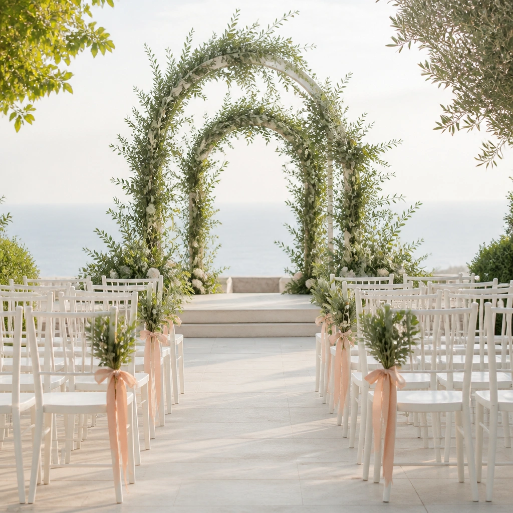
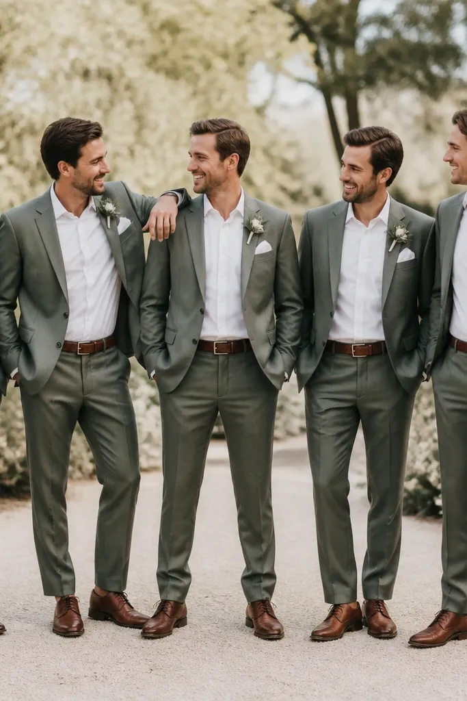
If you’re nervous about color matching, this “mostly white” scheme is the easiest win. White and sage do the heavy lifting for a clean spring feel, while peach accents keep it from looking too plain. Use peach sparingly: ribbon, a few blooms, or peach-tinted candles.
Good to knowUse the 80/20 rule: 80% white/sage base, 20% peach accents, so your photos stay cohesive without overthinking.