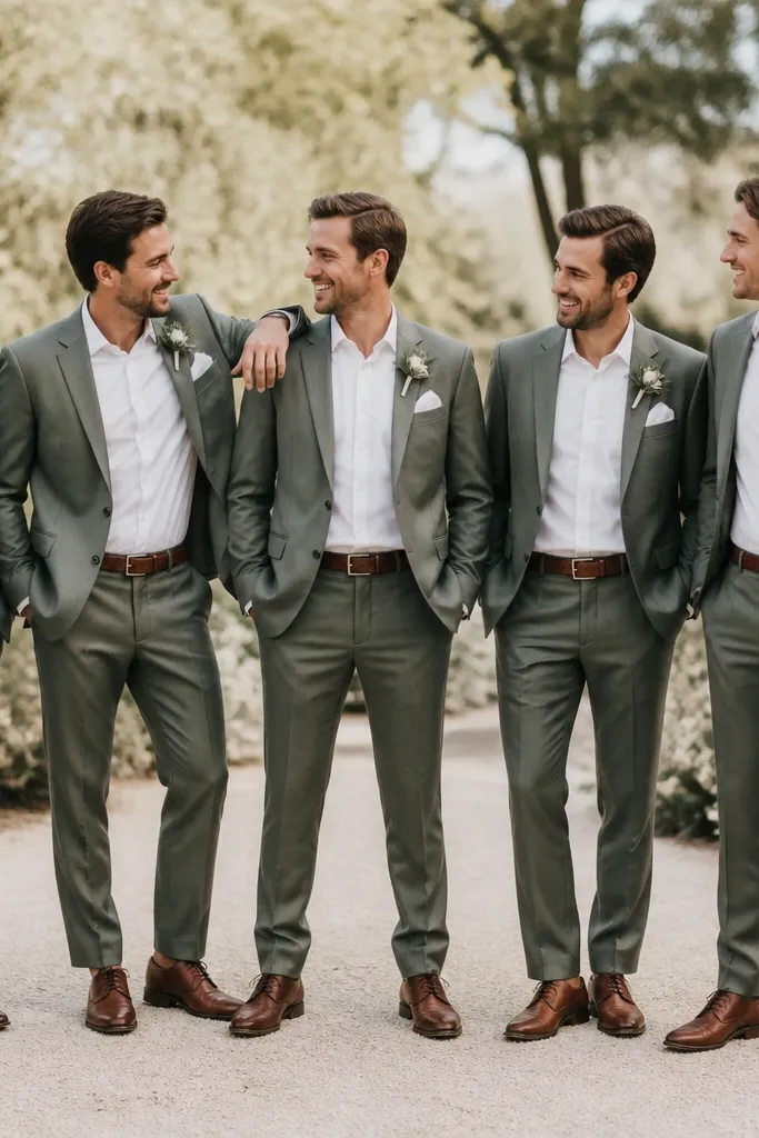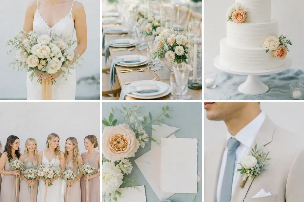
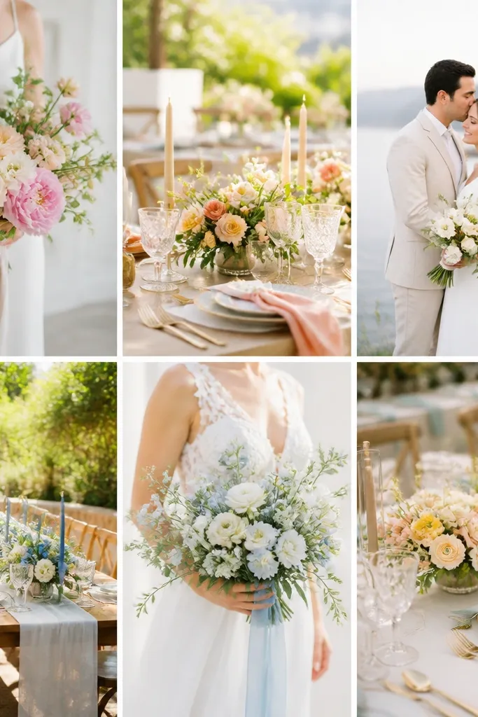
1. Sage + Cream + Soft Gold (Garden Shade-Friendly)
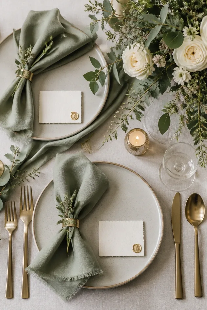
This scheme looks lush without needing lots of fragile color. Sage and cream read fresh even when it’s humid, and soft gold ties everything together in photos without feeling flashy. Use matte textures (cotton, linen, or crepe) to avoid glare in bright afternoon light.
Choose one “anchor” texture (linen napkins or a crepe table runner) and repeat it across signage and favors to keep the look cohesive with fewer items.
2. Dusty Rose + Blush + Natural Jute (Low-Cost Rustic Chic)
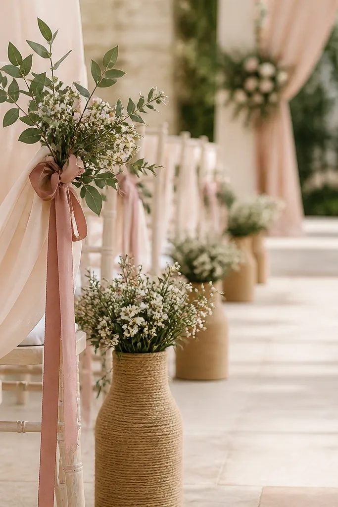
Dusty rose and blush create a romantic palette that hides small imperfections — like uneven flower volume or minor color variation. Jute adds warmth and keeps the overall vibe grounded, which is perfect for outdoor summer venues. This color combo also photographs well in both shade and sun.
Good to knowIf you’re on a budget, prioritize ribbon and table styling (big visual impact) and keep florals smaller but more textured.
3. Navy + White + Lemon Yellow (Crisp Coastal Summer)
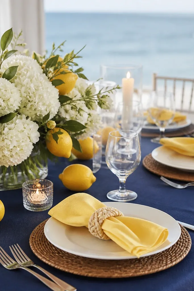
Navy and white give you instant clarity in bright weather, while lemon yellow adds that summer punch without requiring heavy décor. The palette stays clean and doesn’t turn muddy in warm lighting, especially for photos with lots of sky. Pairing crisp whites with saturated lemon also helps skin tones look vibrant.
Good to knowUse lemon in small areas — napkins, signage, or drink sleeves — so the scheme stays “low maintenance” instead of becoming overwhelming.
4. Terracotta + Sand + Olive (Desert Garden Warmth)
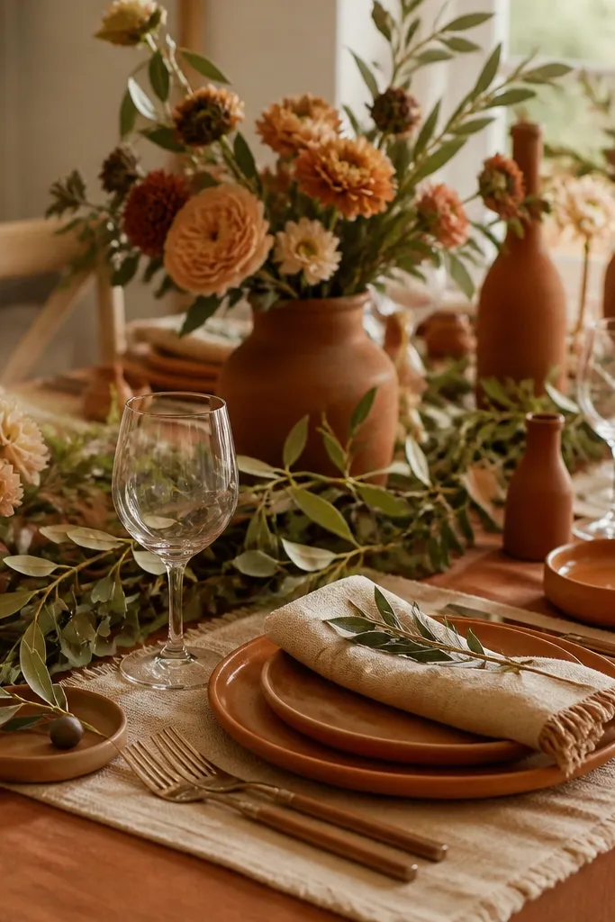
Terracotta and sand create a naturally cohesive base, and olive greenery makes it feel intentional without needing many colored flowers. This palette is forgiving because earthy tones blend well even if your blooms aren’t perfectly matched. It also looks stunning in golden hour — the colors intensify instead of fading.
Good to knowStick to one terracotta shade (more orange or more brown) and match it in ceramics or stationery, not in multiple different décor pieces.
5. Coral + Peach + Champagne (Sunset-Friendly Glow)
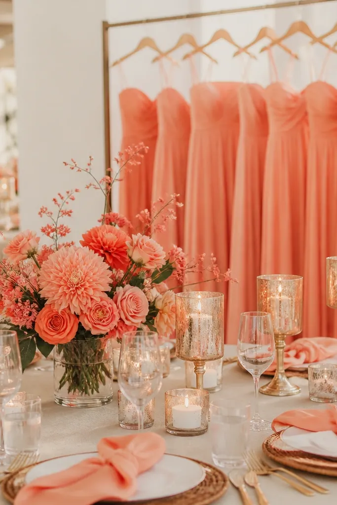
Coral and peach are summer classics, but the secret is the champagne neutral that smooths everything out. This combo feels lively without looking chaotic, and champagne reflects light beautifully during sunset photos. It’s also great for mixed bridal parties because it flatters a wide range of skin tones.
If your venue has lots of warm wood, choose champagne accents instead of bright gold to avoid color competition.
6. Black + Ivory + Raspberry (Modern Summer Contrast)
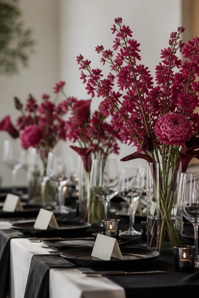
High-contrast palettes hide mess and keep the design looking styled even with minimal flowers. Black and ivory anchor the look, while raspberry adds a bold summer pop that stands out in daylight. This scheme also works for both indoor and outdoor weddings because it doesn’t depend on a specific background color.
Good to knowLimit raspberry to one hero element per table — like napkins or a single floral focal point — so you don’t need lots of décor.
7. Powder Blue + White + Soft Coral (Brunchy, Airy Spring-to-Summer)
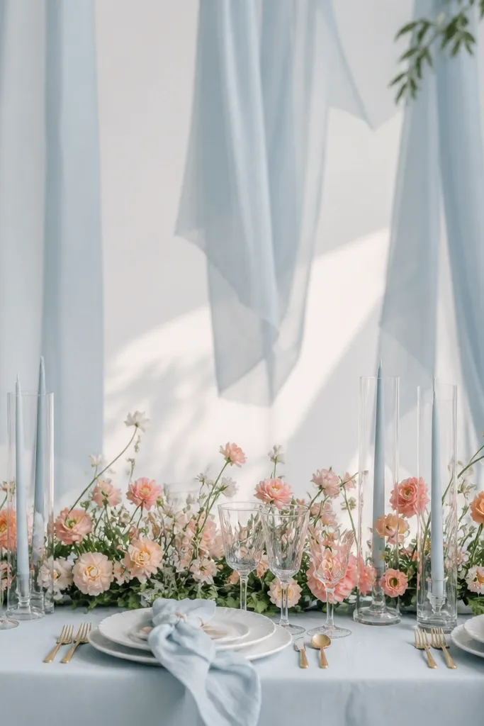
Powder blue makes summer feel calm and clean, while white keeps it light in bright sun. A touch of soft coral prevents the palette from looking too “cool-toned” and adds warmth to skin and floral greens. Use airy spacing and low arrangements for the most elegant, low-maintenance look.
Choose matte powder-blue textiles (not glossy satin) to reduce glare in photos.
8. Olive Green + Cream + Burnt Orange Accents (Mediterranean Minimal)
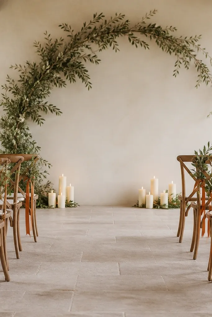
This is a “less décor, more impact” palette. Olive and cream give you a natural, elevated base, and burnt orange accents create a warm focal point without needing full-color centerpieces. It’s ideal if you want your wedding to feel Mediterranean and intentional, even with fewer items.
Go ribbon-heavy: one burnt orange ribbon per chair or per menu card looks styled fast and doesn’t require extra florals.
9. Lilac + Light Gray + White (Cool-Tone Summer Elegance)
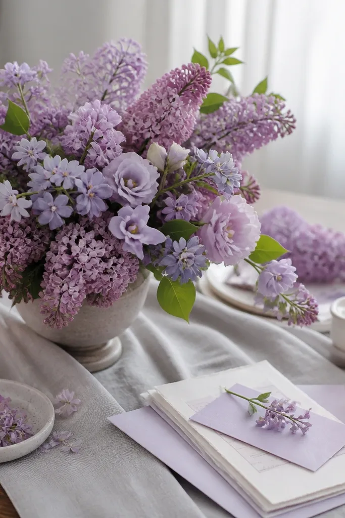
Lilac reads romantic but can be tricky if the venue lighting is too warm — that’s why pairing with light gray helps balance the palette. White keeps everything crisp and photo-ready, while light gray prevents the look from feeling overly sweet. Use airy florals and greenery to keep it breathable in summer heat.
Good to knowWhen buying lilac items, check under both daylight and indoor lighting — you want the tone to stay “soft,” not neon.
10. Emerald + Ivory + Blackberries (Jewel-Tone Without the Drama)
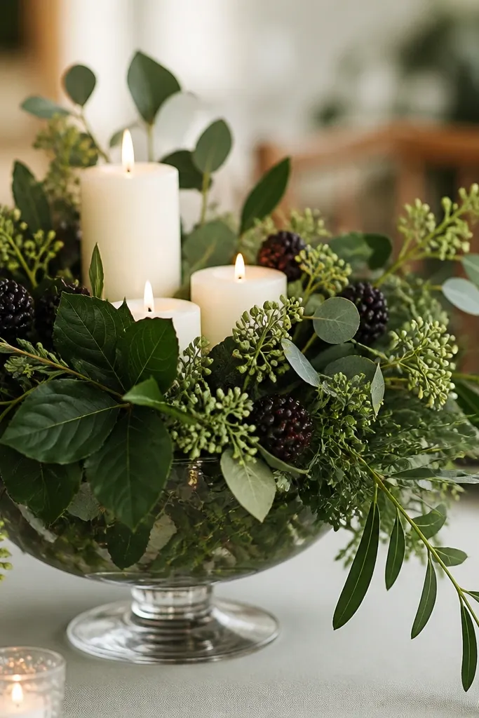
Emerald with ivory creates a rich, luxe look that still feels fresh for summer. Adding dark berry accents gives you depth and a natural “wow” factor without relying on rare flowers. Jewel tones also make skin tones look vibrant in both shade and late afternoon light.
Use berries/fruit as short-term décor only — place them close to the event start time to keep them looking fresh.
11. Monochrome White + Green + Champagne (Ultra Low-Maintenance Minimal)
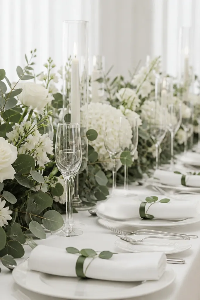
If you want the most low-maintenance wedding color scheme, go nearly monochrome. White and green stay elegant and forgiving, and champagne adds warmth so it doesn’t look sterile. This palette is especially great for summer because it won’t look “off” no matter your venue background color.
Good to knowChoose greenery-heavy arrangements (eucalyptus, olive leaves, or mixed greens) and keep white blooms in smaller clusters for a full look without overbuying.