1. Icy Pearl + Blush + Dusty Rose (soft winter romance)
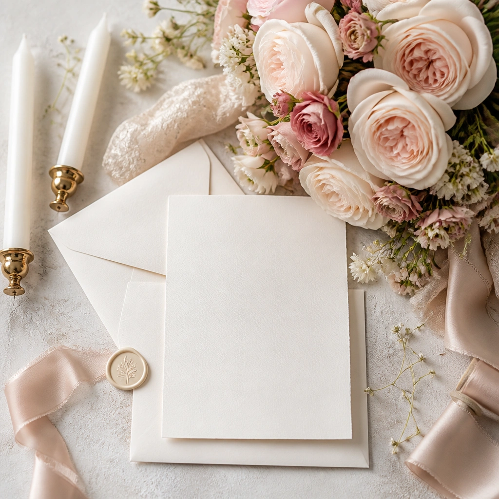
This scheme uses a warm-leaning “pearl” white instead of bright white, so it feels cozy even in snowy lighting. Blush and dusty rose add depth without looking like spring, especially with textured blooms (garden roses, ranunculus) and matte finishes.
Good to knowChoose one anchor white (pearl or ivory) and keep it consistent across invitations, linens, and dress fabric; it prevents the common “two whites” problem.
2. Evergreen + Cream + Cinnamon (cozy lodge elegance)
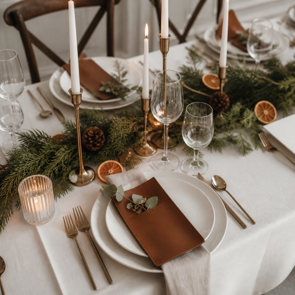
Evergreen grounds the palette, while cream keeps it bright and inviting. Cinnamon adds warmth that balances winter coolness, and the earthy tones look stunning against wood venues and stone fireplaces.
Use cinnamon as an accent only (menus, napkin rings, signage) so the look stays elegant instead of rustic.
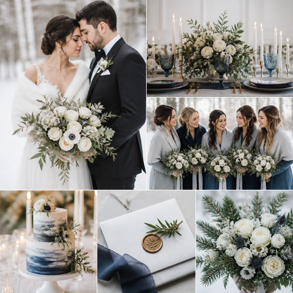
3. Midnight Navy + Silver + Frosted Mauve (formal and modern)
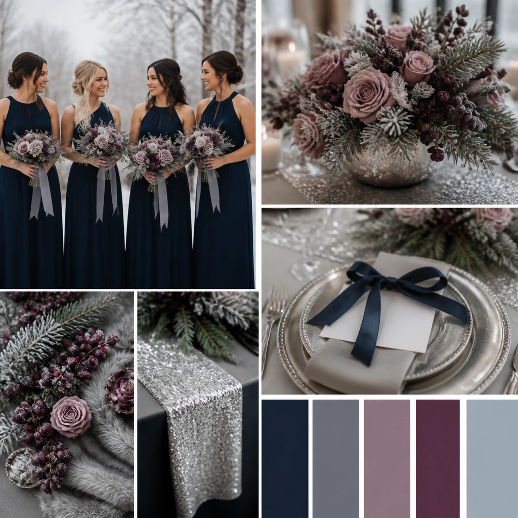
Navy gives the drama winter photos love, while silver (mirrored glass, satin, or metallic candles) adds the “frost” effect. Mauve prevents navy from looking too dark by bringing a soft purple undertone that pairs beautifully with winter berries.
If your venue has warm lighting, keep mauve slightly cooler (more lilac) so navy doesn’t absorb all the color.
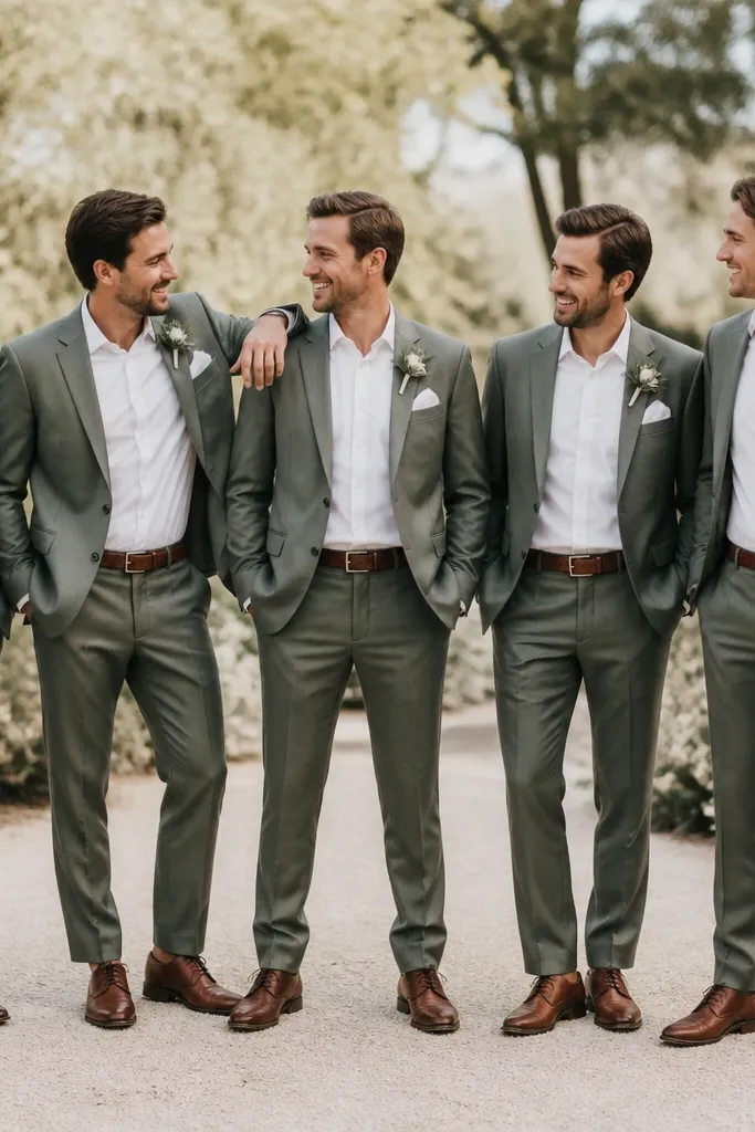
4. Forest Green + Champagne Gold + Warm White (holiday-luxe)
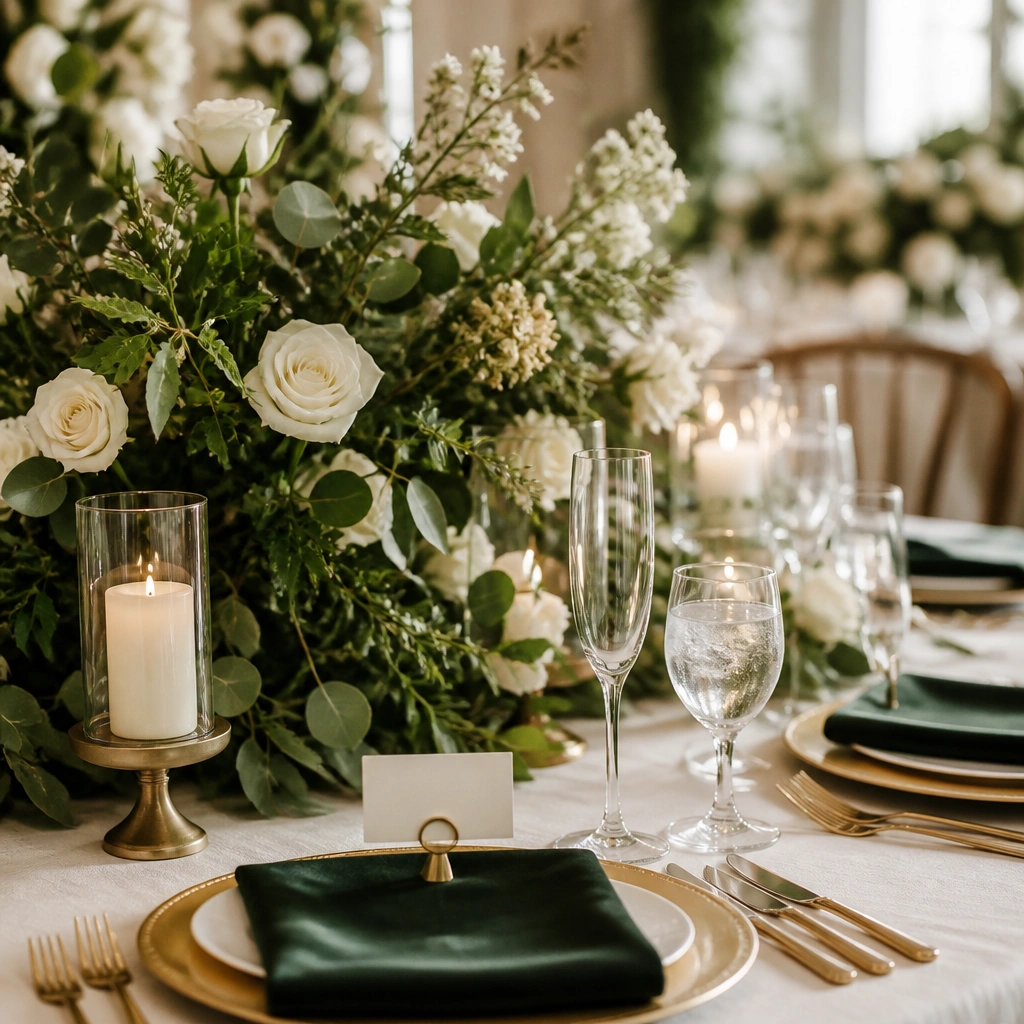
Forest green feels rich and seasonal, and champagne gold reads softer than bright gold. Pair it with warm white (not stark) for a luxurious, candle-friendly vibe that looks amazing in both indoor and evening shots.
Use velvet or thick satin for at least one element (napkins or sash) — texture makes the palette look expensive instantly.
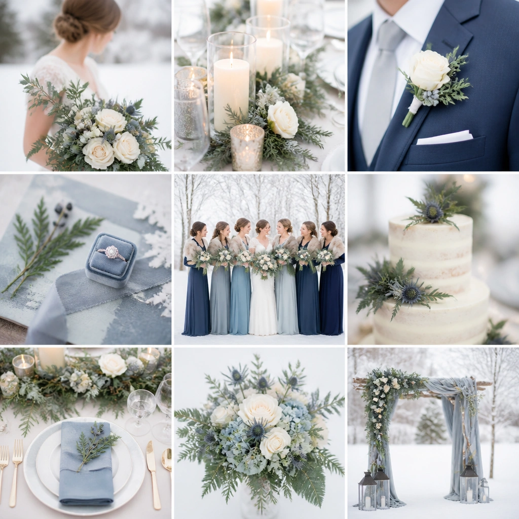
5. Slate Blue + Pearl + Steel Gray (clean winter minimal)
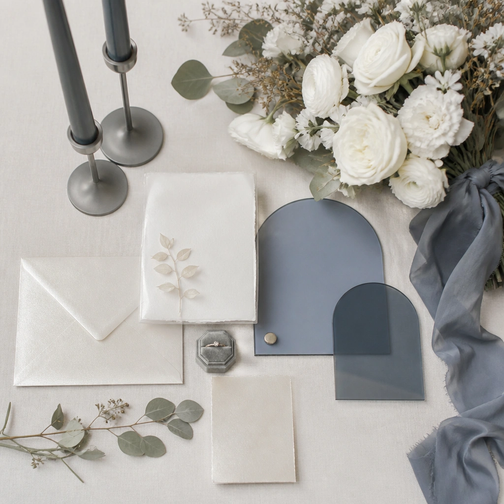
This palette is modern and airy: slate blue adds color without overpowering, while steel gray keeps everything crisp. It’s perfect for venues with lots of natural light because the cool tones stay balanced.
Limit yourself to one flower color besides white (slate-blue ribbon or dried accents) to keep the look cohesive.
6. Burgundy + Ivory + Antique Brass (romantic wine tones)
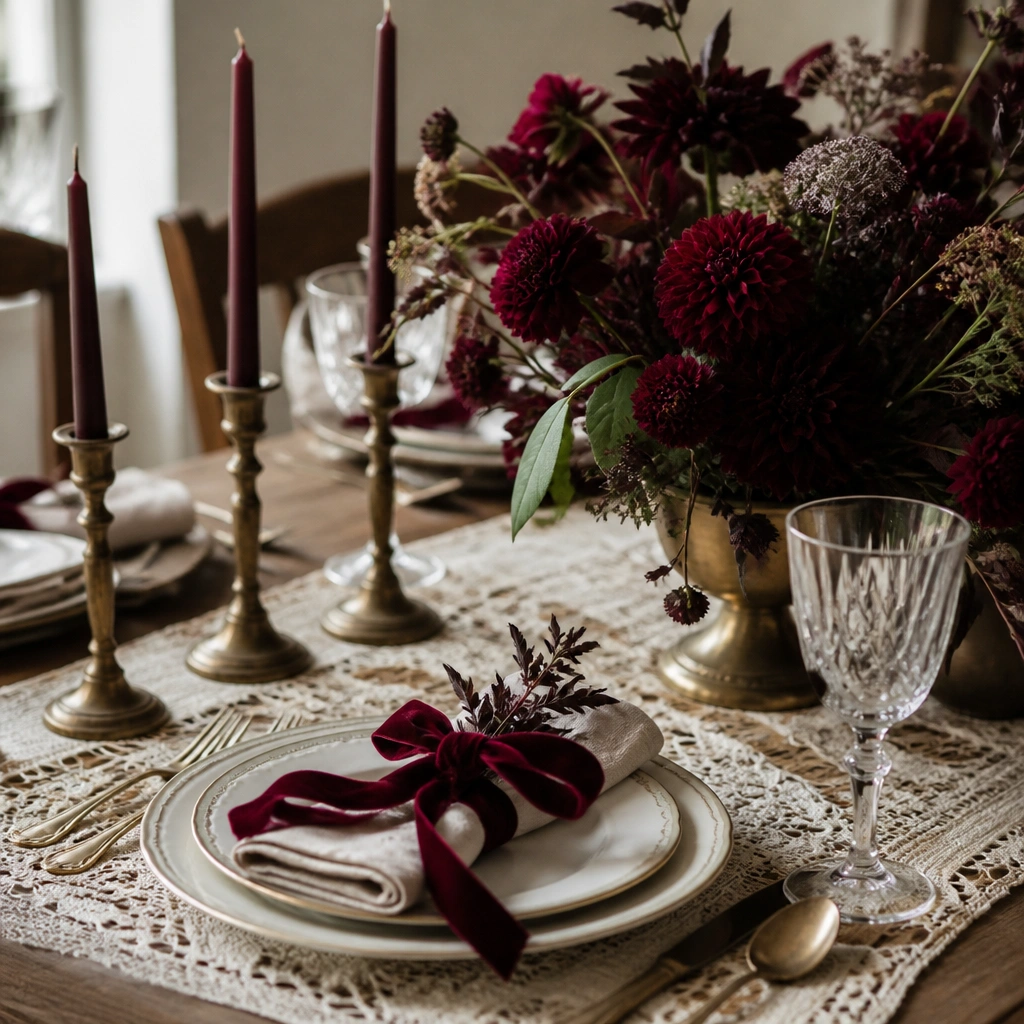
Burgundy is a winter hero because it reads rich even in low light. Ivory keeps it classy, and antique brass adds warmth that makes skin tones look flattering in photos.
Good to knowAsk your florist for burgundy blooms with a natural variation (not a single flat burgundy) — it adds depth without extra colors.
7. Blush Smoke + Charcoal + Soft Gold (editorial winter chic)
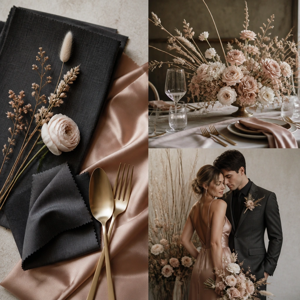
Blush smoke (a muted gray-pink) gives winter calm, while charcoal adds sleek contrast. Soft gold keeps the palette warm and flattering, especially for evening receptions where candlelight is present.
Use charcoal in small, intentional ways (menus, table numbers, suit accents) so the blush remains the star.
8. Teal Frost + Cream + Antique Silver (unexpected winter pop)
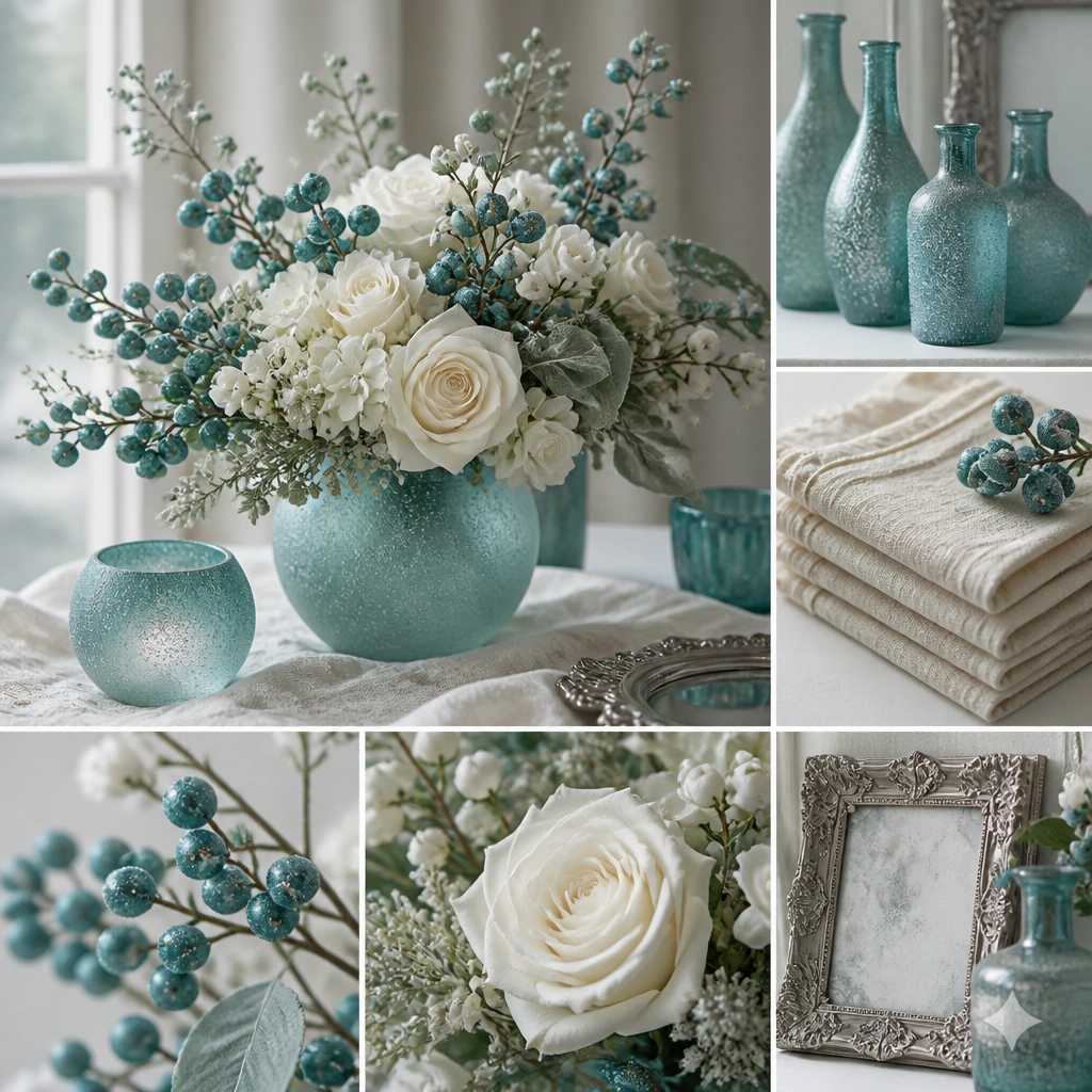
Teal frost is less common than burgundy or navy, so photos feel fresh. Cream and white blooms keep it balanced, and antique silver gives that “winter sparkle” without going too icy.
Good to knowIf teal feels too bold, tone it down by using teal only in glassware, ribbon, or berries — not every floral stem.
9. Rose Quartz + White + Antique Copper (airy but warm)
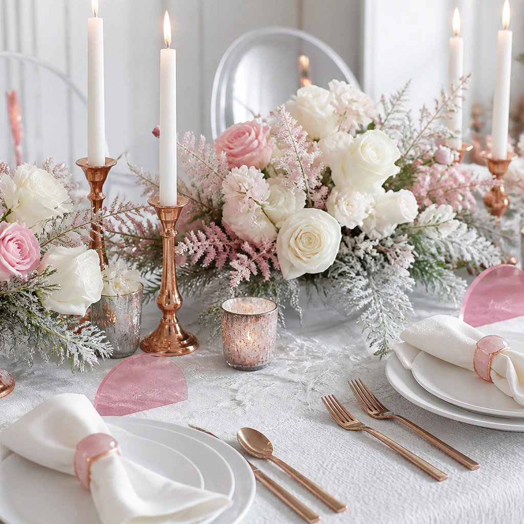
Rose quartz reads romantic and gentle, while copper adds warmth that keeps the palette from feeling cold. This is a great option for winter weddings that want “soft spring energy” without breaking the season.
Pair rose quartz with mostly white flowers (like anemones or ranunculus) so the pink stays delicate, not loud.
10. Champagne Beige + Espresso Brown + Porcelain White (classic neutral winter)
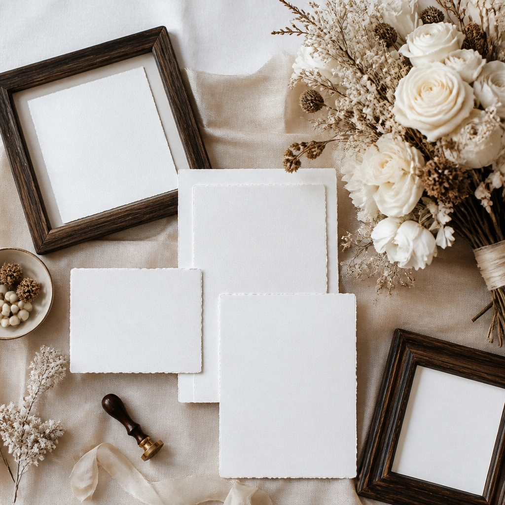
Neutrals look expensive in winter because they don’t fight the season’s darker tones. Champagne beige and porcelain white create softness, while espresso brown adds grounding. It works especially well for rustic-modern venues and indoor candlelight.
Bring one “wow” texture (bouclé napkins, satin ribbon, or a velvet runner) so neutrals don’t read flat.